


Color does more than add a fresh look to your room – it can change the way you see it. As our homes are seeing a lot more of us, it’s the perfect time to explore the different ways color can change our perspective. Want your ceiling to feel higher or room to look bigger? Play a simple trick on the eye with these perception hacks that alter your space with a little paint.
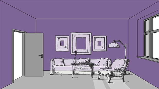
1. Enlarge Your Space
Light colors reflect light, while dark colors absorb it. A contrast-free color scheme with light-colored walls and coordinating ceilings can make your space feel larger than it is. Whether your room is feeling too small, or it’s a place you use for gathering, this monochromatic look instantly creates a soothing space that feels bigger and brighter.
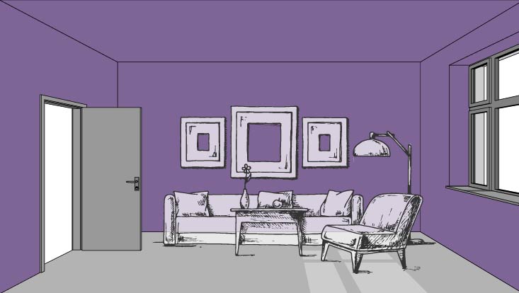
2. Cozy Your Space
If you’re looking to make your room feel smaller, rather than bigger, turn to bolder hues. Because these rich colors reflect less natural light, they’re often used to blanket a room in comfort. This cozier look is suited for places where you’re looking to relax and unwind, making it a natural fit for bedrooms.
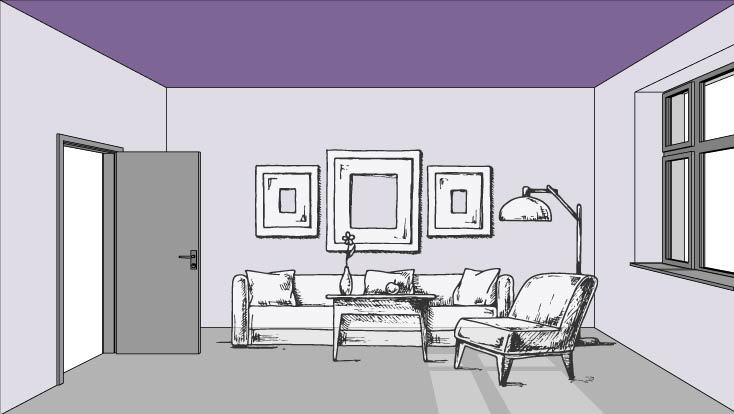
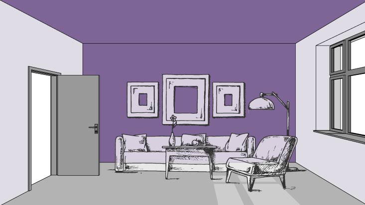
3. Lower the Ceiling
Dark color? Up there? Absolutely! Another way to make a space cozy is by painting your ceiling a contrasting color from the walls. When you use a darker hue to highlight your fifth wall, it creates the inviting illusion of a lowered ceiling and a lived-in look. Choosing a bold neutral for this daring feat ensures your overhead color blends seamlessly with the decor below it.
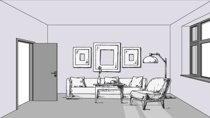
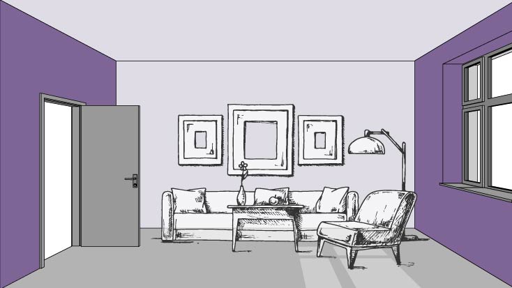
4. Raise the Ceiling
Wish your ceiling was higher instead of lower? Lift it with a light color. Painting your overhead space a few shades lighter than the surrounding walls is a small space secret that can open your room. A hue like white can often disappear, drawing your eye away from the fifth wall and onto your furnishings instead.
5. Widen Your Space
When you’re dramatically altering the width of your room, stronger contrast is needed. Painting your back wall and ceiling in a dark color while keeping side walls a lighter hue can make your room seem broader. This visual line holds your attention and adds a spacious look to your abode.
6. Narrow Your Space
If you’re less interested in widening your space and more interested in narrowing it, all you have to do is reverse the color combination. Adding dark colors to the side walls instead of the top and back can make them feel longer and closer together. This dramatic illusion comes in handy when you’re looking to keep a room with uneven dimensions balanced.
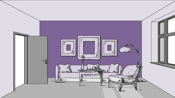
7. Shorten Your Space
Want to make a larger room feel more personal? Look to darker colors that draw you in. An accent wall surrounded by lighter tones is great for immersing yourself in a space, instead of making you feel removed. This bold contrast is also a great way to anchor your area.
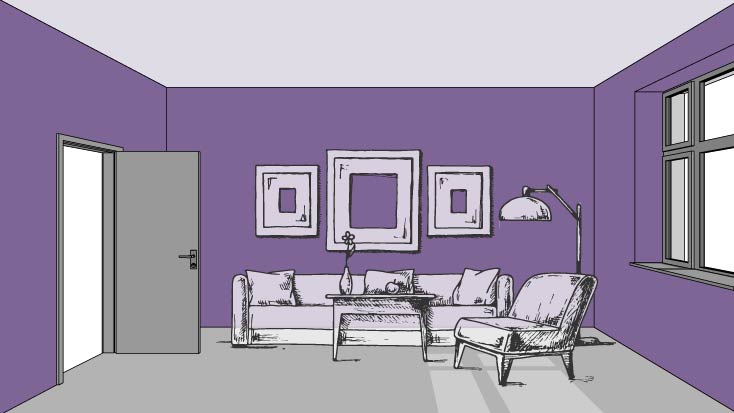
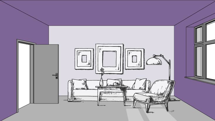
8. Highlight A Wall
Whether you’re gathering to binge your favorite shows or put your gallery wall on display, highlighting a section of your room is the perfect way to draw attention to an area. Surrounding a light-colored accent wall with darker colors from above and each side instantly frames the room and draws the eye to the focal point of your choosing.
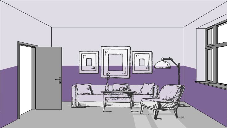
9. Shorten Your Walls
Color blocking has always been a two-toned trend we love, but when used a certain way, it can also play with perspective. Adding a bolder color to the bottom of your walls helps to make them look shorter. This simple technique has an overall effect of visually shrinking the height in your space to make it feel more welcoming.
Looking to get even more mindful of your space? Pair your understanding of color’s spatial impact with our Color Theory Guide to create a thoughtful room that’s perfectly tailored.


What if you put the navy blue all around the room half way down and put the gray underneath on a rectangle bedroom and then paint the walls on the ends solid navy will that make the room seem more square and cozier?
Hi Sandy! We’d like to get a better sense of your space before making a recommendation. Sign up for a free Virtual Color Consultation here.
I am totally stumped. The color on my back wall is Red Bay an 20 years old. Finally need to do something else. I would like to paint my kitchen cabinets, walls an ceiling. As you can see I have stone on the island. Please help!
I am having a difficult time uploading the photo.
Hi Jeannette! Could you tell us more about the space? For instance what color is the flooring and your countertops? Thank you!
While it might be more complex, maybe you could include some info on light reflective value and how it impacts the space; then provide examples.
Thank you for your feedback, Chuck! We will forward it to our marketing team.
I have an open floor plan. My kitchen and family room have walnut floors and cabinets.
The color is coconut cream on walls, and family room accent wall is sticks and stones.
Couch and love seat are grey.
My kitchen island (has a white top) and above cabinets need color to brighten and bring some life into the area. The coconut cream is too blah.. Help, please!
Hi Ellen! Are you painting the walls and your kitchen cabinets?
Unsubscribe me too
Hi Lisa, to unsubscribe please go to the bottom of the email we sent and click “unsubscribe”.
I am remodeling my kitchen and need some help with colors for cabinets, walls and also counter tops. I plan to save my back splash which is a light cream color with dark grayish streaks. I plan to put a light color tin tile on ceiling and brown and gray flooring. What is your suggest for a cool color palette?
Hi Nancy, if you can, please either here or if you could message us on one of our social media channels and attach a picture of your backsplash. This would help to get a better idea of what to recommend. Also, if you have not chosen a countertop yet, you would probably want to select that first before you choose paint. You are painting your cabinets and walls, correct? Let us know when you get a chance. Another option you might enjoy is signing up for a free 30 minute Virtual Color Consultation. Here is the link if so: https://www.sherwin-williams.com/en-us/virtual-color-consultation
I want to congratulate your content, it is very creative, bringing great information…
https://soluartpinturas.com.br