


Wondering about color? When it comes to a room makeover, color is where we spend most of our time thinking. You’re looking for a hue that can do a little bit of everything. It should complement the space, capture style and reflect your personality all at the same time – it’s no wonder color selection gets so much attention. That’s why we’re breaking down the building blocks of color theory to help you find the perfect hue that checks all the boxes.
Warm colors
It’s all in the name. Warm shades of red, orange and yellow are associated with the literal warmth that the sun and fire radiate. These vivid shades are closely tied to energy, joy and positivity, to create a space where the emotion feels uplifting and welcoming.
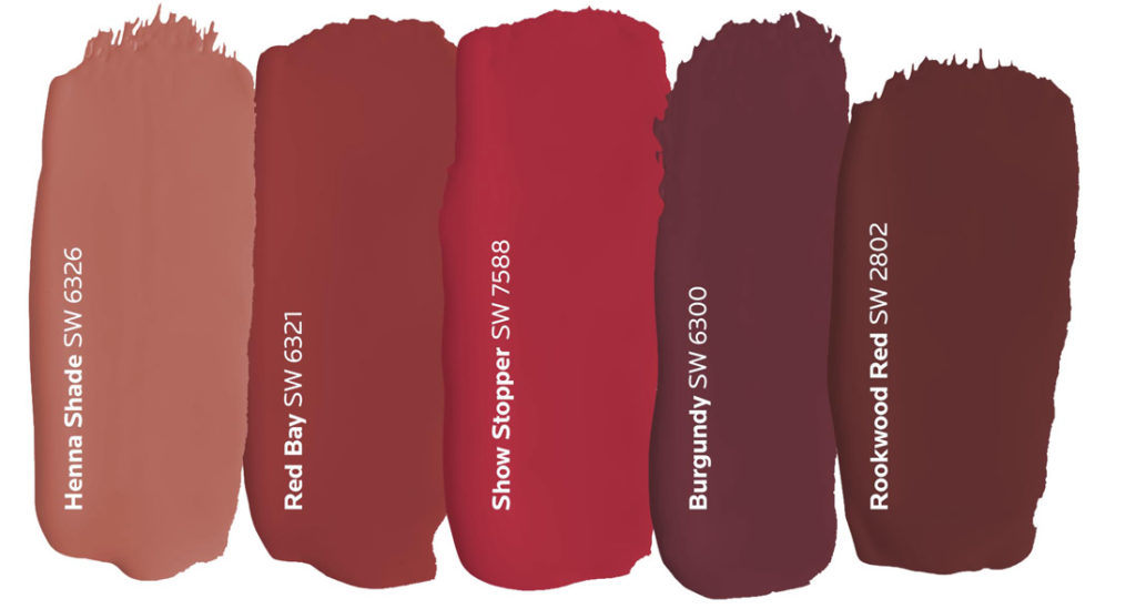
Red
Red is symbolic of strength, power and passion, but it’s boldness can often overshadow its versatility. The key to using this hue is focusing on the statement you want to make with it. While the brighter shades of red generate more energy, darker ones tend to show a softer side that’s subtle and conservative. Consider a rich burgundy or brick red when designing for a space where the atmosphere is warm and welcoming, like a dining room.
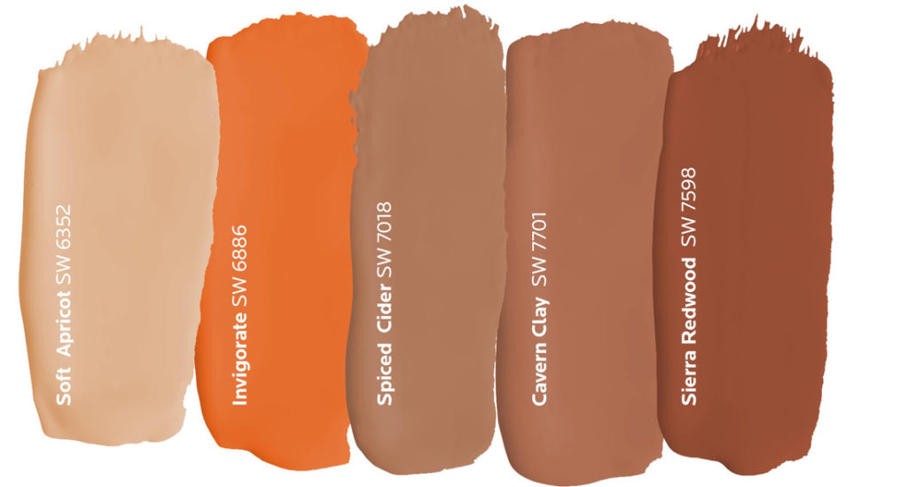
Orange
The overall friendliness of orange makes it an ideal choice for rooms where people gather, but it’s also well suited for front doors that welcome guests into your home. From the bright citrusy hues to the muted earth tones, this happy hue’s versatility allows it to work well with a number of different design styles.
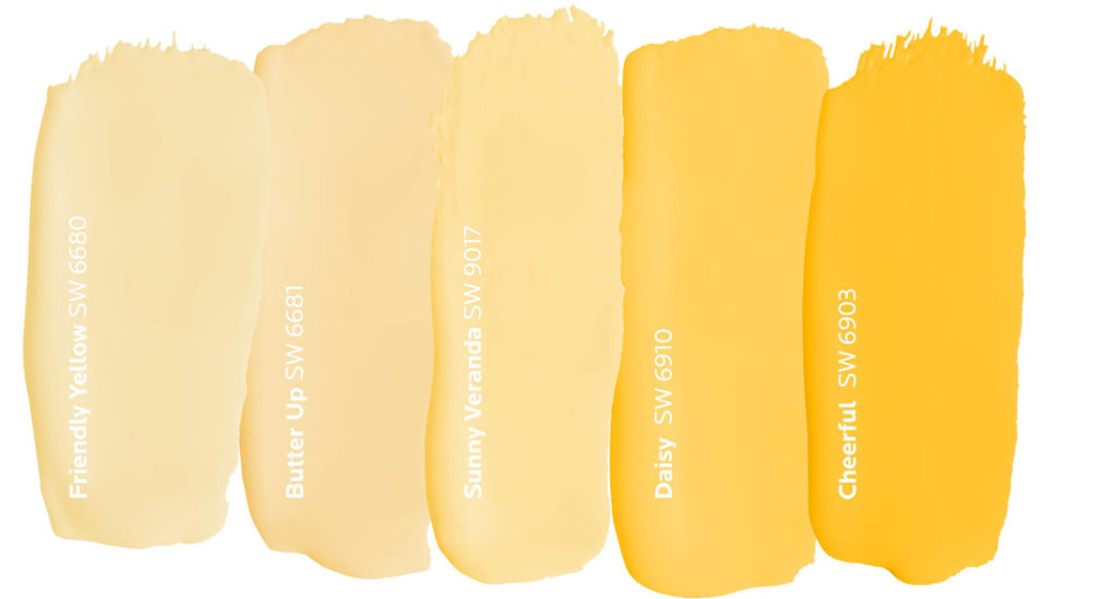
Yellow
A cheery nature follows yellow wherever it goes. This golden hue triggers thoughts of happiness and sunshine especially when it’s used in a room with lots of natural light. Since it’s often considered to be the brightest warm color, a soft, sunny yellow is the perfect choice for guest bedrooms because it makes everyone feel right at home.
Cool Colors
What comes to mind when we think of cool colors? Whether it’s a serene lake or a clear sky, cooler hues are often associated with feelings of calmness, relaxation, and tranquility. They’re a softer option that can make a space feel larger thanks to the way they make color look like it’s receding.
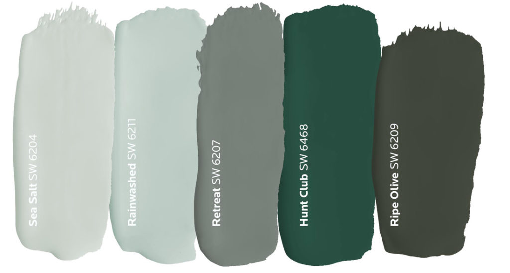
Green
Mixed with the calming nature of blue and vibrancy of yellow, green is a color embodying balance and harmony. This down-to-earth hue is just as diverse as the nature it’s inspired by. Soft sea-greens can bring a restorative energy into a space, while deep olive tones can add depth and stability that feels anchored to the ground. Consider using deep greens to emphasize features you want to stand out like kitchen cabinets.
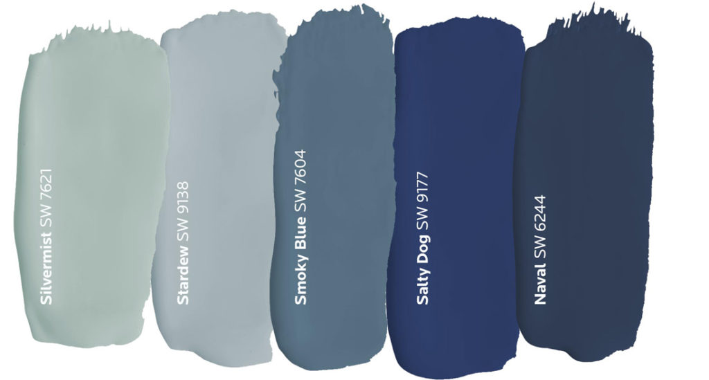
Blue
It’s the color of trust and tranquility. Blue is just as refreshing and friendly as it is reserved and sophisticated. It’s representation of sea and sky closely ties to open spaces where inspiration and imagination flourish. Soothing shades of dusty blue create a sense of serenity, while midnight shades of navy can add depth and drama. Blue’s universal energy makes it a hue that works anywhere.
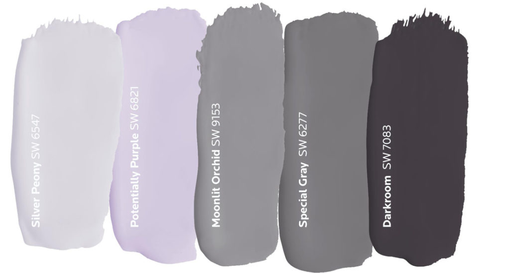
Purple
Like green, purple embodies the characteristics of the colors it’s made of. The energy of red and tranquility of blue result in a hue that’s rooted in imagination and poise. With the ability to be both calming and uplifting, purple is an ideal choice for spaces where you seek creative energy and focus. Try this distinguished color in a home office or as an accent wall in a meditation space.
Neutral Colors
It’s not always warm or cool. Sometimes color falls in the middle for a hue that’s a perfect blend of both. Neutrals can take on the meaning of the colors they’re paired with or they can stand on their own. Either way, these transitional hues are tried and true thanks to their timeless appeal and versatility.
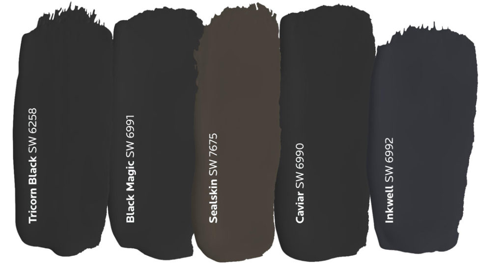
Black
An air of mystery surrounds this bold hue that’s commonly associated with power, elegance and an ability to coordinate with any design style. While this color is most often used as an accent, we’re starting to see it take center stage in newer design trends. Dark shades are working their way into our homes more and more to create a space that’s rich, dramatic and full of dimension. Create a contemporary look by pairing black with rich jewel tones or play up its softer side with natural wood tones and neutral furnishings.
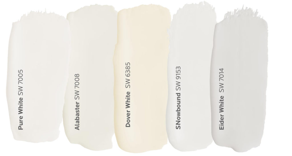
White
It’s technically the absence of color, but when it comes to white, there’s more than meets the eye. Known for its light and innocence, this hue can often be viewed as simple, but a variety of tints and tones proves there’s more complexity than you’d think. Bright whites can help design a space that feels larger and spacious, while softer whites create a sense of warmth and coziness. No matter which way it’s used, this neutral provides a backdrop for endless options.
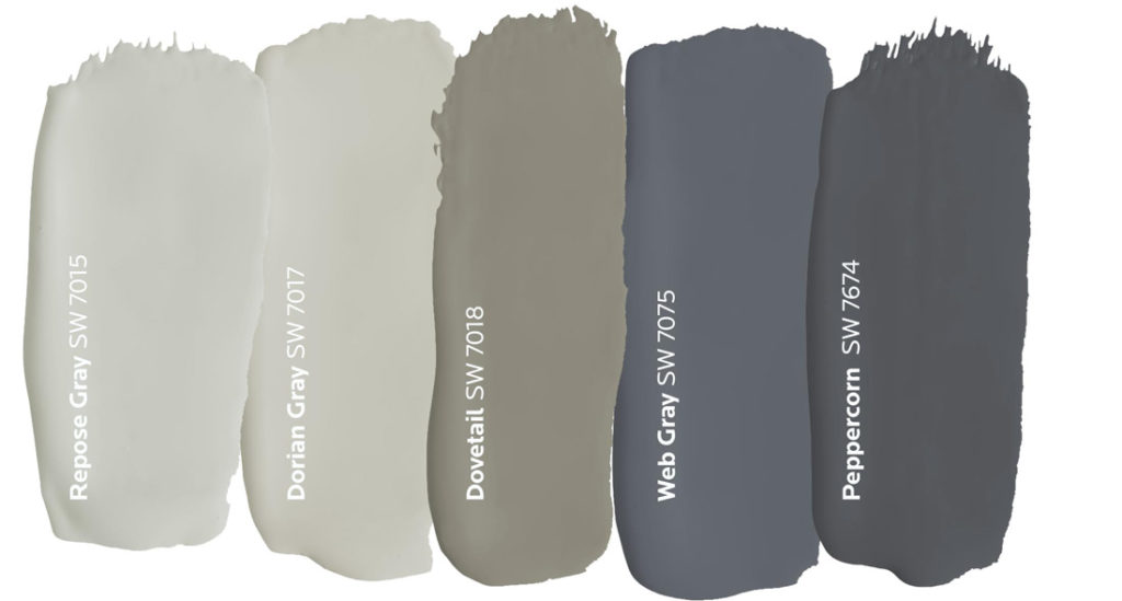
Gray
The conservative nature of this balanced shade infuses spaces with the mystery of black and the lightness of white. Lighter shades of gray can be used to achieve bright modern looks, whereas darker shades can be used to create a bolder space that’s more dramatic, but gray’s versatility doesn’t stop there. It comes in a variety of shades with undertones ranging from red to blue and everything in between.
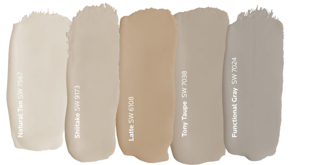
Beige
Rounding out the warm end of the neutral spectrum is a nurturing hue that comes in a variety of tints and tones. Like its gray counterpart, beige is a great transitional color that can take on warm or cool depending on what’s surrounding it. Its natural warmth derives from brown undertones that capture the comfort and calmness that we all seek in a home.
Are you interested in learning more about personalized color theory for your home? Book a FREE Virtual Color Consultation with one of our color experts to make your inspiration a reality.


can I set up an an appointment for a virtual assistant to help with color?
Hi Laura! Sign up for a free 30 minute Virtual Color Consultation.
We painted our kitchen -dining room desert green.
It’s not what we really like and would like to change
the color. We really need some help.
Regards, Elizabeth
Can I come in for help with a contrasting color if I have color numbers for already painted walls??? I’m so confused and need some help!!!
Hi Jeanne! Yes, we are here to help. You can also sign up for our Free Virtual Color Consultation here.
Looking for a color for my bathroom
Hi Roxanna! We are here to help. Please tell us more about your bathroom project. You can also sign up for a free virtual color consultation here.
I’m needing a suggestion on a warm ,neutral, but clean white for kitchen cabinets. I have a dark brown granite with iridescent blue flecks. I want to paint the island cabinet blue. Also the white could continue on the walls, or I could contrast a little with a light taupe or cream. Help!
Hi Catherine, are you open to doing two tone cabinets? We suggest you consider painting the lower cabinets and island the blue you want and then painting the upper cabinets AND the walls the same warm white color. Let us know if this is something you are interested in and we can give specific color names.
I have chosen Naval as my living room color. Much of three of the living room walls are windows, french doors and bookshelves that I want to be white. Is there a warm white that would help lighten up those areas of the living room but not be “cold?”
Hi Jan! There are several options for you to consider for a warm white trim color. Look at:
White Duck SW 7010
Whitetail SW 7103
Futon SW 7101
We live in a condo in which they used Sherwin Williams and they left a pail of paint. It is not what they used originally and touched up with that paint. It has now turned pinkish so you can see all the touch up areas. It has been 15 years and I want to repaint every area in which they did touch up. How do I match? It is throughout the condo which is fairly large. Most noticeable are at the entrance and suggestions please.
Hi Jane, do you have the name and number of the color that was left behind?
I Need help choosing a color for my stairway walls please.
Hi Trisha! We are happy to help! Sign up for a free virtual color consultation here
I love the new format. Thanks
I love this information! It is inspiring and very helpful.
Hi I would Like to do a Bedroom in is what I think is called Flaux or Flax Finish. I forget what they call it where You take Two Rollers hooked together and roll in Crisscrossing directions. I would like to do in some kind of Red, but do not want to be overwhelming . I was thinking of Burgundy with something Similar? Should the Colors be close to matching? Not Sure Any Tips or advise would be greatly appreciated..Kenneth Clark
Hi Kenneth! You are describing a faux finish which requires paint and glaze to get the effect you want. Unfortunately, Sherwin Williams no longer sells any faux techniques or glazes.
I am painting an old China cabinet and wanted a different color for the inside. My wall color is Misty. I was leaning toward Commodore but unsure the inside color. Any suggestions?
Thanks!
Hi Lisa, Commodore SW 6524 may be too dark and bright to complement Misty – the effect could be jarring. Consider using the same color family but lighter versions. Look at either Denim SW 6523 or Sporty Blue SW 6522.
I really appreciate how wonderfully useful, responsive and easy to navigate you’ve designed your site. Kudos!
My walls are painted Placer White. I am needing a white to paint the interior doors that would go good with the white on the walls. What do you suggest?
Hi Jeni, is Placer White a different brand’s color? Or possibly a spelling error? Let us know! We are glad to help.
I have a 1/2 bath with a very high ceiling. It has a large mahogany vanity with an ugly black/rust/grey granite top. I’ve painted it sw natural linen but it’s so boring.
Any suggestions? I read about color blocking to make a room appear shorter but have no clue what bolder color to paint on the bottom half.
I need help. Thanks.
Hello Caroline, do you have ceiling molding? If you do, are you open to painting the ceiling? Let me know when you get a minute. Thank you.
We are painting our home and guess house smoky blue. Not sure what color to paint front doors? Please help! Judi
Hello Judy, there are two color families that would work with your exiting palette. The first option would be comprised of subtle green grays in the Spare White family but several shades darker – such as – Oyster Bay SW 6206 or Acacia Haze SW 9132. The second option would be comprised of sophisticated warm neutrals which would complement your Smoky Blue and still work with your trim – such as – Threaded Loom SW 9512 or Relaxed Khaki SW 6149. Order some chips of these colors to see if they will work for you. Let us know if you need anything else, thank you!
Our house interior walls are painted Pacer White throughout – trim is white. I’m thinking of painting interior doors Shitake. It’s hard to decide if they are compatible in the different sunlight throughout the day. Will these two paint selections go well together?
Hi Sandy, yes Shitake SW 9173 would look great with Pacer White SW 6098. Another option which is just a little lighter is Slumber Sloth SW 9606. Shitake or Sloth would both look stunning paired with Pacer White.
I am having shaker style white cabinets installed. Having Cambria Daron (jewel collection) countertops. Considering Benjamin mores color Ice Mist for walls. What would be a good trim and ceiling color?
Hi Christine, BM’s Ice Mist is very close to our color Snowbelt SW 9623 which is a very light color. Consider painting the trim a crisp white like Extra White SW 7006 and then take your wall color up onto your ceiling as well. This will actually make your kitchen appear larger with a more cohesive palette.
I’m helping my newly devorced son to decorate his apartment living room/dining room. He has a beautiful tryptic ( 42h x 36 – 1 piece; the other two are 42h x 24 wide)which he wants to place on the one wall in the dining room. The colors are predominately peach,slight gry and some light brown and atiny touch of seafoam. It is a tryptic of “Sailboats”. All other walls are dove white.The mantle for the fireplace is Dove White with regular brick on the hearth. Sectional is off white with a leather black chair.Coffee table black wrought iron frame with cream marble top framed in black. Sisal rug. What colors can we use on pillows etc. to pop the area. His taste is less is more and loves black.reds, golds. Any suggestions?
Hi Jean, we’d like to get a better sense of this space before making a recommendation. Please fill out the form link for a free Virtual Color Consultation.
Hello,
I have a house whose exterior color is yellow—fairly mellow yellow with a slight darker yellow trim. I need to paint the front door, the porch, and the front steps. I can’t seem to find a color that goes with the yellow, and yet is dark enough to not show dirt etc. especially on the steps and porch.
I’m not afraid of a bright color, but red and yellow are too clownish looking. Not fond of blue and yellow (too marine or college-y). Brown and yellow not attractive.
Any ideas?
Thank you very much
Judy
Hello Judy, we think a gray would look fantastic next to your yellow house. Check out:
Light French Gray SW 0055
Tin Lizzie SW 9163
Classic French Gray SW 0077
I have a kitchen with very little natural light. It has gray shaker cabinets and white/gray Quartz. I’m thinking of trying to “warm” it up and paint the kitchen and eating area in Perfect Griege. i tried Sea Salt and that definitely doesn’t work. Currently I have Agreeable Gray which appears to be bland to me. Any help is greatly appreciated!
Hello Sherrie, we think Perfect Greige SW 6073 will look as bland as Agreeable Gray SW 7029. Consider instead using a clean white which will emphasize the classic gray and white finishes in your kitchen. Look at Extra White SW 7006 or Pure White SW 7005, either of these colors will allow your cabinets and quartz to take center stage.
I’m looking to paint the interior walls of my home all one color, I like SW Anew but I want to paint my interior doors a different color, what do you suggest would look good with Anew? I’m lost?
Hello Debbie, consider using a color from the Anew Gray family but either two shades lighter or two shades darker. The lighter option would be Incredible White SW 7028 and the darker option would be Warm Stone SW 7032. It is always best to look at color in your lighting.
I am painting the brick on my fireplace Navel sw6244. I also have white trim, doors, and ceilings. What warm beige would you recommend for the walls? Thanks!
Hello Samantha, check out these warm beiges:
Nantucket Dune SW 7527
Urban Putty SW 7532
Malabar SW 9110
I am painting my 3 bedroom 2 bath condo, all windows north facing, and narrowed down to Coastal Plain or Evergreen Fog (for bathrooms and accent walls) and Gossamer Veil or Agreeable Gray as the main paint. LVP flooring is white and gray planking throughout. Existing white doors and trim to be repainted. High, varying height ceilings throughout, between 8′ to 10′. Plan to recover & replace furnishings to go with white mostly and gray or black accents, and some remaining natural wood items. Eventually will replace kitchen cabinets, likely white, in bathrooms replacing vanities with white ones.
Question: Can you recommend choosing the specific colors of green? And then which gray would be best?
Question: Which white color to paint the trim and doors?
Hi Dawn, We’d like to get a better sense of your space before making a recommendation. Sign up for a free Virtual Color Consultation here: https://www.sherwinwilliams.com/homeowners/color/lead-csi
Hi, I’m looking for a nice blue color to go with copper and white panels on our ceiling.
Hello Jennifer, some pretty blues that would work in your space are:
Aleutian SW 6241
Lakeside SW 9683
Faded Flaxflower SW 9146
Please recommend a front door color to contrast with a ranch house where the front of the garage and front porch is Extra White (sw 7006) or Pure White (7005) (can’t decide) and the remainder/body of house is Alpaca (sw 7022). Tricorn Black and Iron Ore seem off with this combo. Thanks for your help.
Hi Joanne, Tricorn and Iron are too dark and the contrast is too wide next to Alpaca. Take a look at these darker colors which would create a seamless palette:
Porpoise SW 7047
Suitable Brown SW 7054
Brainstorm Bronze SW 7033
Working on a basement bedroom with a bayed wall with 3 north to east facing windows. The foundation walls are wainscoted in pine with orange-brown stain. Carpet white with flecks of dark brown/black. The walls are a soft white, close to a bleached linen color. I bought what I thought would be a linen colored duvet which turned out to be quite white with light blue pinstripes. Not crazy about lack of contrast between duvet and carpet. I’m looking at evergreen fog or smokey blue for an accent wall above the bed and wainscoting but am concerned it will feel too cool in winter. Since we live in WI I’m trying to find a balance between making the space feel clean and fresh while keeping it warm enough for the winter. The room has been red/orange/gold, and I’m needing to coordinate with a bathroom that has reddish/orange/brown-grey-black tile. I’m considering a soft yellow for the bathroom to go with the evergreen fog. I hate decorating and am horrible at making decisions, so any help would be appreciated.
Hi Anne, If you want to avoid a cool tone, stick with Evergreen Fog SW 9130. It is a warm green and will create the warm vibe you want. Consider using a lighter shade in the Evergreen Family for your bathroom – a yellow would clash. Some options for your bathroom that would look great are:
Create SW 9646
Contended SW 6191
Hi i want to do a texture milano plaster to an accent wall. My base color is Flaxseed HGSW3165. I need to go 3 shades lighter. What color would that be?
Hi Erin! HGSW 3165 Flaxseed is part of an exclusive HGTV palette carried at Lowes. A color from that palette that is 3 shades lighter than Flaxseed would be HGSW4039 Varsity White. You can order free chips of this from their website. This is the link to that website: https://www.hgtvhomebysherwinwilliams.com/en/colors/white/varsity-white-hgsw4039
What are your paint suggestions for a medium sized bathroom without windows? Looking at highly reflective white and favorite tan or underseas. Thoughts?
Hi Gwen, what other colors are in this space such as flooring and sink/countertops and upholstery?
Hello, I recently updated my kitchen countertops. They are now white quartz with grayish taupe veins. I plan to paint kitchen top and bottom cabinets white. Kitchen walls are a taupe color. I’m undecided on color for kitchen island cabinets. Looking at Mystical Shade SW 6267, Quest Gray SW 7080, Mysterious Mauve SW 6262 or Imagine SW 6009. Please help! Thanks!
Hi Cynthia! Consider using Quest Gray SW 7080 for your island cabinet color as it is the most versatile color in your list.
Hi,
I need a lot of help selecting paint colors for the exterior of our cypress log home, the porch and deck, trim around the windows and the door. We have never painted the logs and they are getting darker so my husband thinks painting will be best. I want to stay in the brown (not too dark) color family for the logs and lighter coordinating trim and maybe a shade of red or cranberry for the door. The roof is brown shingles, and we have a rocked foundation that has various shades of brown, red / brown flat rocks. I have looked at so many color samples that I am totally confused about what will look nice. Any suggestions will be appreciated. Thanks.
Hi Linda! For a job of this scope and detail, you would benefit best from a one-on-one virtual consult with one of our designers. You can schedule a “real-time” appointment with a designer when you sign up. This virtual consult will allow the designer to see your space and lighting which would be the best option for your project. Click the following link to get started. https://homeowner.sherwin-williams.com/colorconsult/
Need some help picking colors bast/trm combinations for a few different houses. Also I’d like to use an exterior picture and experiment with color options. Is there an app or web page for this?
Hi Alex! Give our ColorSnap Visualizer app a try or you can use the web version here: https://www.sherwin-williams.com/visualizer#/active/default
Remove my email from your list
Hi Wendy, to unsubscribe please go to the bottom of the email we sent and click “unsubscribe”.
UNSUBSCRIBE
Hi Nancy, to unsubscribe please go to the bottom of the email we sent and click “unsubscribe”.
Hi, Is there a certain SW Brown that would go well with Red Bay (SW6321)? We are painting the outside of our house Red Bay and want brown shutters. Thanks!
Hi Kristy! Check out the three brown options below, they each have a drop of red and would look great with SW 6321 Red Bay.
Craftsman Brown SW 2835
Mexican Sand SW 7519
Down Home SW 6081
I’m painting the exterior of my home Billiard Green, and I need help with trim and front door/accent color! I know I would like the trim to be some shade of white/cream, and I like a bold front door, but am completely adrift for color on that. Can you please help with some suggestions?
Thank you!
Hello Kendra, thanks for contacting Sherwin Williams. Consider the following options for your exterior:
Trim: SW 2833 Roycroft Vellum or SW 2829 Classical White. For your door, try either Coral Reef SW 6606 or Full Bloom SW 9700. It is always best to look at color in your lighting. Order some free sample chips from our website to determine which color will work best for you.
Please unsubscribe.
Thank you
Hi-Kitchen wall is yellow, am looking for a light grey color. Have already tried reflection, silverpoint and crushed ice. Walls have a blue tinge. Looking for grey please help.
thanks
Hello there, check out these options, they are our closest colors to a “true” gray. Look at:
SW 7667 Zircon
SW 7672 Knitting Needles
SW 7668 March Wind
It is always best to look at color in your lighting. Order some free sample chips from our website to determine which color will work best for you.
I set up a color consult appointment but can’t find the email confirmation
Hi Cynthia, please let us know the email you signed up with and we can check for a verification email and resend it.
We have a tan stacked stone fireplace on an accent wall. I am painting the remainders of the wall a contrasting color, Inkwell. What is a good warm tan or beige color for the other walls in this cozy open concept living room and kitchen combo. I also plan to paint our exterior front door in inkwell and want to know if the side lights and trim should be inkwell or the contrasting tan color. Thank you
Yes, your side lights and trim should also be SW 6992 Inkwell – it will make your doorway look bigger and more cohesive. Consider asking your local SW store to borrow a fandeck from them; then, take that fandeck home and use it to find a matching tan from your existing stonework. Use that color to paint your other walls. Thanks again.
Hi, I’m doing my whole house with a colonial theme but have run into a snag. Most Colonial Williamsburg historic reds are to orange for my likeing I have the rest of my colors picked out. I just need an accent color. My fabrics are black and white toile, exept for the kitchen which is red with black cabinets. Can you help me out?
Hello Debbie, thanks for contacting Sherwin Williams. We’d like to get a better sense of your space before making a recommendation. Sign up for a free Virtual Color Consultation here: https://www.sherwinwilliams.com/homeowners/color/lead-cs
I am painting my living room and hallway with SW 7628 Windfresh White. Which color can I use for the trim and baseboards? The entryway is in the middle of the room and is painted with SW 6005 Folkstone and the dining room wall and kitchen island is a color similar to SW7615 Sea Serpent.
Hello Gigi, consider using Extra White SW 7006 which will work with your existing dark colors and light color in the living room and hallway. It is always best to look at color in your lighting. Order some free sample chips from our website to determine which color will work best for you.
Hi. I am painting all my walls Crushed Ice and I am looking for a blue-green-gray color with a bit more depth for my kitchen cabinets. I don’t like the coordinating colors shown on the website. Suggestions?
Hello Lauren, here is no color that is blue and green and gray so I have sorted colors into blue-green and green-gray. Check out these options for your kitchen cabinets:
Blue-Green: Delft SW 9134 & Interesting Aqua SW 6220
Green-Gray: Evergreen Fog SW 9130 & Escape Gray SW 6185
It is always best to look at color in your lighting. Order some free sample chips from our website to determine which color will work best for you.
I am going to update my kitchen. I have pulled a lot of sample cards from SW. Would the following be a good combination:
Walls: Shiitake – SW 9173
Top cabinets – Pure White – SW 7005
Bottom cabinets – Black Magic – SW 6991
Thanks for you help.
Hi Theresa! Yes, these 3 colors would be a great combination. Pure White and Shiitake complement each other very well ad well as Black Magic and would also go nicely. If you would like some other close suggestions, try taking a look at Shiitake with Aesthetic White SW 7035 and Dark Clove SW 9183 for another option.
I have a small galley kitchen and want to paint the walls and cabinets. Should I paint the cabinets in the dark color (Silvermist SW7621) and the walls in the light color (Fleur de Sel SW7666) or should it be the other way around. The counter tops have blueish green, grey, and white colors in it.
Hello Anna! Have you considered painting everything the same color? That would make your kitchen feel bigger and more cohesive. Another option would be a two tone kitchen – consider doing the darker tone Silvermist SW 7621 on the lower cabinets only and then painting the upper cabinets AND walls Fleur de Sel SW 7666. This approach will also make your kitchen feel bigger. It is always best to look at color in your lighting. Order some free sample chips from our website to determine which color will work best for you.
I am looking for a warm, neuteral color for my kitchen/living room. We have our doors painted agreeable gray, and kitchen cabinets painted anew gray w/Silestone Cemento Suede for our countertops w/Magical Forest Champion backsplash. Our trim is maple so we will need a color for the walls that is neuteral/warm. I have a very contempory look, dark wood kitchen, end, & coffee tables and gray leather sofa with silver & metals decor. I am not afraid of color but want a contempory/modern color to go with what I have. Any suggestions on color?
Hi Ann! We’d like to get a better sense of your space before making a recommendation. Sign up for a free Virtual Color Consultation here: https://www.sherwin-williams.com/en-us/virtual-color-consultation
Hello Jeanette, Online is a blue gray so it probably does read very blue inside your home. Accent color families that would work would be yellow or orange. Are you open to either one of those families?
Online is a blue gray so it probably does read very blue inside your home. Accent color families that would work would be yellow or orange. Are you open to either one of those families?
We have a ranch home built in the 50s and we’d like to paint it two colors in the style of a mid century modern home. We were thinking of gray and brown. Any suggestions?
Hi Liz, in order to recommend anything, we’d need to see a photo of your home to see what other colors are currently in the space.
Will evergreen fog kitchen cabinets pair well with silver-point walls?
Hi JoAnn, that is a beautiful color combo!
Hello. Having a tough time finding a living room paint. The kitchen has antique white cabinets and Accessible Beige walls. Although sometimes it can give a gray look it’s ok. We want the bordering small living room and a narrow adjoining hallway to be tan. Dromedary Camel and Totally Tan feel too dark. Definitely want to see color (not a white look)without darkening the room. Will Flax Seed HGSW3165 work?
Hello! Sherwin-Williams Flax Seed (HGSW3165) is a warm, medium tan with golden undertones. It’s lighter and brighter than Dromedary Camel or Totally Tan, so it should add visible color without making your living room and hallway feel dark