


Ready to find your fresh start? When the life we know becomes something brand-new we adapt, grow and settle into a new way of existing. Experience that style of the moment with MODE – our 2022 Colormix® Forecast. We caught up with our Director of Color Marketing to get the inside scoop on this year’s forecast and how it’s influencing designers and DIYers alike.
Looking Forward
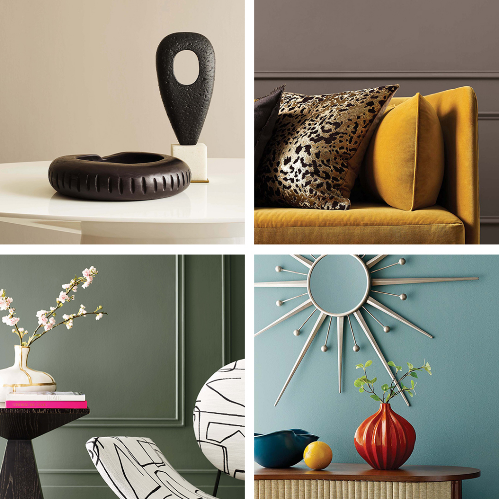
What can we expect in 2022? This year’s color forecast, named MODE, represents a collection of the top trend colors we’ll be seeing. From warm neutrals to strong blues and verdant greens, this collection of 40 hues helps you create a space of inspiration as we journey toward something new.
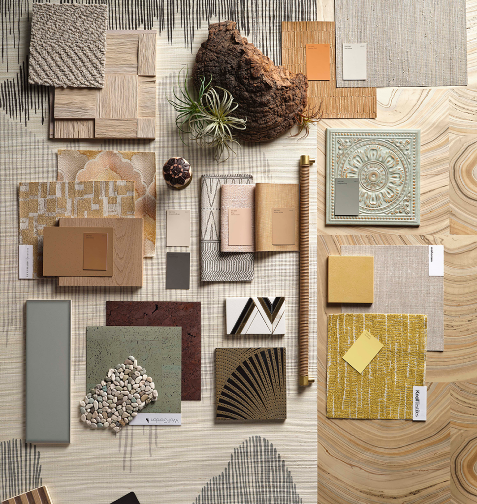
From the MODE palette, we curated smaller collections of colors into four palettes that neatly pack themselves into an acronym standing for Method, Opus, Dreamland and Ephemera. “We chose the name MODE because we’re paving the way for a future where we get to redefine the way we’re expressing and experiencing the world around us,” says Director of Color Marketing, Sue Wadden.
After a year of living and working in the same space, we’re seeing a dynamic shift in the way we think about color and our homes. “There have been big changes happening,” hints Wadden. “We’ve been given a clean slate and it’s good to take that time to slow down, be thoughtful and rethink how we do things.”
Fun Fact: Our Color of the Year and Colors of the Month all come from the Colormix® Forecast. (You can find our 2022 Color of the Year, Evergreen Fog, in the Method palette!)
Finding Joy in Color
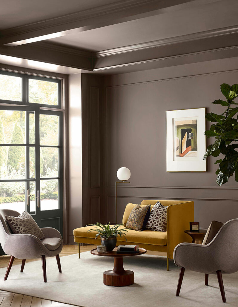
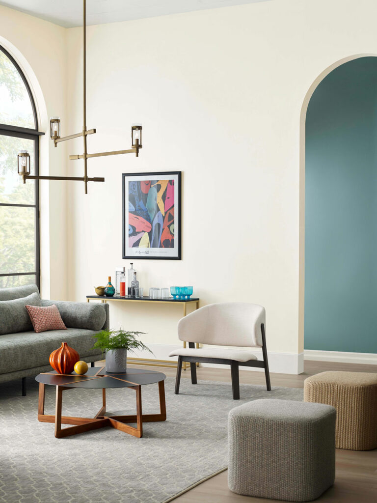
While mainstays like gray will always be in style, we spent more time at home than ever before surrounded by a sea of neutrals, so it’s no surprise we’re craving a little vibrancy. “There’s just a joyfulness in color,” says Wadden. “It’s the perfect time to balance all that gray with accent colors that lift your spirits at the end of the day.” Whether it’s lively greens and pinks or rich, dramatic jewel tones, the return to color is one we’ve been waiting for, and our forecast captures it beautifully.
Making Time to Live Well
Whether it’s a blank canvas of bright neutrals or calming oasis of rich earth tones, each Colormix® palette taps into the essence of how you want a space to feel. In 2022, it’s all about living well and envisioning the different pieces and parts that help you do that. “I look at wellness in two different ways. There’s wellbeing and then there’s living well,” says Wadden. “Wellbeing is doing good for your body by bringing in the things that make you feel great and living well is bringing those things into your home. So, we’re making sure our homes are the best place possible.”
Behind the Scenes
How does Colormix® come to be? Every year, our talented Color Forecast team gets together and workshops what trends are emerging. The greatest thing about the colors they come away with is that you’ll see them beyond paint too. “These are the colors you’re going to see everywhere.” Says Wadden. “Whether they’re in artwork or furniture, you’re going to see them in place at your favorite stores and it’s going to be easier than ever to bring these looks into your home.”
Explore more of the 2022 Colormix® Forecast in our lookbook to find inspiration and style cues that help bring these designs to life. Don’t forget to drop a comment below to share which palette speaks to you!


don’t like any…
One is too southwest, first time that didn’t last long.
another too dark.
another too gold.
another just yuck.
sorry
I’m torn between Dream land and Ephemera. Good thing I have 2 floors so I can do one of each. 🙂
We love the way you think!
Love the mood board of the Method Pallette. Can you post the boards of the other palettes? Thank you.
Hi Mary! Thank you for your feedback. Moodboards for each palette can be found by clicking the following link and selecting the palette you wish to view. https://www.sherwin-williams.com/content/colorforecast