5 Fresh Kitchen Colors We Love

Director of Color Marketing at Sherwin-Williams, Sue Wadden, shares her picks for the five freshest colors for your kitchen.
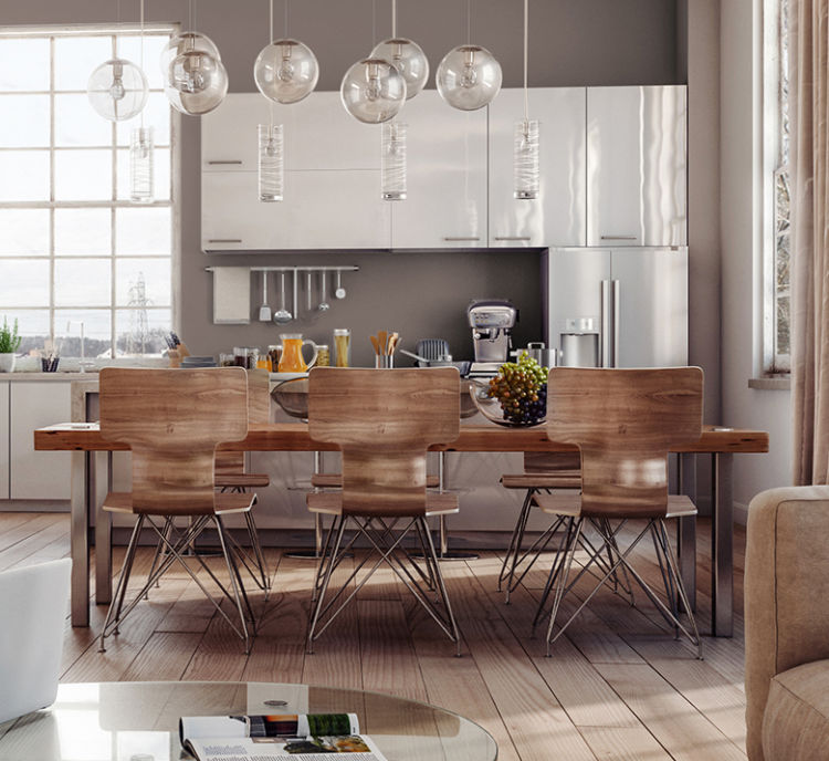
light kitchen with white cabinets, white table with granite top, light blueish gray walls

Fleur de Sel

Achieve a subtle, chic look that goes great with stainless steel appliances and open spaces with a lot of natural light thanks to Fleur de Sel.
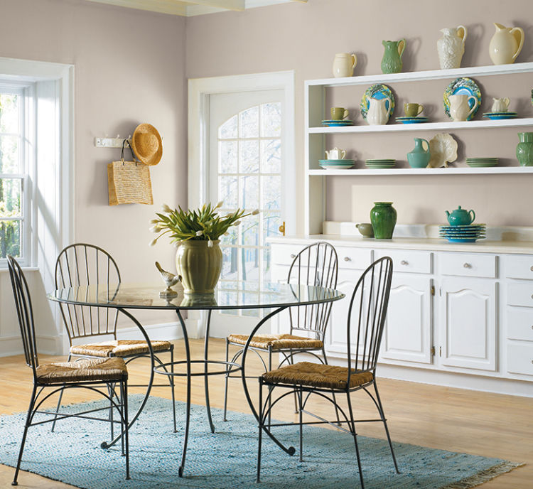
kitchen with wooden dining table and chairs, white modern cabinets, poise taupe walls

Poised Taupe

Use our versatile 2017 Color of the Year anywhere, especially in a kitchen, where Poised Taupe can blend perfectly with every style.
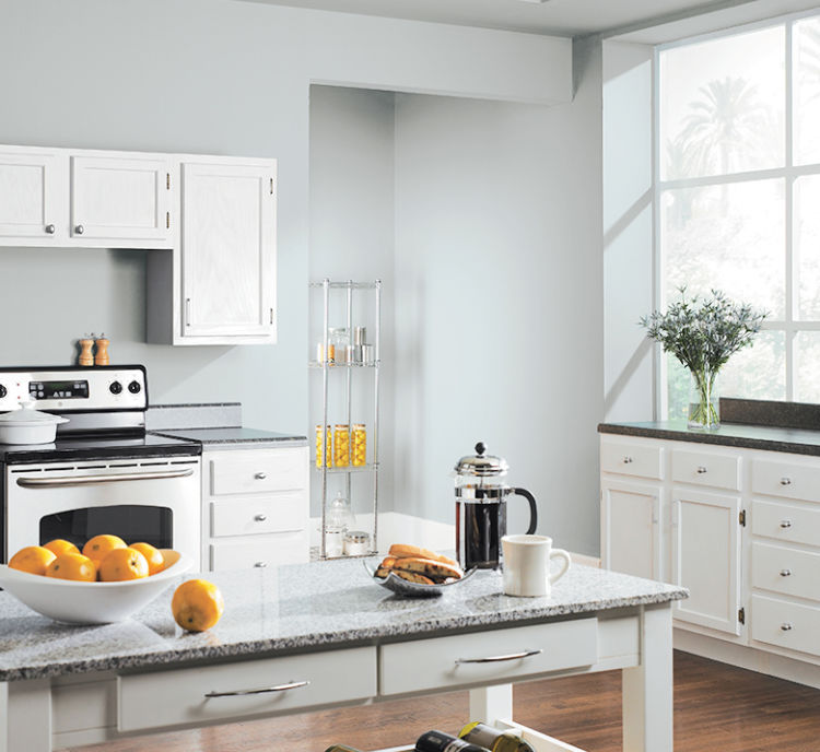
kitchen, metal rounded table with glass top and metal chairs, modern gray walls

Modern Gray

Modern Gray’s pale warmth is perfect for any kitchen aesthetic from classic to contemporary.
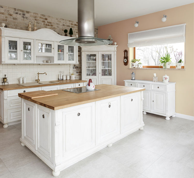
kitchen, white cabinets with glass, white island with wooden top, ivory walls

Inviting Ivory

Beautifully soft and welcoming, Inviting Ivory’s shade is perfect in kitchens with white cabinetry or accented by white hardware.
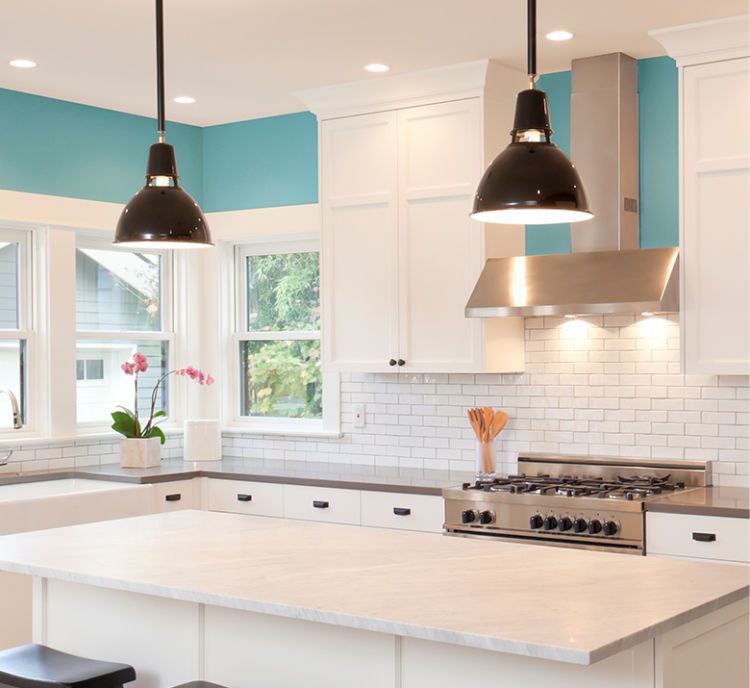
kitchen, white island and cabinets, white brick backslash, aquitaine walls

Aquitaine

Aquitaine is a popular turquoise that adds a refreshing splash to kitchen walls or cabinets.

4 Comments

  1. I am trying ot choose colors for the trim, walls, kitchen cabinets and island. I want very neutral in the tan line. I think I want DOVE while for the trim. I know I want the island maybe the darkest. I would like it to be in the same pallete. I do not want anythign that will pick a pink or orange hue. Sooooo do you have any suggestions.

    Tracy Streeter
    • Sherwin-Williams logo

      Hi Tracy! . Can you tell us the exact name and number for your trim? We see Dove but we don’t have a color by that name. A number of paint companies make a color called Dove White and Benjamin Moore makes a White Dove that is very popular. We would need to know which Dove/Dove White/White Dove you are using. Also could you please tell the colors of your flooring, countertops, and backsplash?

      Sherwin-Williams
  2. I want to mute my honey alder cabinets. I do not want grey. I have sw pure white ceilings, and white appliances, white subway tile, and white quartz countertops. I like greiges, beiges, and light taupes. I do not want it too dark. Muting is my highest priority. What colors do you recommend?

    Angiei Driggs
    • Sherwin-Williams logo

      Hi Angiei, If you’re working with honey alder cabinets and want to mute the orange warmth—while still staying in the greige, beige, and light taupe family—the key is choosing neutrals with soft, balanced undertones (often a hint of green or taupe). These subtly counteract the orange without making the space feel cold or gray.

      Top 3 Picks (Most Reliable & Versatile)

      1. Accessible Beige (SW 7036)
      The best overall choice. This is a true greige-beige hybrid with just enough muted undertone to soften orange wood without turning cool or dull. It pairs beautifully with white quartz, subway tile, and Pure White trim.
      2. Shoji White (SW 7042)
      A warm, light greige that keeps the space airy while gently toning down cabinet warmth. Ideal if you want something brighter than a traditional beige but still soft and cohesive.
      3. Natural Linen (SW 9109)
      A warm beige that leans cozy but not yellow. Instead of contrasting the cabinets, it blends and calms them—perfect if you want a softer, unified look.

      🎯 If You Need a Bit More Muting Power
      If your cabinets are especially orange, consider:

      Anew Gray (SW 7030) – a deeper greige/taupe that provides stronger contrast while still reading warm
      Balanced Beige (SW 7037) – a slightly richer beige with earthy undertones that help ground the space

      What to Avoid
      To keep honey alder from looking more orange or dated, avoid:

      Cool, blue-based grays → These clash with warm wood and make cabinets look more orange by comparison
      Yellow-heavy beiges → They amplify the warmth instead of muting it
      Pink or rosy undertones → These can look muddy or off next to natural wood tones
      Stark whites → Too much contrast can highlight the orange rather than soften it

      Bottom Line
      If your top priority is muting orange while keeping a light, warm-neutral look:

      Go with Accessible Beige for a safe, balanced result
      Choose Shoji White if you want lighter and brighter
      Pick Natural Linen if you prefer a warmer, cozy feel

      All three will work seamlessly with white finishes while calming the warmth of honey alder—without pushing your space into gray.

      Sherwin-Williams

Leave a Comment

Your email address will not be published. Required fields are marked *


The reCAPTCHA verification period has expired. Please reload the page.

This site uses Akismet to reduce spam. Learn how your comment data is processed.

More Stories Like This