


When you’re shaping a space, few decisions carry as much weight as color. Do you lean into the simplicity of neutral shades and the endless versatility they bring, or are you drawn to the statement-making impact of bold hues? The good news: you don’t have to choose sides. With a thoughtful approach, both can work beautifully on their own or together.

The Case for Neutrals
There’s a reason neutral paint colors have always been considered timeless. Shades like soft whites, warm beiges, putty grays and muted taupes create an airy backdrop that feels clean, classic and endlessly adaptable. They invite natural light, work with any style and give your accents, furnishings and textures room to shine.
Neutrals are a natural fit when you’re aiming for:
- Calm, restorative spa-like environments
- Spaces where texture or bold accents take the lead
- Flexibility to evolve over time
Whether you prefer minimalist chic or layered coziness, neutrals make it easy to create a palette that feels cohesive and effortless.
Neutrals play especially well in:
- Living rooms where you want flexibility to update accents
- Bedrooms for a calm, restorative environment
- Kitchens where cabinetry and finishes take center stage
- Hallways and entryways to create an effortless sense of flow
- Open-concept spaces where light is key

The Allure of Bold
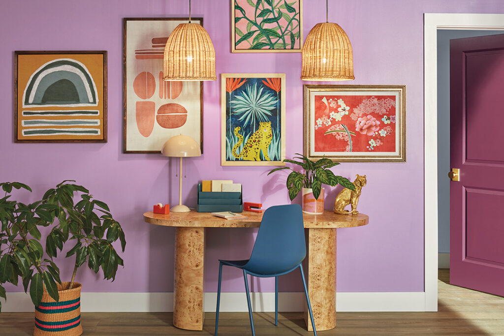
On the other end of the spectrum, bold colors bring personality in full force. Deep greens, vibrant blues, rich terracottas and jewel tones add drama, dimension, and a sense of richness. Darker, moody paint colors can create eye-catching focal points and infuse a room with character.
Bold hues shine when you want:
- A strong visual statement
- Accent walls or architectural features that stand out
- Spaces that feel energized, inviting, or moody
Used strategically, saturated color can elevate even the simplest room into something stunning.
Bold hues play well in:
- Dining rooms where mood and atmosphere matter
- Offices or creative spaces to energize focus and inspiration
- Powder rooms — the perfect small space for a dramatic moment
- Accent walls that define a space without overtaking the room
- Rooms with abundant natural light, which helps bold colors stay vibrant
The Secret: Balance
You don’t need to commit exclusively to one direction over the other. The magic often happens somewhere in the middle. Neutral foundations paired with bold accents allow you to experiment without overwhelming a space. And starting with bold walls softened by neutral furnishings can create a sense of harmony and sophistication.
Wondering what approach will work best in your home? Start with samples! We’ll send you FREE color chip samples for all the paint colors in this article so you can see them in person, in your space. Leave a comment below to let us know if you’re Team Bold or Team Neutral!


