


If the most beautiful beige could blush, you’d find our 2023 Color of the Year. No matter the destination, Redend Point is about finding beauty beyond ourselves. See how we’re bringing that spirit to life with a color whose uncomplicated charm encourages you to take the road less traveled.
Go Beyond
In 2022, we saw new life spring forward in the gentle mists of Evergreen Fog – now we’re ready to expand our horizons as we take another step forward. “We’re craving connection and that’s starting to show in our homes,” says Director of Color Marketing, Sue Wadden. “Redend Point is a thoughtful hue that knows how to reinvent a space in the warmest of ways.” As we seek new experiences and meaningful exchanges with the world around us, this hue reflects the need for nurturing ourselves and others.
Tried & True
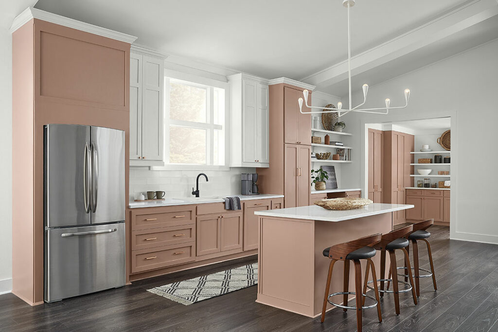
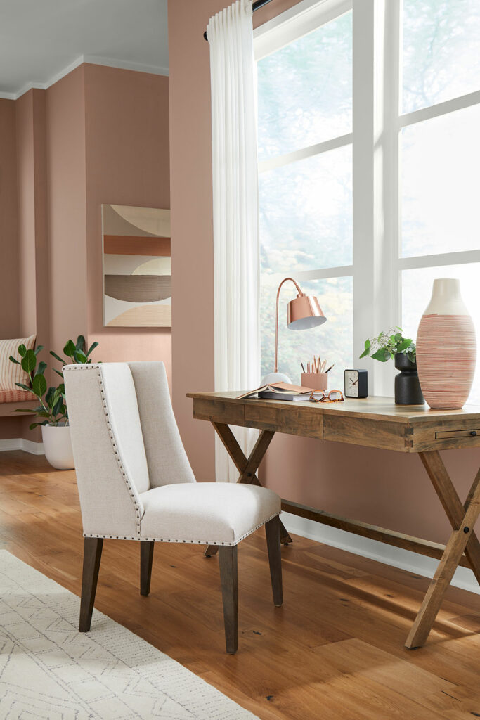
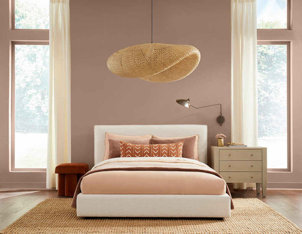
What do we love the most about Redend Point? Its go-anywhere attitude. Whether it’s a picturesque desk moment or a bedroom backdrop, this blushing hue has a story to tell in every space – and it leaves a special down-to-earth coziness along the way.
When styling, think minimal and calming to complement the quieter nature of the color. From rounded shapes to warm wood tones, it’s about balancing layers of naturals and neutrals for a look that instantly makes you feel at home.
Beautifully Balanced
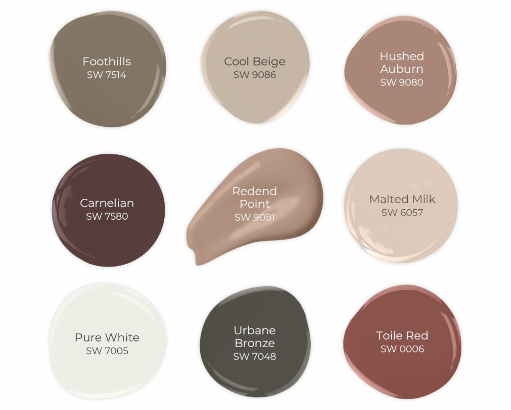
The coordinating colors behind our Color of the Year have also mastered the art of wrapped-in-comfort style – especially when layered together. “What I really love about this palette, is that it’s this great team of colors,” says Wadden. “They all look pretty on their own, but when you pull them together, they create this gorgeous harmony.” From pink clays to terracotta shades, this palette is as rich in tone as it is in options, too. “You don’t have to use every single one of these colors, but you can pull in the ones you like and still get the essence of the collection,” concludes Wadden.
Want to learn more about the stunning neutral that’s making us blush? Check out our 2023 Color of the Year (and its coordinating palette) in person with FREE color chips. You can also shop our curated collection on Etsy to style your space with handcrafted decor and accessories that bring the story of Redend Point to life beyond your walls.


If that’s the color of the year our home will definitely be staying out of fashion. Seriously “Redend Point sw9081” for kitchen cabinetry??? Maybe , maybe a powder room . But this color is more suited to a bra and panty collection than a wall or kitchen cabinet color.
That is the BEST comment!!!! LOLOLOL..
Agreed
Where is the pizazz, the flare, the dramatic Maybe could have gone with a bright yellow or vibrant blue to show support for those suffering in Ukraine; it would be truly inspiring if Sherwin Williams were to take a bold stance maybe there’s hope for 2024?
What’s the difference between inside and outside paints? I have an enclosed back porch with some railings, doors and trim that need paint…which kind would be most appropriate?
Hi Gary! For this sort of project, you will want to play it safe and go with exterior paint. Although it may be enclosed, you still might get temperatures from outside (unless it is heated and gets no moisture or extreme temps). Exterior paint will hold up best if this is the case. You will also want to base the type of paint off of the substrate. Etc if it is bare wood, you will use something different than if it is just going on regular drywall. We recommend calling your local store for additional details.
I actually happen to LOVE this color for an accent wall in my office. 🙂
Yay! So glad to hear!
What color goes with creamy mushroom
Hi there, are you looking at Mushroom SW 9587? If so, are you looking for some complimentary color suggestions?
Really disappointed by the color of the year. Hope you get your head out of your ass for the 2024 color.
What is your exterior paint color of the HGTV Colorado 2023 house?
Hi Mike, it seems to be Austere Gray HGSW6184 but you may want to double check with the HGTV SW Team at 855-330-4753 or by email at https://www.hgtvhomebysherwinwilliams.com/contact-us
I just painted my powder rm this colour. It’s definitely different than what I’m used to but with the right accents, it’s really nice.
Pink tones have been trending in surfaces and decor for the past few years so I’m happy to see it as an SW color of the year. I was looking at my white painted fireplace today and wanted to add some distressing and thought some terra clay tones would look nice. Pulled up Sherwin Williams and what do I see?? Redend Point! The entire pallet is perfection.
So glad to hear that you’re loving our Color of the Year! We’d love to see your fireplace when finished!
Love this color! Excited to try it for our dining room!
Be sure to tag us if you post any pictures on social media so we can be sure to see! How exciting!
Love this color!! I am using this in my coffee/tea room and in my family room and my hall. I am also using urbane bronze as a accent color for trim and doors Using pure white and Redend for wall. To me it is turning out just perfect. Just can’t wait to get it all finish.
This sounds like a beautiful project! Be sure to tag us if you decide to share any photos after. We’d love to see!
I was skeptical of this color at first. I bought a quart and painted a little of my wall with it. I liked it and didn’t like it. I decided to go for it! My living room, hall, kitchen and dining room are all this color. I went with Shoji White for the crown molding and baseboards. It creates a very welcoming, earthy feel. I went from all gray to this. If you’re contemplating this color, go for it! It’s a hard color to describe but it’s beautiful!