


It’s been another amazing year filled with exciting new directions and lots of colorful inspiration! We sat down with our Director of Color Marketing, Sue Wadden, to recap some of her favorite moments.

Q: As you look back at a year filled with a lot of incredible activity, is there anything that stands out the most?
A: I loved launching Anthology, Volume 1, which was a fresh approach we took this year to our Colormix® Forecast. We really focused on color and color families and people were delighted to have a deeper dive into color than we normally do.
Color is more than just visually engaging in interior design; it’s a storytelling tool that speaks to our deepest emotions and experiences. The use of color in spaces is not merely about creating a style or setting a mood, it’s about crafting a narrative that resonates with the inhabitants. From the deepest darks to the whispers of our most delicate tints, each hue holds a unique power to evoke memories, inspire actions, and stir emotions.
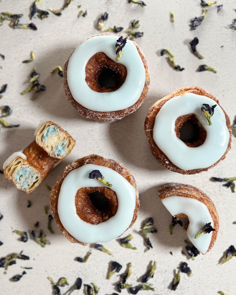
Q: There was a lot of excitement around the vegan cronut that Dominique Ansel created exclusively for Sherwin-Williams to accompany our Color of the Year launch. How did that partnership come to life? What was it like seeing a world-renowned pastry chef bring the Color of the Year to life in his flagship bakery?
A: This was such a unique partnership for Sherwin-Williams. It started because we wanted to connect with an audience that we don’t always talk to, but we see as a very natural fit. Food, like color, is very much a creative, sensory experience after all. So, we looked for a partner that would bring a unique color perspective to food and create something amazing – and Dominique delivered! He created a delicious and beautiful interpretation of our color of the year in his cronut. It was such a great moment!
Q: What was your favorite Color of the Month palette in 2023? Why?
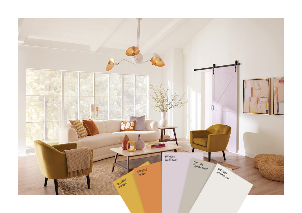
A: I loved our May Color of the Month for a few reasons. I have a love-hate relationship with purple! It’s difficult for me to bring it into my interiors, but with May we really looked at the color in a unique way. The results were stunning. Whether an accent color or full room, Wallflower is beautiful, and the coordinating palette, inspired by sunset hues, was very relevant.
Sunset hues and sunset-inspired color palettes gained popularity in interior design and broader aesthetic trends in 2023 for several reasons. These palettes typically include warm shades like deep oranges, vibrant pinks, fiery reds, and soft purples, often complemented by cooler tones like dusky blues and lavenders, reflecting the colors seen in the sky at sunset.
The colors of a sunset evoke a range of emotions, from calmness and introspection to passion and warmth. In a world recovering from global challenges, these colors offered comfort and a sense of hope. There’s been a growing trend towards bringing elements of nature into the home. Sunset colors, being inherently natural, fit perfectly into this theme. The serene quality of sunset colors aligns with trends emphasizing mindfulness and relaxation in personal spaces, acting as a counterbalance to the high-energy digital world. There’s a growing recognition of color’s impact on mental health, and the warm, rich tones of sunset palettes are believed to create environments that foster wellbeing and positivity.
And, finally, these hues, particularly oranges and pinks, hark back to design trends from the 70s and 80s. This retro revival, seen across various design fields, influenced the popularity of these colors. Sunset hues can be bold or subtle, allowing for versatile use in different interior styles – from modern minimalism to bohemian chic.
Q: What color and style trend are you looking forward to most in 2024? Is there anything you can tease that’s coming in 2024 for readers to look forward to?
A: There is a rawness that we are going to explore next year. It’s a sense of the elemental and basic. We’re still hashing out our color perspective and working on 2025/2026 trends, but it should be another great year for color!
Ready to put a lid on 2023? Not so fast! Before trekking forward into another year filled with color inspiration, take a look back through the year in color and revisit our Color of the Year, and then drop us a comment below to share your favorite moment! As always, we couldn’t be happier to have you along for the journey! (p.s. If you haven’t yet had a chance, try out May’s stunning sunset palette with FREE color chips delivered to your home!)


