Whether it anchors a space, draws in extra light, or frames furniture arrangements, color completes a room’s look. Certain color palettes work exceptionally well with specific design styles. Find your style below and discover the ideal color palette to bring it to life.
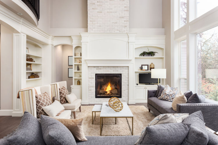
Traditional
Classic lines and consistent themes define traditional style. Imbued with elegance, the atmosphere is nevertheless comfortable and inviting. Traditional style and neutral tones often go hand-in-hand; today’s “new neutrals” take traditional to another level of visual appeal. Consider greens like sage and olive to lend balance, blush tones to lighten a space or earth tones to reinforce a natural feeling.
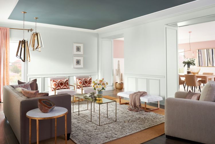
Modern
Modern style finds its inspiration in industrial materials like metal and plastic. The look is sleek, never cluttered, and adds hints of the latest trends to bring it up-to-date. Modern can be moody – in a good way – which makes it a great match for deep grays and blues softened with yellowy-green and bluish-gray accents.
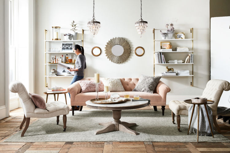
Eclectic
Eclectic combines different furniture, fabrics and finishes for a look that is sophisticated as well as fun. Someone with eclectic taste may be a seasoned traveler who gathers unique items from favorite trips, but it can also be someone who simply appreciates the attributes of a variety of styles. Set the tone with a room filled with wonderful stories.
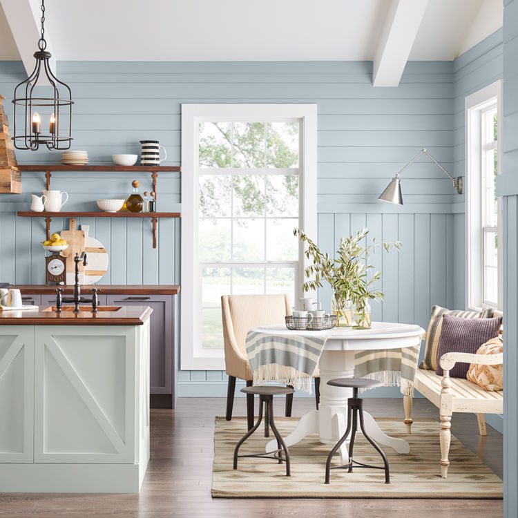
Farmhouse
If you crave a look that is cozy and sophisticated at once, the modern farmhouse style will suit you just fine. Wood floors and paneling bathe a room in warmth; textured rugs and upholstery add layers of design interest. While whites are often associated with farmhouse, natural blues and greens also make excellent accompaniments to the style.



I have been going back and forth between accessible beige for north facing bedrooms and something a bit “brighter”. Would Modern Gray be a better choice or should I just lighten accessible beige by 50%??
Thanks for the info.
Julie DeHaven
Hello Julianne, tinting Accessible Beige SW 7036 at 50% will make it lighter not brighter. Modern Gray SW 7632 is a brighter color. If you are looking for brightness, you may want to consider using whites in the same Greige (grey+beige) family as Accessible Beige and Modern Gray. Some options for those brighter greiges would be:
Origami White SW 7626
Aesthetic White SW 7035
White Heron SW 7627
Hi what is best color for a West facing bdrm. with loads of windows. I am leaning towards color “Ponder” but open to suggestions. Thank you
Hi Nadine, Ponder SW 7079 is a beautiful, subtle color. It would be very sophisticated and soothing for a bedroom. Get a chip of this color and put it in your room to look at during daylight and at night. If Ponder looks to dark, consider using Grayish SW 6001 or Destiny SW 6274.
I am trying to figure out how to paint an adjoining dining room living room to make it bright but pretty. And I also wanted to try to paint my kitchen which is currently yellow with brown wood. My furniture in my living room is off-white and I can’t seem to figure out what color would go good with it and join the living room and dining room
Hi Tristen! For a job of this scope and detail, you would benefit best from a one-on-one virtual consult with one of our designers. You can schedule a “real time” appointment with a designer when you sign up. This virtual consult will allow the designer to see your space and lighting which would be the best option for your project. Click the link below to get started. https://homeowner.sherwin-williams.com/colorconsult/
I’m getting ready to do my mudroom which is currently beige. the room opens into a great room which is tiki hut. I have a flood of light in both rooms I was thinking of doing a gray but unsure if it’ll blend with the tiki hut. Any thoughs?
Hi Sandra, yes if you choose a Greige (grey + beige) it would flow seamlessly into your Tiki Hut. Take a look at these options for your mudroom:
Modern Gray SW 7632
Colonnade Gray SW 7641
Skyline Steel SW 1015
I’m redoing our mudroom and thinking of painting the main wall red. Any suggestions for perfect red? Classy cozy and inviting. Thanks MUCH
Hello! What other colors are in your mudroom? For instance flooring, window treatments, furniture etc. Thank you!
Hello,
I going to attempt to brighten my south facing dining room and entry way. I have dark wood flooring and 3 large windows in the dining room. I’m thinking origami white on the walls but not sure about the trim/crown molding paint color. I lean towards transitional style. Thanks
Hi CJ, with a soft color like Origami White on the walls, stick with a clean crisp white like Extra White SW 7006 or High Reflective White SW 7757.
Can you provide a little more information on tinting a color to 50%. Our dining room is painted in Wall Street and I love it. I am interested in the idea of lightening it for use in other rooms, but not sure I understand it that would look like to tint such a dark color at 50%.
Hi Alexis, what you are describing is a custom color. This is done usually in one of our small color to go samples to try out the color in your house before committing to it. It is a great way to put your own personal twist on a color; however, it is a custom color so we recommend getting a sample first to see how it will appear.
Love reading the Sherwin responses!
We’ve got a blank slate. Midline trim for entryway, dining, and kitchen. Would love to do two tone for the walls in these rooms. The kitchen reno has dark floors. Two tone cabinets (black bottom/ white top) and stainless steel appliances. Any help picking traditional color scheme for the rooms that surround a bold kitchen would be so helpful!
We’d like to get a better sense of your space before making a recommendation. Sign up for a free Virtual Color Consultation here.
Hi! We are undergoing remodeling our kitchen which is South facing and I have picked Accessible Beige for our walls and I’m struggling with a good warm to creamy white to paint our cabinets that’s not too yellow. What do you recommend? Thank you!
Hi Danielle, all creamy whites would have a yellow undertone – that is what makes it creamy. A better choice would be a very light greige, similar to:
Aesthetic White SW 7035
Eider White SW 7014
Toque White SW 7003
I am so glad that I found your blog!
We have painted our entire house in SW alabaster and SW extra white trim. Open dining room wall is SW swimming, extending into a small kitchen wall area. We will paint the upper kitchen cabinets with alabaster but would like to paint the lower cabinets in a darker hued green shade that would complement the SW swimming wall. Purchase of four paint samples has not been successful.
Hi Janie, so glad to hear you like the blog. We can see why you are having difficulty getting a green to work. We suggest you stick with the Swimming family but go several shades darker on the lower cabinets – introducing a green color family is fighting your current palette. Look at using either Bora Bora SW 9045, Mariner SW 6766, or Aquarium SW 6767. Repeating the Swimming color family will create a cohesive, intentional palette.
i want to paint my family room, kitchen and breakfast room alabaster they all open up to each other. What trim color should I use for baseboards etc? I did not post this before.
Hello Claire, Alabaster SW 7008 is a beautiful soft warm white, consider using Extra White SW 7006 for your all your trim. Extra White is a clean, crisp white and will really “POP” next to Alabaster.
We have our ceilings and trim painted Antique White in most of the house. We have been doing remodeling and updating and would like to go whiter and brighter paint as we go, but want to complement the existing Antique white trim moldings and ceilings. Can you please offer a few suggestions for trim (Semi gloss), and Ceilings to help us go whiter brighter..
Thanks!
Steve
Hi Steve, a crisp, clean white similar to Extra White SW 7006 Extra or High Reflective White SW 7757 would work for our project.
We just painted our fireplace accent wall Harbours Gray and need a nice light neutral for our other walls. The room faces Northeast with large windows and we get a good amount of light. Right now it’s amazing grey and would like it lighter. Not sure whether to go with a warm or a cool white. Would also like to paint the doors a grey. The floors are a medium grey hardwood our sofa is navy. Do you have any colour suggestions?
Thank you !
Hi Deanna, Consider a warm white on the other walls. Grays Harbor SW 6236 has a lot of blue in it and if you paint the other wall a cool white, the room could turn baby blue. A warm white, a few shades lighter than Amazing Gray would be ideal. Look at Shoji White SW 7043 or Limewash SW 9589. Finally, about your doors. If those doors are in the same room as your fireplace accent, you may want to rethink that. One eye-grabbing color is beautiful – you don’t want to introduce yet another accent in the room. Consider painting the doors the same color as your other trim or use a clean white like Extra White SW 7006. If you still want to paint the doors, use your Grays Harbor SW 6236 or a similar color but darker, like Dark Night SW 6237 or Gale Force SW 7605. You can order free color chips here to see how these colors look in your space.
I would like to see exterior house paint ideas with different color of trim but a good combination
Hi Ruth, thank you for the suggestion. We will pass it along to our internal team. You can try out our ColorSnap Visualizer to test out different colors on either our sample scenes or upload a photo of your own here.
I’m wanting to do two tone kitchen cabinets , bottom cabinets haylcon green top is between alabaster or Dover white. What color would compliment the walls in the kitchen with those color schemes? I was leaning towards repose grey or agreeable grey?
Hi Melissa, consider painting your walls the same color you choose for the upper cabinets – either Alabaster SW 7008 or Dover White SW 6385 would be lovely with Halcyon Green SW 6213. When you paint the upper cabinets AND your walls the same color, your kitchen instantly becomes brighter and bigger with an intentional, cohesive palette.
Hello, what color cabinates will go well with a heart pine floor, its a english cottage theme.
Thank you
Hello there, heart pine floors are best complemented by blue or aqua families. Consider painting your cabinets something like Faded Flaxflower SW 9146 or Interesting Aqua SW 6220. Either of these colors would look fantastic with a heart pine floor.
What is the wall and trim color in the eclectic photo? Tia!
Hi Elva! Do you mean the blue trim? If so it is Stardew SW 9138.
Hi, Im looking for a wall color to paint my downstairs area that is beautiful in the cream/beige warm neutrals paint group for my foyer, family room, dinning room, breakfast room. etc. My trim is already painted in white. I have looked at a Sherwin Williams designer color collection folder of warm + welcome that shows Sanctuary sw9583 that I think I like but not sure. My floors are engineered wood in a beautiful brown. I have agreeable grey painted in all my upstairs because a friend said it was the popular but I did not want to use it downstairs. I’m looking for a color that pretty much goes with most things but warm, welcoming and beautiful. What would you suggest.
Thank You
Hi Viola, for a job of this scope and detail, you would benefit best from a one-on-one virtual consult with one of our designers. You can schedule a “real time” appointment with a designer when you sign up. This virtual consult will allow the designer to see your space and lighting which would be the best option for your project. Click the link below to get started. https://homeowner.sherwin-williams.com/colorconsult/
Hello. I want to paint my living room, stairwell, and hallway in Lazy Gray with an accent wall in the living room Serious Gray. The trim in the house is oak. We will do ceiling bright white on the ceiling. My question is about the kitchen. It has an adjoining wall with the Lazy Gray. My kitchen cabinets and table are in light maple wood. I was thinking of Accessible Beige. Would this pull the whole look together or would this grayish beige not look the best with the maple cabinets?
Thanks. Will you be emailing the answer or do I need to look on the blog. Carolyn
Hi Carolyn! We’d like to get a better sense of the space before making a recommendation. Click the following link to schedule a free Virtual Color Consultation. https://homeowner.sherwin-williams.com/colorconsult/
Hi. I painted my whole downstairs grey because the realtors told me to do it. We were going to sell our house but not now. I am an artist and love to collect seaglass,potter and funky things. My problem is my family room and kitchen which is together seemed dreary to me so I painted it a mustard yellow thinking it would Bri g warmth and coziness! Yuk! I have some turquoise pieces and a couple of morrocon benches. You can see into the dining room and the living room. I do not know what to do! There are lots of windows and doors I the room but it is the darker side of the house. Could you please help me? Terri
Hi Terri, you would be best served by a one on one virtual/real time design consult. It sounds like you have a lot of different elements and decisions to make. A designer can be with you virtually and look at everything in your home. Sign up for free virtual consult here.
HI
I am about to paint my house in sherwin williams. It is being built now. I have lots of windows and love a very natural feel. For the main pain color, I am looking at a very warm color like sand. I dont want to pick up much yellow, green or blue… very neutral and not too dark. I was considering Wordly grey, Gracious Greige and possibly Basalt Powder. Which color would you say is most neutral? My floors are Seaboard Oak by Cali bamboo and my couch is cream color. In the kitchen, my countertops are Steel grey leathered and white shaker cabinets. Its an open floorplan and back of home is north facing (lots of picture windows). I also considered Agreeable Grey but it may be a tad darker than what I want. Help .. Such a big decision and so many colors. Also what is the best reasonable paint that deters scuffing and wont break the bank. Thank you for any help you can provide
Hi Mary! For a job of this scope and detail, you would benefit best from a one-on-one virtual consult with one of our designers. You can schedule a “real time” appointment with a designer when you sign up. This virtual consult will allow the designer to see your space and lighting which would be the best option for your project. Click the following link to get started https://homeowner.sherwin-williams.com/colorconsult. As for what product to go with, consider using Duration Interior Acrylic Latex in your home. It provides outstanding coverage and washability with no color rub-off and less visible shine after washing.
Hi there, My wife and I are in love with Snowbound for the main living area in our ranch but can’t seem to find a trim/crown molding/doors color that goes well with it. We would like to be able to see a slight contrast in our trim/crown molding/doors. Any suggestions? Also, are there any difference in pure white and snowbound.?We painted them on the wall side by side and they look identical.
Hello Adam, Snowbound SW 7004 is very similar to Pure White SW 7005. Snowbound is in our Whites & Lights family. If you want to see a noticeable difference, look at High Reflective White SW 7757 for your trim and doors.
We have two bathrooms we want to paint. They both have the same style/vanity color. They have white quartz countertops and matte black fixtures.
Master bathroom….https://www.build.com/james-martin-vanities-147-114-561-3clw/s1599625?uid=3820884
Kids bathroom…..https://www.build.com/james-martin-vanities-147-114-v26-3clw/s1643111?uid=3892379
Both Floors …https://coretecfloors.com/en-us/products/coretec-stone/egeria-vv567-18241
Here is the shower curtain I have picked out for the master bath. …..https://www.hyggeandwest.com/collections/shower-curtains/products/storyline-shower-curtain
I’m trying to decide between these two bathroom shower curtains for the kids bathroom.
1. https://www.walmart.com/ip/seort/179256400
2. https://www.amazon.com/gp/product/B07Q5TSS2F/ref=ppx_yo_dt_b_asin_image_o04_s00?ie=UTF8&psc=1
Our Master bath has 1 window that faces southeast and gets lots of morning sun. Our kids bathroom is very small and doesn’t have any windows.
We are looking for suggestions on paint colors for both rooms. Thanks in advance for your help.
Hi Ashley! For a job of this scope and detail, you would benefit best from a one-on-one virtual consult with one of our designers. You can schedule a “real time” appointment with a designer when you sign up. This virtual consult will allow the designer to see your space and lighting which would be the best option for your project. Click the following link to get started. https://homeowner.sherwin-williams.com/colorconsult/
We are remodeling a 1920 rock farmhouse. It is only 850 square feet, 1 bedroom and 1 bathroom. It has beautiful honey oak hardwood floors and light oak kitchen cabinets, with dark quarts counter tops. Silver appliances and silver cabinet pulls. All baseboards and trim is white and doors also. My big question is. I would like to paint the whole house the same color. To give it one continuous Flow from room to room. I am leaning toward Aleutian SW 6241. But am concerned that it’s a little to dark. There isn’t a lot of windows in the house and I am not living with white or biege ever again. Love the look of light blue and white with the floors. Do you have a better idea for a light blue that can be bright and cheerful. Not really into to much grey. I find it depressing. Help!
Hello, this would be a dream home for me. We understand your concern about Aleutian possibly being “too” much. It may be too dark. Instead check out these blues, they are a little softer but still sophisticated. Look at:
Faded Flaxflower SW 9146
Lakeside SW 9683
Blissful Blue SW 6527
Hello. We just purchased a house close to the water and we’re looking for coastal theme. Any recommendations on some color schemes? We have an open floor plan downstairs with white shake cabinets, brushed nickel finishes, and white countertops with some light gray veins. Flooring is light gray all inside the house. Thanks for your help and recommendations.
Hello Tony, a coastal palette echoes the colors of the sand and sky surrounding you. Check out these coastal colors:
Nantucket Dune SW 7527
Pacific Fog SW 9627
White Sesame SW 9586
Serenity SW 9632
Hello!
Love reading your replies to each comment!
I want to have blue cabinets – trying to decide between Denim and Down Pour. Which one will go better with a cool gray tone on the walls such as Light French Gray or Knitting Needles? or another gray tone you would recommend? Thanks in advance!
Hello Deniz, Knitting Needles SW 7672 is one of our favorite grays, we would totally stick with that. Denim SW 6523 has more depth of color and reads as a more sophisticated blue than Down Pour. We think the combo of Knitting Needles and Denim would be a stunning and timeless look.
So glad I got this email today… I’ve been renovating my late mothers home and making it mine for the past few years and it’s time to paint. She installed a cream colored shiny porcelain tile downstairs and I just upgraded the stairs and 2nd floor with a wood style luxury laminate in a greige tone. I’ve shopped some tones recently but have yet to pin-point the right one. I lean towards the Traditional/Contemporary Style and am interested in adding moldings on the passage ways and crown molding as well. I have a sun room with lots of light that leads to the pool facing the South and want that room in some sort of greenish tone since I’m very into my garden as well. I also have little light in the entry way but want a light neutral tone to go on the rest of the walls. Also need the right white for the roof and moldings. What would be your suggestion? Also like the eggshell finish or do you recommend a flat on walls and a satin or glossy on the moldings and doors? Too many options to decide. I need help…
Hi Madeline! For a job of this scope and detail, you would benefit best from a one-on-one virtual consult with one of our designers. You can schedule a “real time” appointment with a designer when you sign up. This virtual consult will allow the designer to see your space and lighting which would be the best option for your project. Click the link below to get started. https://homeowner.sherwin-williams.com/colorconsult/
My house is yellow with a wrap around porch and I want to paint my porch ceilings blue but I’m have a hard time picking a blue and choosing another color for my front door. Can you help me make a decision?
Hi Mary, your best approach would be to use the same family of blue but in different intensities for your porch ceiling and front door. Look at Naval SW 6244 for your front door and Upward SW 6239 for your porch ceiling.
Hello. I’m looking for a suggestion. We are painting our walls Agreeable Gray, top kitchen cabinets in Alabaster but I’m struggling in finding a contrasting and complimentary color for the bottom cabinets. I absolutely like darker grays but am concerned the whole area will look dreary. Not sure if go with a darker blue or darker green palette. The kitchen is open space and all walls around will be Agreeable Gray. Thanks!
Hi Mariel, a dark blue like a Charcoal Blue SW 2739 or Mineral Gray SW 2740 would be a beautiful complement to both Agreeable Gray and Alabaster.
Hello,
I am building a small, guest house/office area facing East. There will be lots of windows, but it is located in a heavily wooded area, so obviously lots of green outside the windows. I want a cozy, warm, “wrap your arms around” feel. Grays are depressing to me. Any ideas for an interior color?
Thank you so much.
Hello Jan, that sounds like a beautiful setting. Consider emphasizing the “treehouse” feel by using a warm neutral on the wall and incorporating an earthy green as an accent color. Some wall color options are Nantucket Dune SW 7527 and Taupe of the Morning SW 9590. Some accent color options are Clary Sage SW 6178 and Jade Dragon SW 9129.
Hi there. I am building a craftsman style home with board and batten, columns and corbels, and cedar shakes. For the body of the house I have chosen White Duck. For the trim around the windows and the eaves I like Useful Gray. I would like to go a bit darker for the cedar shakes for contrast but stay monochromatic. What would you suggest? Also, we will be installing a silver/galvalume roofing. Thank you.
Hello Cherie, you can get any SW color you want tinted into a solid stain for your shakes. Two colors that would look great with your palette are Studio Clay SW 9172 or Fawn Brindle SW 7640. It is always best to look at color in your lighting. Order some free sample chips from our website to determine which color will work best for you.
Hi Maria! This is not an odd question at all. The only way to make a white feel warm or look creamy is to add yellow to it. We have some whites without a lot of yellow in them that may work for you. Check out Alabaster SW 7008 and Greek Villa SW 7551 for options of a light, creamy white. Also, take a look at Ibis White SW 7000 which has just a drop of pink in it and would look fantastic in your barn.
What is the wall color in the first image? It would be helpful if there was a note with each photo identifying the colors used.
The colors are Origami White and Twilight Gray!
https://www.sherwin-williams.com/en-us/color/color-family/white-paint-colors/SW7636-origami-white
https://www.sherwin-williams.com/homeowners/color/find-and-explore-colors/paint-colors-by-family/SW0054-twilightgray