


Take time to slow down and appreciate your surroundings with hues from our Living Well™ collection. With busy schedules that define our days, it’s important to make time for the sanctuary spaces that help us balance, breathe and center.
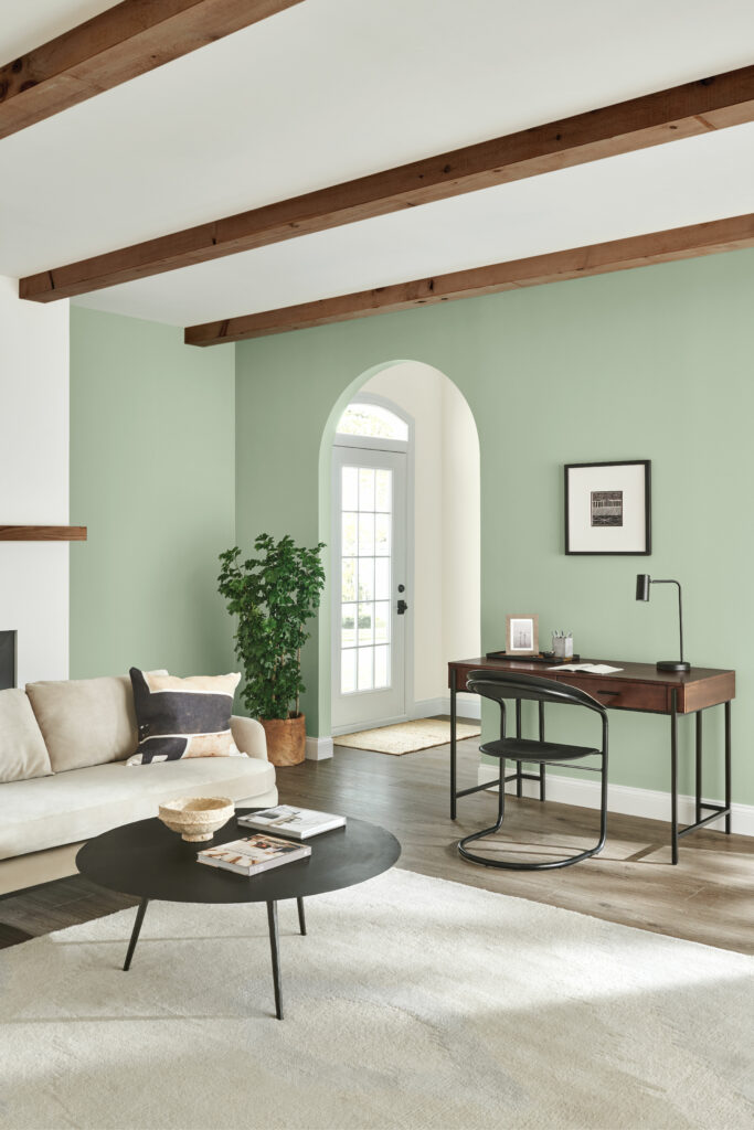
Balance
Woodland-inspired hues are the perfect way to feel balanced and one with nature. From leafy greens to golden yellows, the organic shades in our Balance palette layer softness and texture to evoke the simple tranquility of a lush forest. Pair these pastels with other natural elements like exposed wood and potted plants to bring the outdoors in.
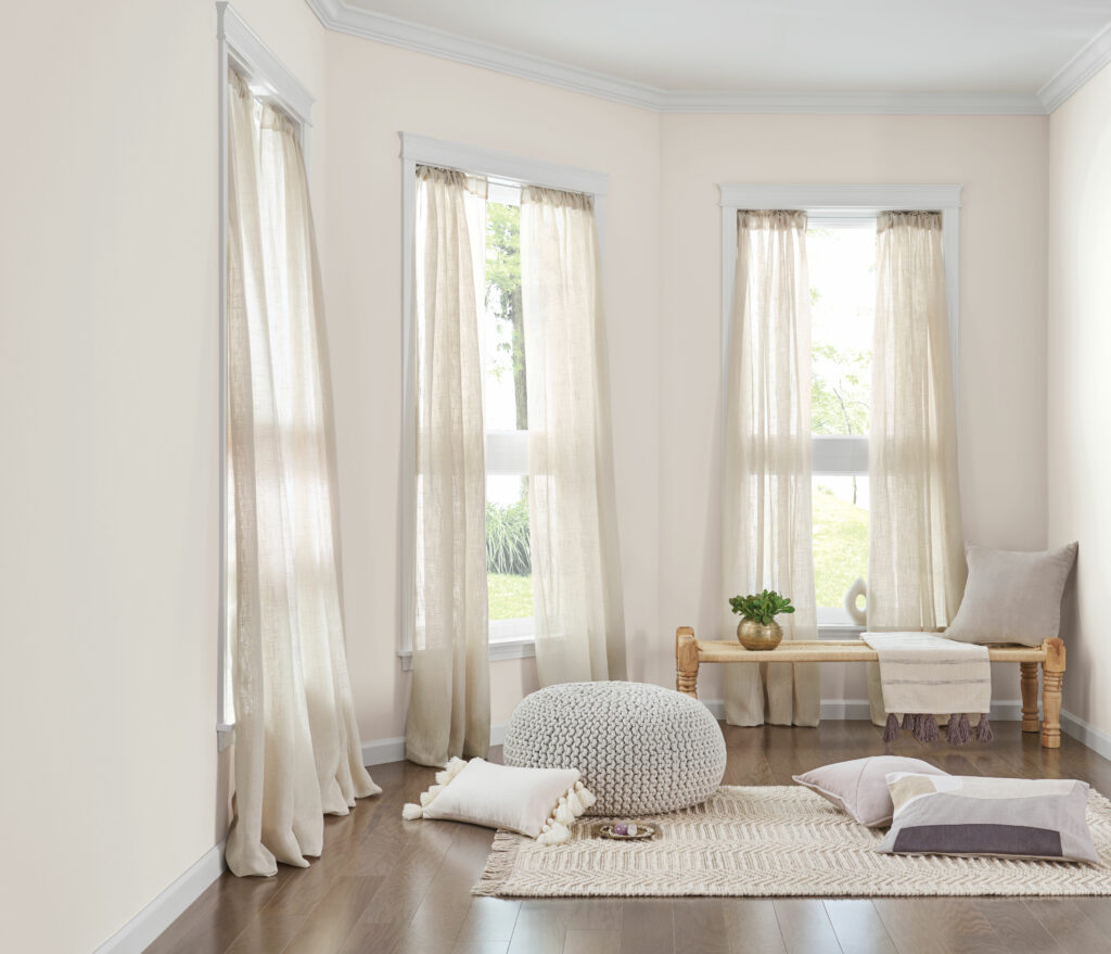
Breathe
Inhale the positivity and exhale the negativity. Our Breathe palette features a collection of gentle taupes and hints of sand that are a natural fit for making a space feel restorative. These warm neutrals instantly wash over the room to create a sense of stillness where you can unwind from a long day.
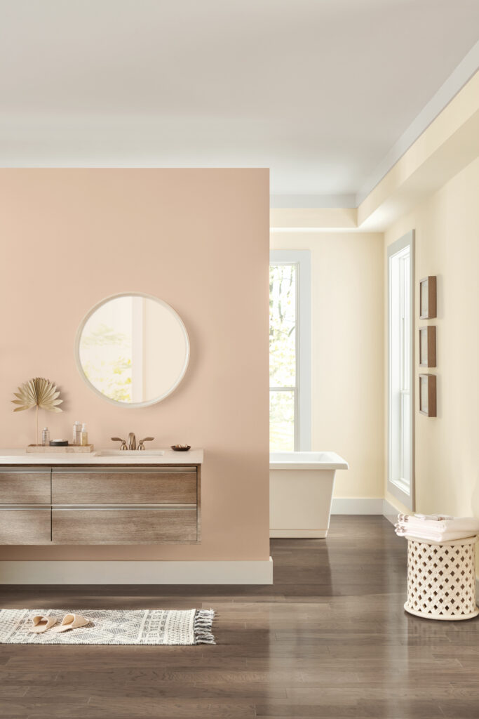
Center
Surrounding yourself with a mix of restorative neutrals is the perfect way to get to the heart of what matters. Our Center palette features a beautifully balanced mix of violet-tinted tones that create a blissful space for zoning out and finding yourself. Save these hues for quiet spaces like meditation and yoga rooms.
Ready to bring a sense of calm to your home? Order color samples from our Living Well™ collection to find the perfect hues that remind you to take time for the things that matter.


Do you have any Paint that does not have a smell to it. I have to leave my home for about a week when having painting done.
I am allergic to the Smell.
Thank you
Jean Lang
Hi Jean! Take a look at our SuperPaint Interior Acrylic with Air Purifying Technology for your project.
What blues would you use with Classic Sand? I imagine a sand & sea theme. Two walls each, or 3 blue, or 3 Classic Sand & one blue? Your thoughts please.
Hello Rebecca, accent walls are usually put on just one wall to make the most impact. Take a look at Mineral Gray SW 2740 or Charcoal Blue SW 2739. Also, Classic Sand SW 0056 can look orange in some lighting so you may want to consider looking at Sand Dollar SW 6099 or Playa Arenosa SW 9094 for additional sand options.
lovely color selections
Beautiful Tranquility feeling when viewing these Living spaces
Love the Cascade Green and the Classic Sand. We have two rooms with similar Grayish color.
What color is on the walls to the right of Classic Sand? Its beautiful.
Hi Geoff, it is Dover White SW 6385. You can order a free sample here.
What would be a good cabinet color to coordinate with a kitchen that is painted “grayish”, with an accent wall in “proper gray”??
Hi Cyndi, can you tell us what other colors are in the kitchen – as far as flooring, countertop, and backsplash? Thank you.
Hello,
What shake of white/Creme would you use with a very dark navy?
Hi Lyne! Consider Creamy SW 7012. It pairs beautifully with dark navy blues.
What would be a good color to paint a small windowless powder room. Floor is grey and white tile. Sink countertop is also grey and white. Looking for a color/colors that would brighten it up.
Hello there, the grey color family is going to be with us for quite some time because it works so well with other color families – especially yellow. Consider using a soft yellow in your powder room. Any of these soft yellows will bring light into the space and complement the gray finishes already in your room. Some yellow options are Lantern Light SW 6687 and Lily SW 6693.
Hello. I just bought a condo & I want to do all white. I have used ‘white Dove” on trim in old house on trim & really liked it. Can you please share a good white pallet for my new place. I heard you do ceiling same color as & trim & door just different schenes. Flat for ceiling, semi gloss for trim etc. in same colors but what would be a beautiful white for the walls. ? I need help please.
Hello Deborah! Some whites that would look great with this approach are:
Alabaster SW 7008
Snowbound SW 7004
Ivory Lace SW 7013
I used Smoke in my living and dining room with mid century walnut woodwork and built ins and oak flooring. My living room and kitchen, which has light blue walls, creamy cabinets and taupe flooring, open to my entrance hallway. The hallway doesn’t get much light except from the doorway and light stolen from other rooms. What color would you suggest for walls and floor to ceiling cabinets?
Hi Pat! We’d like to get a better sense of your space before making a recommendation. Sign up for a free Virtual Color Consultation here: https://www.sherwinwilliams.com/homeowners/color/lead-csi
If we paint a family room with Dover White SW 6385, what color would you suggest for an accent wall (where the fireplace is). It is a two-story ceiling.
Hi Noemi,
A couple colors that coordinate well with Dover White that can be used for accent walls are: Waterloo SW 9141 and also Dakota Wheat SW 9023. Is there a specific color you liked or wanted to lean towards?
I am using sw 6001 for trim and accent and sw6000 for walls. What is a good ceiling color?
Hi Mary! Consider using Bright Ceiling White SW 7007 in a flat sheen for your ceiling. It will look great with Grayish SW 6001.
Hi,Trying to decide on the color for inside of my house its white now with an accent wall in dining room of repose it has open kitchen,open living room and dining room. several hallways, beige and med brown title throughtout. kitchen has brown med oak cabinets and white shiplap kitchen area and livingroom thought about repose,agreeable grey and Apaca. help
Hi Carol, for a job of this scope and detail, you would benefit best from a one-on-one virtual consult with one of our designers. You can schedule a “real-time” appointment with a designer when you sign up. This virtual consult will allow the designer to see your space and lighting which would be the best option for your project. Click the following link to get started. https://homeowner.sherwin-williams.com/colorconsult/
I love SW paints and use them all the time! Can you tell me how to find those lucious linen drapes featured in your Center Palette?
Hi Deborah, to unsubscribe please go to the bottom of the email we sent and click “unsubscribe”.
Although I’m not a fan of pastels, those rooms are so inviting. They reflect beauty, and calming down effect which is something very necessary in a place called home. I can’t even pick a favorite one.
There are so many calming beautiful colors to choose from! If you are looking for help choosing the perfect colors, you would benefit best from a one-on-one virtual consult with one of our designers. You can schedule a “real-time” appointment with a designer when you sign up. This virtual consult will allow the designer to see your space and lighting which would be the best option for your project. Click the following link to get started. https://homeowner.sherwin-williams.com/colorconsult/
Hello. I am trying to bring in a warm Pallet for livingroom and bedroom. Basically I am a DIYer and want to paint my wood furniture these colors and decor and linens. Can you please help? My walls are repose gray throughout. I like neutral colors with no orange or pink hues. I have only found a khaki in behr don’t like thier paint. The livingroom is morning natural light and bedroom is late afternoon evening.
Thank you
Hello there, if you did like the Behr color, we can make it in our paint! But secondly, let me clear this up… You are looking for a warmer color without pink or orange undertones to go with repose gray walls? Would you be open to something such as Pearly White SW 7009 or are you looking for a specific color family?
Looking for a white wall paint at a coastal home and need trim recommendations too. Should the doors be a different color than the trim?
Thank you
We’d like to get a better sense of your space before making a recommendation. Sign up for a free Virtual Color Consultation here: https://www.sherwinwilliams.com/homeowners/color/lead-cs
Also do I need to pick different sheens for the trim work and doors. I do like the glossy look on the walls. The flooring in a patterned blue and is to die for, so I don’t want to take away from it, as it is the true star of the show.
Our semi-gloss wall paint isn’t too overly shiny… You will likely want to stick with either a satin or semi-gloss if you want to keep the focus on the floors!