


Our Enneagram-inspired palettes bring your personality to life with color. Whether you fall into one category or find a little of yourself in all nine, these curated hues speak volumes.
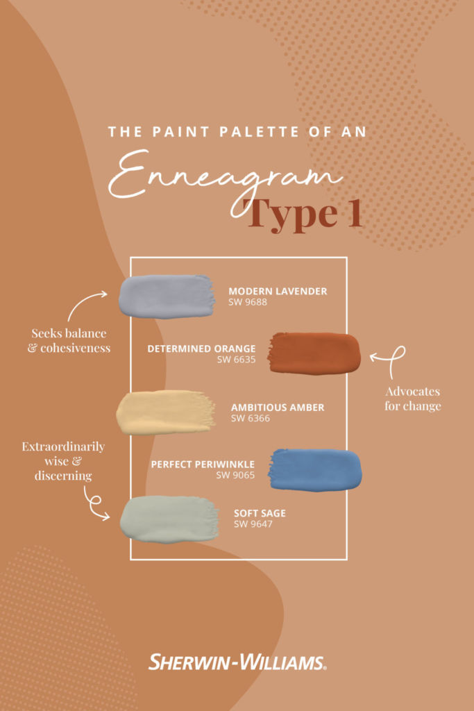
Type 1: The Reformer
Ones are practical in every sense of the word. Known for their honesty and dependability, this type embraces the balance of Modern Lavender while striving for the tenacity of Determined Orange.
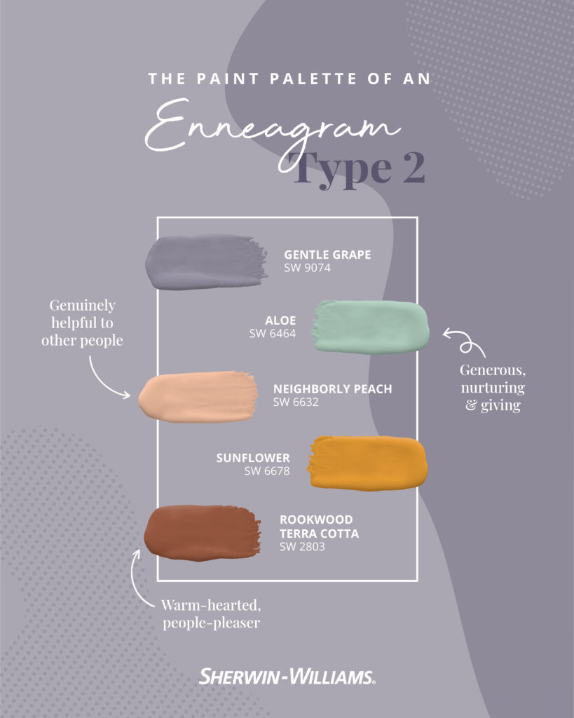
Type 2: The Helper
Just like a Sunflower, twos love bringing joy to someone’s day. These generous spirits have unconditional love for others, and they’ll go out of their way to help a person in need.
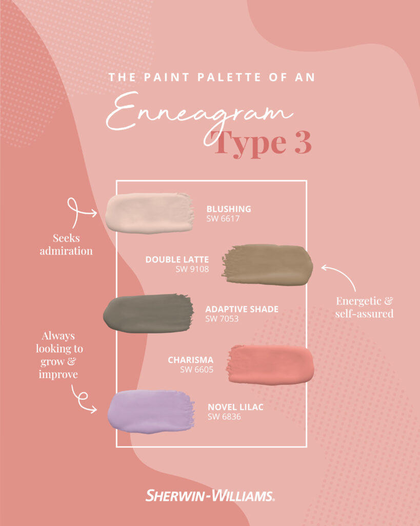
Type 3: The Achiever
Known for their Charisma and authenticity, this type harnesses the energy of a Double Latte while fueling their desire for growth and improvement.
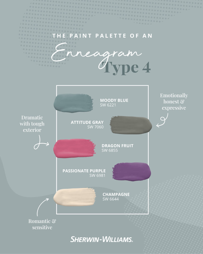
Type 4: The Individualist
Like Passionate Purple, this type is emotionally driven in everything they do. While fours adore their individuality, they also love connecting with people who match their level of creativity and honesty.

Type 5: The Investigator
Fives are insightful and always curious. Despite their occasional Daydream drifts, these visionary inquisitors take in the environment around them to understand the ins and outs of the world.
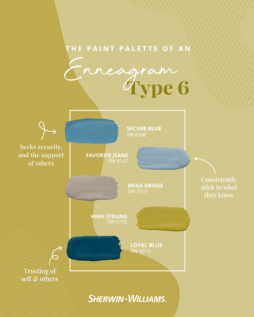
Type 6: The Loyalist
Just like your Favorite Jeans, sixes love a tried-and-true favorite. These reliable allies are fiercely loyal to their loved ones, and they’re always willing to stick up for their beliefs.
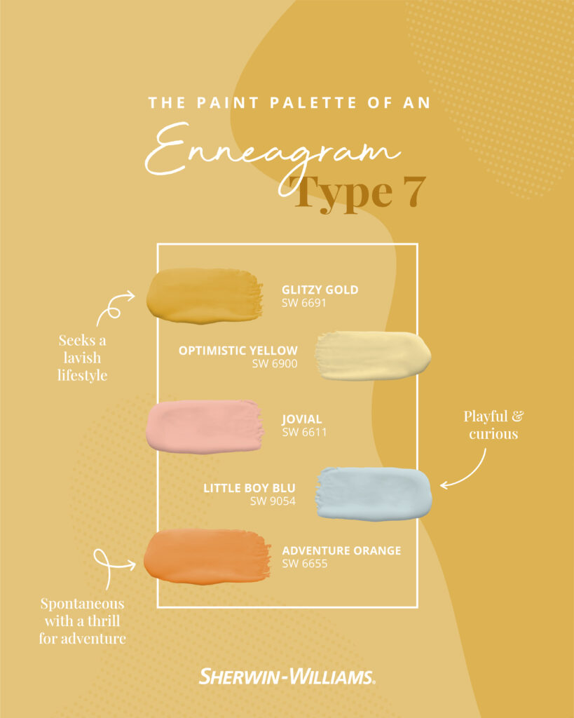
Type 7: The Enthusiast
It’s no surprise that sevens are always on the go. Their adventure-seeking nature leads them to new experiences while their daring spontaneity leaves their soul feeling Glitzy Gold.
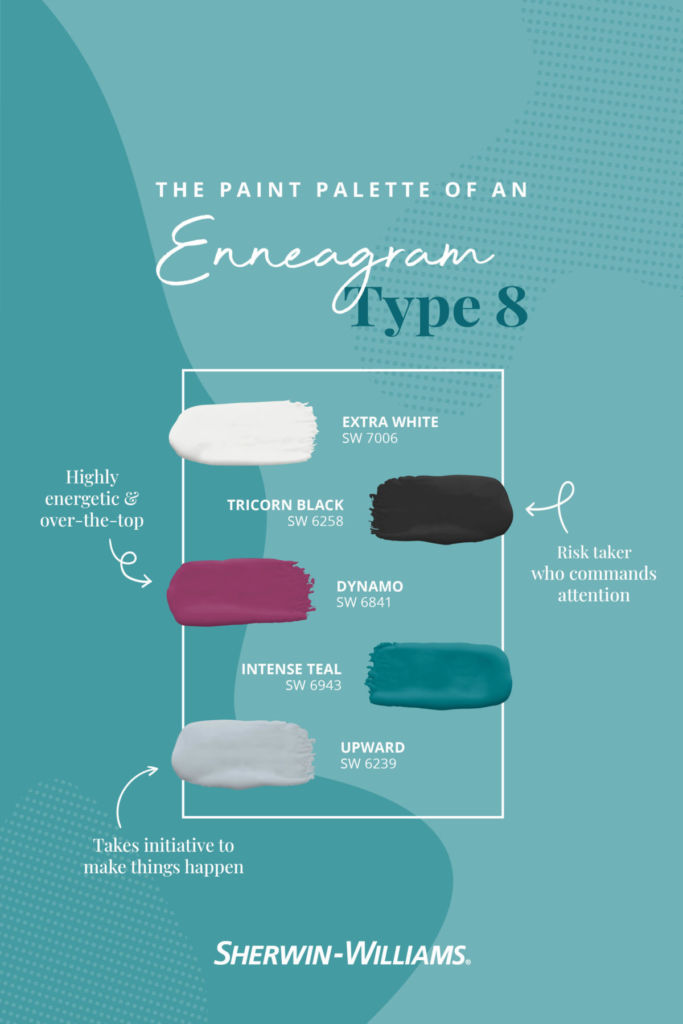
Type 8: The Challenger
With Dynamo energy, eights tell it like it is. This type won’t shy away from a challenge or taking a risk thanks to their self-confident and assertive nature.
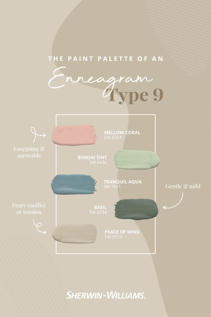
Type 9: The Peacemaker
Most likely to give you Peace of Mind, nines enjoy going with the flow. As a result, their gentle disposition makes for an easygoing personality that brings people together.
Where did you find yourself? Share which enneagram-inspired color palette speaks to your soul in the comments below.


I would like to use Sea Pearl on the outside of my home.
What would you recommend for trim.
My roof is a tan/muted rose color.
Susan
Hi Susan! Consider the following two crisp whites in order to make your body color “pop”. Take a look at:
Extra White SW 7006
Pure White SW 7005
I am palette #8
I like the upward Gray
And the Extra White
Do these two colors go together
In a bedroom and bathroom.
Hi Vernita! Do you have a color number by chance? You may be referring to Upward SW 6239 and this color is not gray, it is definitely blue – it is the lightest color in our Naval family. Let us know. Thanks!
I’m redoing my kitchen,cabinets tops and bottoms in pure white ,the bottom island ,was told to paint naval ,to go with the already painted “practical beige”walls in kitchenette ,bottom half of walls are Beaded board & will be pure white in kitchenette . What other color ,besides white,beige & navy can I use for accent colors ,like pillows & mantle on beige wall ? Floors have beige & brown -the grey/beige tile (sometimes looks blue in different light) thank you ,MW
Hi Marsha, that is a beautiful palette for your kitchen. Consider sprinkling the navy blue throughout your other rooms. Navy blue is now considered a neutral because it has gained so much of a following – classic color that will never go out of style. Have fun, sounds really pretty.
Thank you for the way you have put together different pallets I will Be sure to use them when I decide to Start painting.
#5 spot on for me! for me. Each room in my home Is painted quietude, this is second home I’ve done this. Absolutely love this color. Surprisingly most of my accent colors are in the #5 palette. I waited for sooo long for SW to feature Quietude in a specific palette!!
Thank you, love, love your color palettes!
Hello Marcele! Quietude SW 6212 is a beautiful color.
I love Quietude!
Not sure what color to pick for my new kitchen walls. My island and doors are going to be Sherwin-Williams Luna Moth. White subway tile backsplash with medium tone cherry cabinets, light gray floor and soapstone counter. My designer suggested a putty color but I was thinking maybe something in the bluish/ gray family might play well off the Luna Moth. Something like SW9145 or SW6479. Would like to know your thoughts. Thanks.
Hi Susan! Do you have a color number for Luna Moth by chance?
Hi! I going dark and using Greenblack on my exterior. A fun front door consideration is Rose Colored, Tassel is another consideration, but I don’t want it to look Ralph Lauren-esq…I prefer funky…do you have 2 more front door color ideas for me…a little less precious than Rose Colored and less conservative than Tassel??
Hi Michele, take a look at the two fun colors below – either one would look fantastic with your Greenblack exterior:
Constant Coral SW 6325
Luau Green SW 6712
I can’t believe I found a color post based on the Enneagram! It has been part of my life and now my Spiritual Direction Practice for over 10 years. Ironically, the paint color that I am seeking is for a new place for Spiritual Direction. Since I am a “5”, I paid attention to those colors. My choice is now made – “Open Air!”
I have a folk Victorian with lots of trim work, posts and rails.
I want to paint the exterior white with the slightest pink undertone. I want to soften all the white without making it yellow, cream, green or blue.
I’m thinking of using Gorgeous White but I’m a little afraid that might be too pink. Do you have any other options?
I’m also trying to find a white to go on All of the trim work, that will work with the slight pinkish white body color and not be too glaring but clean looking.
Hi Heather! If Gorgeous White does not feel right to you, check out Hush White SW 6042. Whichever soft pink-white you choose, your best trim option would be Extra White SW 7006.
Hello. We are staining our brown clapboard post and beam lake house SW mediterranean. What colors go with it for a door? We have black window boxes too. Thank you.
Hi Deborah! Consider using a saturated gold or orange for your door. Both of those color families are opposite Mediterranean on the color wheel and will really “pop” on your home. Check out:
Armagnac SW 6354 Torchlight SW 6374
Reynard SW 6348 Anjou Pear SW 6381
I need a suggestion for the interior main walls in my house. I have deep brown chairs and maple oak tables, chairs, base board, window and and door frames and wooden flooring in some areas. I would like a color that brings brightness into a house, yet give it the warm.,Inviting, country living feel. Also maybe two colors that will go with the main color for a dining room that is off from the kitchen and one big medium size wall area for the breakfast area that is attached to the kitchen. The kitchen it’ self has no wall to paint other than the main hall wall to the house that run through it. Please help. Going on 20 years of complete paint confusion.
Hi Vicki, We’d like to get a better sense of your space before making a recommendation. Sign up for a free Virtual Color Consultation here.
Hi! Our French-feeling house has a good deal of light buff toned stone and black window frames, and the rest is painted 7542 Naturel with 7008 Alabaster trim and 6172 Hardware garage doors. Our current shutters are a natural wood toned stain, but must now be painted due to weathering issues. Can I use yet another color,such as 9147 Favorite Jeans, on the shutters, or is this too many colors? (The front door cannot be seen from the street, by the way)u. The garage door color is negotiable, as well. Thank you!
Hello there, we think you are on the right track by editing your palette, not expanding it. One suggestion would be to paint the shutters and garage doors Cocoon
SW 6173 which is one shade darker and will have more a of presence and “pop” on your home.
I am painting my 1970’s finished basement. It doesn’t get a lot of natural light. I have a large cherry stained bar and pool table to work around and a Family TV area. If I want to brighten it up and have a martini bar feel what would you suggest. Thank you
Hi Krista, greens and aquas look best with cherry wood, what color is the felt on your bar? Also, what color is the flooring in that space? Let us know when you get a minute
Hi,
I wanted 8 five gallons of Colonnade Gray and the store has been out of supplies for 4 weeks. Is this color discontinued?
Hi TC, this color has not been discontinued, but the product might not be in stock. We recommend reaching out to your local store to confirm the product.
Hi , I just finished doing my foyer, living room and dining room in Natural line and Dove white. I am in love with my space. I now want to paint my kitchen cabinet with a pop of color. My back splash is glass tiles which are a mixer of brown beige and bronze. Love my back splash not making any changes. Concerning changes my current tile floor for the latest wood flooring for kitchen. Can you please give me some ideas to for colors that would make my kitchen pop. Thanks.
Hi there, can you tell us the colors in your countertop and what your floor is now? Thanks.
OMG!!! PLEASE continue to send color palettes! Love and need these for our craft biz!! We use ONLY SW paint so these are soooo very helpful!! And please please hurry returning the color to go 1 quart as that is our paint preference for crafting signs. I am a combo of about 4 of these Enneagrams. Lol. #5 and #9 are tops!
I love Bonsai in type 9 for my open living room area. And I’ve always wanted yellow for my adjacent kitchen. What suggestions for yellows do you have? Cabinet dark grey, grey noted granite countertops. Thanks
Hi Roberta, yellow and gray are just beautiful together. This is a gorgeous palette for your kitchen. Check out these pretty yellows for the walls:
Butter Up SW 6681
Friendly Yellow SW 6680
Lemon Chiffon SW 6686
These are fantastic! My home exterior is white with black roof and shutters. I want to paint my front door a fun color and I’ve been leaning toward pink (because I’m an enneagram 4 and/or 8) or maybe blue. Can you recommend a responsible, exterior pink or blue for a front door?
Hi Theresa, a pink would look fantastic with the black roof and shutters; consider using Youthful Coral SW 6604 or Jaipur Pink SW 6577 for a pink option. Some blues that could work would be French Moire SW 9056 or Aquitaine SW 9057.
First off, I’m grateful I found this article! I’d been struggling to find a blue that spoke to me to put in my living room. I’m a 9 on the enneagram, and when I saw Tranquil Blue, it spoke to me and I felt at ease! So excited to put that color in my living room 🙂
So glad it was helpful and that you found the perfect hue!
I just found out about this and literally am wearing all the colors in the 8 palette right now. Well done, Sherwin Williams, and WHERE ARE YOU WATCHING ME FROM!?
We’re just that good! 😉
I liked two from each group – my faves were Passionate purple, Dragon fruit, Novel lilac, Gentle grape, Perfect periwinkle, Open air, Secure blue,
Jovial, Little Boy Blue, Intense Teal, Dynamo and Tranquil aqua.
I am a Palette #5 and have used Daydream (Master Bedroom) and Willow Leaf (Family Room.) I think I’d like to try Open Air in my daughter’s bedroom.
I have read your article; it is very informative and helpful for me. I admire the valuable information about Enneagram inspired color palettes that you offer in your articles.
https://www.ppropainting.com.au/
Hi there, we are so glad to hear that you’ve enjoyed this article and found it to be helpful. We are here if you ever have questions or need assistance. Thank you!
The Enneagram-inspired color palettes featured on the Sherwin-Williams blog are truly captivating and innovative. It’s refreshing to see the intersection of psychology and design in such a creative way. The Enneagram system provides a unique lens through which to explore and understand different personality types, and Sherwin-Williams has translated this concept beautifully into color combinations.
Each color palette captures the essence and characteristics of the Enneagram types it represents, evoking a sense of personality and emotion. The thoughtful selection and arrangement of colors demonstrate the deep understanding of both color psychology and the Enneagram system. It’s evident that a great deal of thought and expertise went into crafting these palettes.
The blog not only provides visually appealing color combinations but also includes insightful descriptions of each Enneagram type and how the colors relate to their characteristics. This adds an extra layer of meaning and depth to the palettes, allowing readers to connect with the colors on a more personal and introspective level.
Whether someone is looking for color inspiration for their living space, a branding project, or simply for personal reflection, these Enneagram-inspired palettes offer a fresh and engaging perspective. They provide an opportunity to explore the connection between personality and color, and how different hues can evoke specific moods and emotions.
Kudos to Sherwin-Williams for their innovative approach to color inspiration. This unique blend of psychology and design not only sparks creativity but also invites us to explore ourselves and our surroundings in a new light. The Enneagram-inspired color palettes are a testament to the power of color in shaping our experiences and expressing our individuality.