


Mimic the world outside your window with hues that draw their inspiration from nature. Whether it’s a botanical shade of green or a sky-like shade of blue, these colors and biophilic designs bring the outdoors to you.
A Layered Look
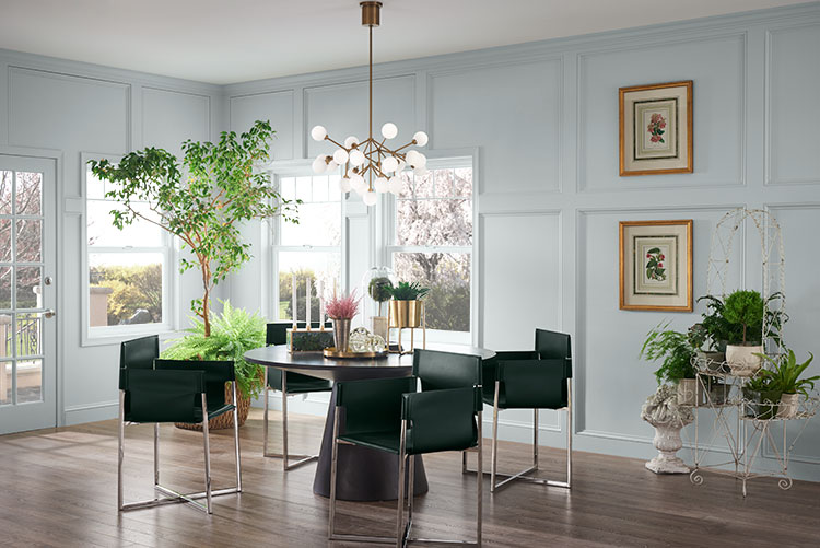
Biophilic design reinforces the existing bond between humans and nature. With an emphasis on order and harmony, biophilia is a great way to create a beautiful, stress-free living environment that also encourages sustainability. To get the look, start with color. Choose outdoorsy shades like Pewter Green for walls and a calming neutral for trim. These simple colors set the tone for plants and natural lighting to complete the look.
A Burst of Color
The key to successfully incorporating color into biophilic design is finding hues that evoke the soft, reflective aspects of nature. Bathing a room in Misty creates a soft, neutral background for a variety of natural design elements. Just like the landscape outside your window, your interior should feel airy with splashes of color to refresh your senses throughout the day.
Looking for more inspiration? Show us your own biophilia-inspired spaces! Tag your photos on social media with #SWColorLove or upload your image here for a chance to be featured in our gallery.


Delightful expectancy towards outdoors, fresh and new!
I am looking for a color for a computer room with large medium wood tone desk. The carpet has gold tones 2 good size double hung window facing west with afternoon and evening daylight hours. I tend to like the deeper tone colors. My Kitchen dining room walls are very close with the pewter SW6208 and my cabinets are called Canvas a light cream. Now back to the computer room / guest room. It is currently a yellow and it is too yellow or bright and the trim is deeper color in the yellow shades I want to change the colors in that computer room and feel that I may need help from a professional. I am not changing the carpet it is a deep gold tones with some pale color tone threads. Do you have any suggestions. I only mentioned the kitchen dining room colors to let you know that I do have color in my home.
Hello, We’d like to get a better sense of your space before making a recommendation. Sign up for a free Virtual Consultation here.
You might consider a blue as that pairs well with gold and also looks good with wood tones.
I love the look of natural colors. Currently all my walls are in SW Macadamia (not my choice). I need a lighter color that goes with this color to bring in more light as an accent to break up the one color palette. Any suggestions? Thank you.
Hi Sally! Check out these warm, light neutrals for an accent color. Any of these would complement Macadamia beautifully. Look at:
Casa Blanca SW 7571
Lotus Pod SW 7572
Navajo White SW 6126
We just painted let it rain in my
Dining room
We have a taupe grey in my family room(forget the name ) looking for a kitchen color. Any advice ? Not
Sure if I go for a color
Or go for white but need some advice and suggestions please
Hi Emily! What other colors are in your kitchen such as cabinets, flooring, counter tops?
I would like to use Keystone Gray below a chair rail. What color would work on the upper half? It is a well lit room with large windows on 3 sides.
Hi Donna! Keystone Gray SW 7504 is a mid-tone greige and would work with several paint families. You could use yellow, green or blue. What other colors are in the room or your living room? On the walls or in furniture and accessories? You could also do a monochromatic look in your dining room with Keystone on the bottom and then a lighter greige on top, like Stucco SW 7569.
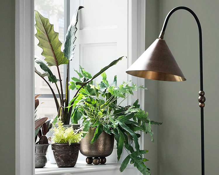
Where did the sweet lamp come from? Love the color too.
Hi Lisa! The lamp was a vintage thrift store find. The original source is unknown.
please show me locations in Largo FL. 33771 I just moved here.
Hi William! The closest location to you is our Clearwater store located at 1467 GULF TO BAY BLVD CLEARWATER, FL, 33755-5320.
They can be contacted by phone at (727) 446-2262. Additional Sherwin-Williams stores are available here: https://www.sherwin-williams.com/store-locator
What lighter color would go well with a two tone chair rail in a master bedroom. The first color is darker, SW. Walk Street
Hello Linda, lighter colors that complement Wall Street SW 7665 are:
Gossamer Veil SW 9165
Alpaca SW 7022
Drift of Mist SW 9166
I am looking for a paint color that will send my honey oak cabinets in background , kitchen is small the counter tops and backsplash colors are , ivory, tan, mocha more like small rippers line in stone and floor colors is about same without color mocha and there are gray seams In tiles. One window.
Hi Loretta! Are you open to painting your cabinets? Perhaps just the bottoms? Let us know when you get a moment. Thank you!
Looking to paint my home office. It’s has lighter wood floors and only 1 window. White trim. I’m looking for something soothing, warmer, and slightly green, like a sage. Do you a recommendation for a sage???
Hi Deanna, Some subtle sages that would work in your office are:
Sea Salt SW 6204
Sweater Weather SW 9548
Moorstone SW 9630
need a wall color for a townhouse living room, curtains are blue/white, furniture are neutral with gold accessories, black metal and glass tables. Kitchen backsplash is grey as flooring which has some brown overtones. Currently walls are builder white, I don’t want to lean on grey and space is cozy.
Hi Laura! Our color experts would be the perfect people to help. Sign up for a free Virtual Color Consultation here: https://homeowner.sherwin-williams.com/colorconsult/
I need a color that would go in my kitchen between Play it cool (dining room ) and debonair (family room) the kitchen is between them. White cabinets, gray wood tone floor and taupe backsplash.
Hi Jennifer, consider going a little darker than debonair in your kitchen, similar to either Blustery Sky SW 9140 or Waterloo SW 9141. Kitchens do not usually have a lot of wall space – most of the walls are taken up with cabinets or appliances. If you paint your kitchen a darker shade of Debonair, you will be creating a cohesive and intentional palette.
I really enjoyed reading this article about biophilic design and how it can help create a harmonious relationship between nature and indoor spaces. It’s inspiring to see how Sherwin-Williams promotes the idea of bringing nature indoors to create a calm and peaceful environment.
We’re so glad to hear you enjoyed this article! We truly believe paint can bringing calmness and tranquility into each and every space by incorporating Biophilic Design. 🙂
Hello. We are repainzting our home office with windows on South and West side (bigger window is the South side). We have a warm dark orange/golden rust/pale coppery type carpet with a black pattern and black desks and a creamy trim. I’m looking into a deeper green, but want it to be somewhat warm to go with the carpet without going too yellow. I do love some of the darker greens/darkish olive greens and like Meadow Trail and Messenger Bag, but they are a LITTLE too brown or yellow. Any recommendations without going to blue undertones?
Hello Shaina, take a look at either Evergreen Fog SW 9130 or Dried Thyme SW 6186 for a dark green without yellow or blue in it.