


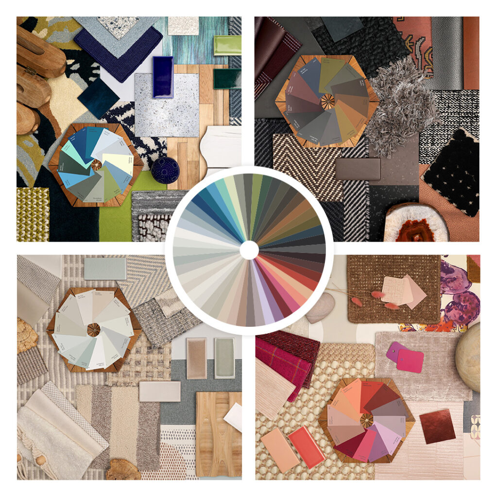
When it comes to color forecasting, we’ve all come to know and love the annual Colormix® Forecast that keeps us ahead of the curve on the year’s top trend colors. This year brings an exciting new direction. Anthology: Volume One is the first installment in what will be a biennial color trend report that explores directional shifts in the landscape through a curated collection of 48 hues organized by color family. Our Director of Color Marketing, Sue Wadden, sat down with us to pull back the curtain for a behind-the-scenes look at what we can expect and where this will take us.
Featured Color: Stardew SW 9138
Q: Tell us a little about what inspired the idea behind Anthology and how it’s different from the Colormix® Forecast as we’ve known it.
A: We were finding ourselves in a cycle every year where the storytelling around style and trend was becoming more and more prominent, which has always been an important part of forecasting. But what I wanted to do was create an environment where we get back to color. Anthology was developed to be that report. The approach we’re adopting is every other season we’re going to do an analysis of the last two years of color to alternate with the style and broader trend storytelling of our traditional annual approach to Colormix®. It’s going to function more like a report for homeowners around what we’re seeing and where we’re going in terms of color families. It’ll make it easier to bring trending color into the home in a way that can feel truly cohesive from room to room.
Featured Colors: Wild Currant SW 7583 (doors), Intuitive SW 6017 (walls)
Q: What does this new approach mean for homeowners?
A: From a baseline level, they’re getting a snapshot of the top trending whites, the top darks, the top blues and greens and the top warm colors. With Anthology, they can visualize their own space with new color and know it’s on-trend. It becomes about the color first, and that’s an exciting story to tell.
They can feel good knowing that they’re going to be seeing these colors in retail and fashion spaces, so they can have more confidence about painting their walls these colors because they’re relevant and are going to look great in their home and interior. This report gives homeowners the confidence to take risks, try something new with color and ultimately bring something beautiful into their interiors.
Featured Colors: Antiquarian Brown SW 0045
Q: What does Anthology do for them in their homes in a practical sense?
A: First, it conveniently provides homeowners with curated palettes they can use to bring trending colors into their interior spaces. And then they’re also getting the benefits of these colors from a physiology and health and wellness perspective.
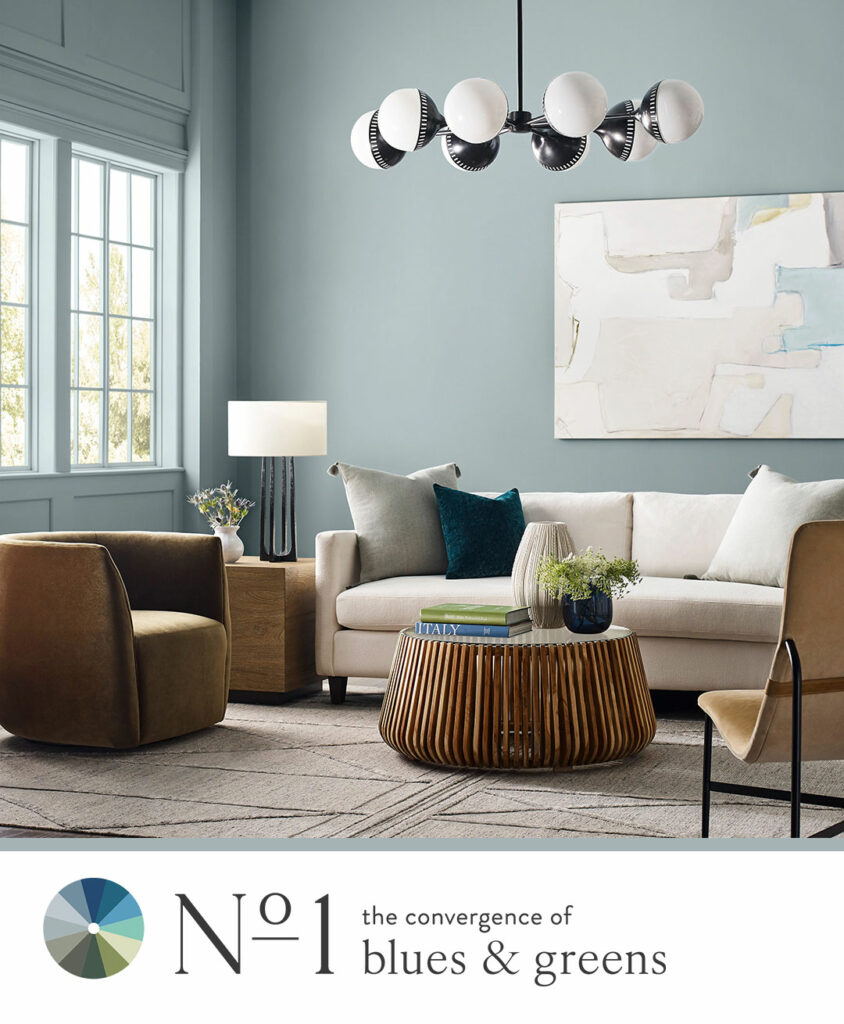
Starting with The Convergence of Blues and Greens, we know how these shades are important for interiors because they create soothing, nurturing environments that have a positive impact on well-being. They’re tied to nature-inspired designs, like Biophilia, which recognizes the positive impact of incorporating the balance and serenity of nature into our interior spaces. These hues were selected for their power to instill a sense of tranquility, promoting calmness and a clear state of mind. So, not only are they visually appealing and versatile, but they also promote health and well-being.
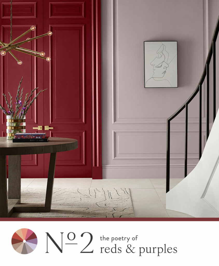
With The Poetry of Reds and Purples, the last several seasons of Colormix® has forecasted a general rise in elevated warmth in color preference, which brings us the punchy, vibrant reds and nourishing terracotta and brown tones of this palette. Purple is finding prominence and becoming a much more mainstream color. It’s on the rise because of its ties to finding joy and bringing bright color into your home. The range of red to earthy brown tones in this palette are expressive and energetic yet also supportive of mindfulness and slowness.
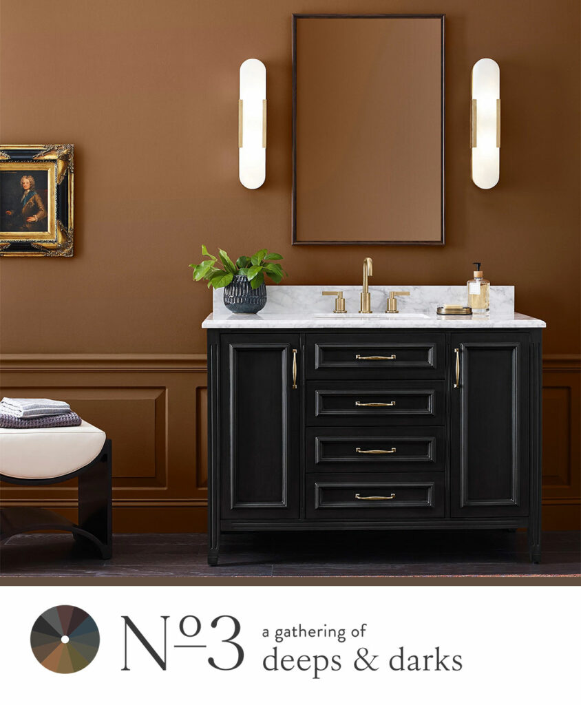
In A Gathering of Deeps & Darks, dark tones become important because they create a sanctuary, which is always essential but especially so amidst challenging times like we’ve seen the last few years. There are positive health benefits of bringing a darker color into certain areas of your home by creating a sense of well-being within a space because it encourages quiet contemplation and solace. By creating an environment that’s less visually stimulating, dark tones allow you to turn your focus inward, promoting concentration, emotional comfort and self-reflection.
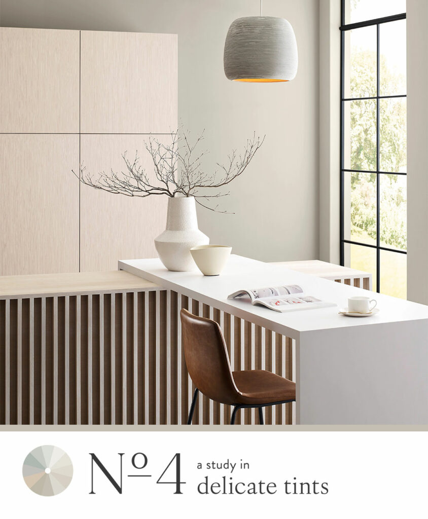
And in A Study in Delicate Tints, we get a close look at this back-to-basics, start fresh color group that’s experiencing a transition from starker, crisper whites into warmer, more soulful representations. The tones in this palette have always offered simplicity, versatility and adaptability in interiors. They serve as a clean, neutral backdrop, but we’re also seeing how whites and tints contribute to a therapeutic sense of harmony within a home. These tones bring a gentle, soothing touch, allowing for moments of tranquility and serenity. Lighter tones also reflect light more effectively. Maximizing natural light not only enhances the visual appeal of a space but also promotes circadian rhythm, energy levels, and overall health.
So, overall, Anthology functions on a couple levels, bringing aesthetic appeal as well as the broader benefits to health and wellness and contributing in a big way to creating a positive living environment.
Featured Color: Skyline Steel SW 1015
Q: There’s a lot of work that goes into developing this kind of report. How will we see Sherwin-Williams use these 48 colors throughout the year?
A: Anthology is curated from our best colors. Even though the format is a little different, it’s still a representation of true trend forecasting based on heavy research. So, homeowners can rely on our professional resources to deliver on-trend colors. And they can expect to see the conversation around these colors carried throughout the year in our Color of the Month palettes and our Color of the Year. All of the colors that get highlighted in the monthly palettes are pulled straight from the Anthology collection.
Q: With so many stunning hues, I’m sure there’s no easy answer here, but do you have a favorite palette this year?
A: I love them all – they become like my kids. I think, though, that I lean toward A Study in Delicate Tints. It’s just so soft and delicate and clean. But I also love the mystery of the darks. Those are all really beautiful. It’s easy to get lost in their mystery.
Intrigued by this exciting new direction and want to learn more? Explore the story of Anthology: Volume One further to find inspiration and ideas. For a close-up look, bring all twelve colors of each palette into your home with FREE color chip ordering using the links below, and, for personalized, one-on-one guidance on bringing these palettes to life in your space, book a FREE Virtual Color Consultation!
No. 1: The Convergence of Blues & Greens color chips
No. 2: The Poetry of Reds & Purples color chips
No. 3: A Gathering of Deeps & Darks color chips
No. 4: A Study in Delicate Tints color chips


Very interesting