


No filters are needed to make these dreamy destinations more colorful than they already are. Whether it’s the crystal waters of Bora Bora or the grassy hills of Derbyshire, these five vacation-inspired paint colors bring a traveled look home, so your vacay never has to end.
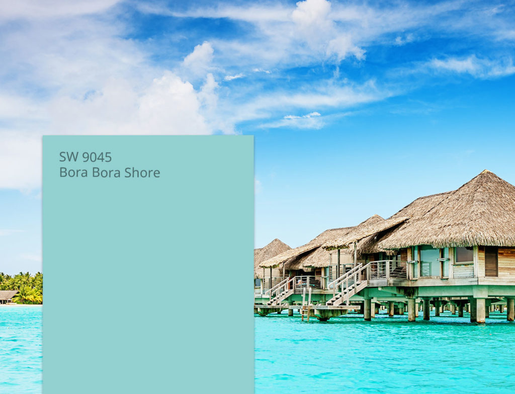
Bora Bora Shore
Love the tropical life? A bright blue like Bora Bora Shore is the ultimate shade to brighten every day with some island-inspired charm. Pair this aquatic color with other carefree shades like crisp whites and sandy beiges to wash a space in chill vibes.
Coordinating Colors
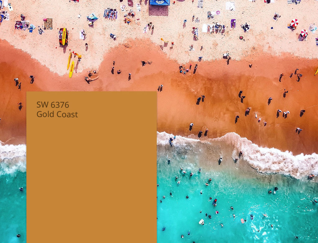
Gold Coast
Catching a wave on the Gold Coast gives you some of the best views of the shoreline. This sunny shade inspired by the land Down Under goes together with equally bold shades of red and blue to create a fun in the sun palette no matter where you live.
Coordinating Colors
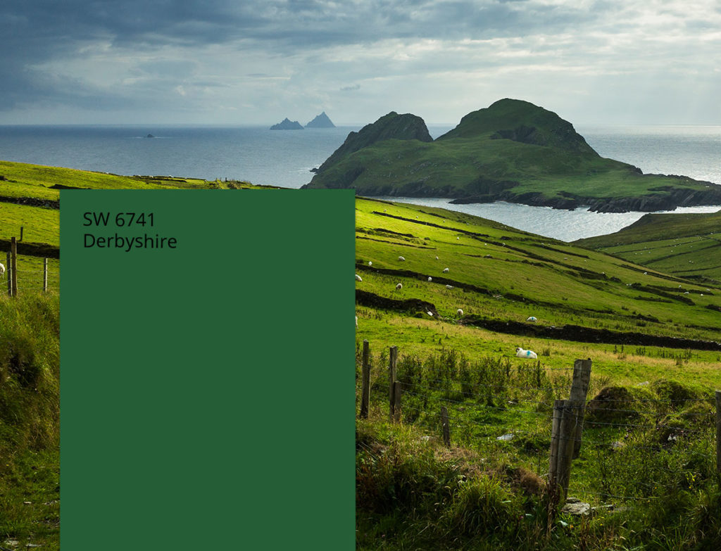
Derbyshire
Is there anything more perfect than England’s countryside? A nature-inspired green like Derbyshire captures the famous rolling hills and breathtaking sceneries that were practically made for postcards. Complete the color scheme with other verdant hues to create a monochromatic look inspired by Derbyshire’s many shades.
Coordinating Colors
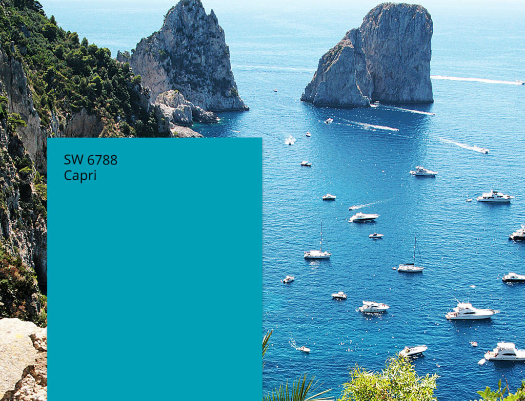
Capri
The waters of Capri are ones you never forget – that’s why this beautiful blue is sure to make a statement at home. Pair this Mediterranean hue with other aquatic blues and shades of green that help bring the island life inside.
Coordinating Colors
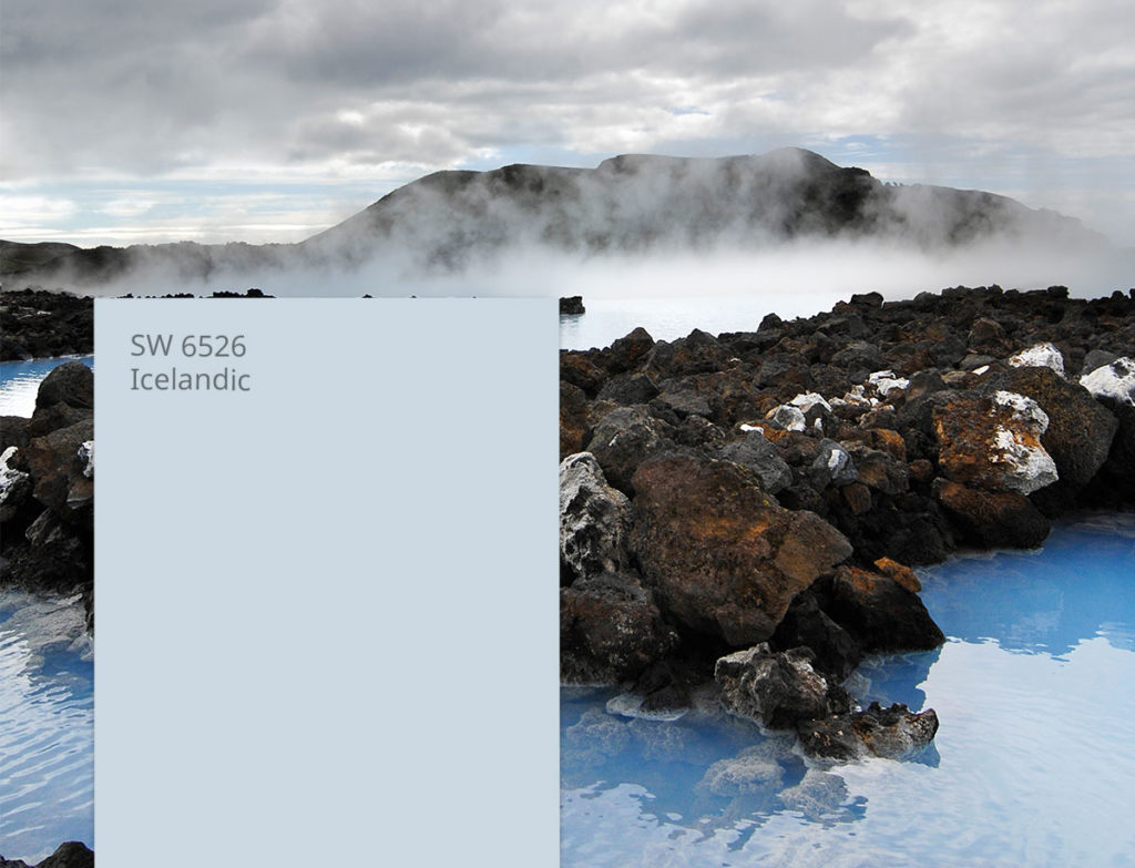
Icelandic
Home to hot springs, glaciers, volcanoes and more, Icelandic views are truly one of a kind. We’re paying homage to the land of fire and ice with a crisp shade of blue that pairs with other arctic colors of purple, green and gray.
Coordinating Colors
Want to keep the wanderlust going? Check out our color palettes inspired by states and don’t forget to drop a comment below to share your favorite vacation destination and the colors that capture it.


Hi, my rooms has two windows on the same side of the room except for the front room
it has four windows two on each wall, and there is not much sun light. I need a paint color
but I do not want a beige, eggshell, white, mushroom sand, none of that type of color.
I need help with a color.
Hi Linda, is there a color family you are leaning towards?
I have a bathroom that has white cabinets, fixtures and trim with two westerly facing windows over the washer and dryer. I’m thinking of Adriatic sea for the color in most of the room with a contrasting/coordinating color above the sink . (It’s in a little alcove). Should I stay in the blues or go outside of the family for some pop? Suggestions
Hi Karen! Consider any of the warm neutrals below which will really allow your Adriatic Sea to “pop”. Take a look at:
Wool Skein SW 6148
Malabar SW 9110
Skyline Steel SW 1015
Looking at agreeable gray for open living room and kitchen. Currently have stamped concrete to include the ceiling. Looking to lighten things up. Possibly add dark blue wall
Agreeable Gray is much lighter and is a Griege (grey+beige) which would work much better with a dark blue accent wall. Here are some blues that would look great with Agreeable Gray:
Naval SW 6244
Charcoal Blue SW 2739
Mineral Gray SW 2740
My living room is sand dollar SW6099. Have chair rail along one of the walls & looking to paint the bottom portion a different color. The foyer opens to the living room – foyer is tradewind SW6218. I have green tone accents in the living room so not sure what color to use.
Hello Cheryl! Consider repeating a color from the Tradewinds family in order to create a cohesive palette. Look at these options for under your chair rail:
Interesting Aqua SW 6220
Delft SW 9134
I was trying to do a pale yellow and a gray for my living room. I have bought 2 different colors of gray now. The first gray looked blue gray, the second gray was too dark. Do these colors go together? Is there. Gray that is just gray? Suggestions please I’m very frustrated
Hi Gina! Grays can be very difficult. Our closest color to a “true” gray is Light French Gray SW 0055. That gray would complement many color families with yellow being the most popular.
I’m looking to paint a bathroom a pale blue or green. Wanting to do a bit of a mermaid theme. There is one east facing window over the shower/bathtub and a white counter top with dark cherry wood or mahogany cabinets. Suggestions on paint color?
Hi Vicki! A green or teal would work best in the bathroom given the red undertones in your cabinets. Look at:
Breaktime SW 6463
Tame Teal SW 6757
Waterscape SW 6470
I am looking for a gray that isn’t too cool toned. I see Icelandic and wonder if that has too much blue. I do want it to be one the lighter value.
Also, do most people still paint ceiling’s white?
Hi Helen! Yes, most people paint their ceilings white. Our ceiling white is Ceiling Bright White SW 7007. Now, onto your wall paint question. Icelandic is very cool – it is a light blue color without any gray in it. If you are looking for warmer light grays, check out:
Shoji White SW 7042
Skyline Steel SW 1015
Worldly Gray SW 7043
I am looking to do a very dark accent wall in my bedroom behind my headboard. But the room is pretty dark with an east facing window. Do you think the white heron or Islandic would make the room too dark with that dark accent color? Also- I really love the dark teal color that is shown in the email that brought me to this page. It is a teal dining room wall. Any idea what I am referencing and what color that is? Thank you!
Hi Margo! Icelandic SW 6526 is a very pretty soft blue white White Heron SW 7527 is a soft off-white with a subtle beige undertone. Both of thee colors are soft and light and will not add any darkness to your room.
i have stained wood cabinets that will be painted a gray. what color should i paint the walls in the kitchen the floor is while tile
Hi Toni! We recommend that you wait until your cabinets have been stained – at least 24 hours after the job is done – and then pick a shade from our color wall at least two shades darker.
Hi! I am planning to redo the kitchen in my Vermont ski house and am thinking of painting the cabinets an off white/cream. The whole house has tonged in grove paneling which is fairly dark. We plan to keep the paneling but are looking for a cabinet color that would lighten up the room. Any suggestions?
Amy
Hi Amy! Take a look at these warm white, any of which will brighten your space. Check out:
White Flour SW 7102
Futon SW 7101
Greek Villa SW 7551
I have a split level and from the kitchen through the living room the previous owners used a blue that I think makes it too dark in the room (plus it’s a pretty annoying blue, both too bright and leaves the room too dark), what would you recommend for that area? The back sliding door is South-facing, but still doesn’t bring in much light because of the overhang. Icelandic looks promising but still maybe a little too blue and a little too dark.
Hi Bob! We’d like to get a better sense of your space before making a recommendation. Sign up for a free Virtual Color Consultation here: https://www.sherwinwilliams.com/homeowners/color/lead-csi
Hi.
I painted my front door with the beautiful seascape and would love to know what gray color I could use for the exterior brick and what white color for the trim.
Thanks Bari
Hi Bari, Can you tell us the color number for the Seascape color you are using?