


When it comes to picking new colors, the walls always seem to get the spotlight. But it’s the trim paint that can be the unsung hero of your color scheme. It adds so much more to the personality of your space than you might realize. We’re looking at four wall and trim color combinations and showing why each pairing works to spark ideas for your next refresh.

The Magic of Contrast
Looking to make a statement but want to keep it lowkey? Bringing together a clean white backdrop with a saturated, bold hue on the trim speaks volumes (but using your inside-voice).
Featured: Bold Trim + Lighter Walls
- Trim: Borscht SW 7578
- Walls: Oyster White SW 7637
Why it works: Borscht’s deep red hue pairs modern sophistication with Oyster White’s classic shade of white. Outlining windows, doors and baseboards like a clean stroke of ink, Borscht’s bold red makes the room feel put-together and polished. But also a little daring. It’s a playful way to bring personality and visual interest into a space without committing to the drama of bold walls.
Best for: Living rooms, offices, foyers, spaces with crown molding or accent trim to highlight.
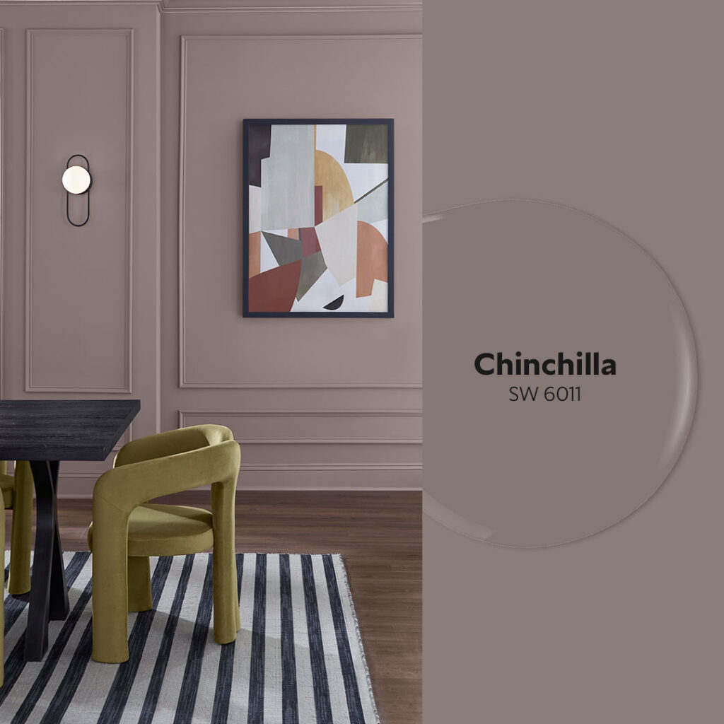
One Color, Two Sheens
Color drenching is a popular trend that isn’t going anywhere anytime soon. With a slight twist to highlight the trim, it becomes an easy shortcut to a chic, high-end look.
Featured: Matte Walls + Semi-gloss or Glass Trim
- Trim: Chinchilla SW 6011 – Matte Finish
- Walls: Chinchilla SW 6011 – Semi-gloss Finish
Why it works: A single hue in contrasting sheens keeps things simple while still giving the room a sense of elegance. A matte Chinchilla wall wraps the space in moody coziness, while the semi-gloss trim adds a gentle gleam that stands off and brightens the edges. It’s the perfect approach if you’re after a monochrome look that still feels layered and luxurious.
Best for: Modern spaces, small rooms that benefit from light reflection, minimalist interiors, architectural details you want to subtly highlight.
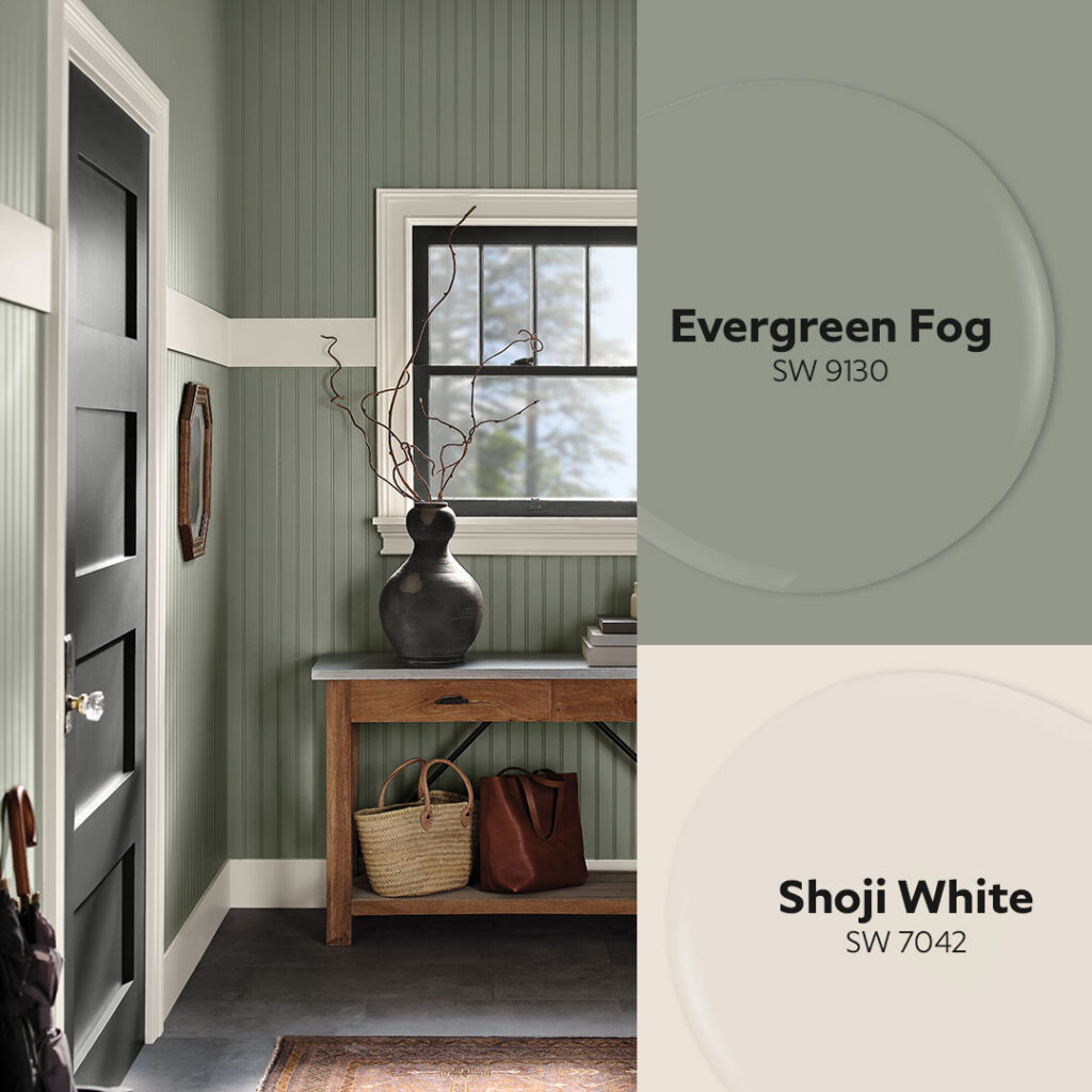
Cozy Up to Warm White
White trim is timeless. Choosing the right white makes all the difference. While cooler whites on trim tend to bring more contrast, sharpening and defining lines in a space, warm whites have a gentle, softening effect that feels more blended and casual.
Featured: Warm White Trim + Earthy Green Walls
- Trim: Shoji White SW 7042
- Walls: Evergreen Fog SW 9130
Why it works: Shoji White leans toward the warmer end of the spectrum making it an easy choice to go with a comforting, earthy shade like Evergreen Fog. It smooths out the edges of a space lending a relaxed, welcoming atmosphere.
Best for: Bedrooms, mudrooms, family rooms.
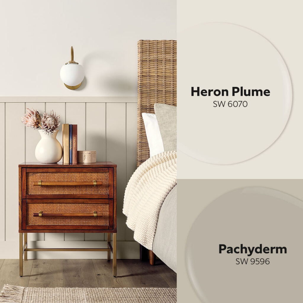
Tonal Softness
Neutral trim is having a moment. Softer than stark white but more polished than natural wood, these tones create a calm, contemporary look.
Featured: Taupe-Greige Trim + Cream Walls
- Trim: Pachyderm SW 9596
- Walls: Heron Plume SW 6070
Why it works: Greige trim like Pachyderm adds subtle warmth and character without the high contrast of a bolder hue. Next to the creamy, soft white tone of Heron Plume, the palette feels layered and sophisticated. It’s the perfect combo for creating an airy but inviting atmosphere.
Best for: Living rooms, kitchens, open-concept spaces.
Ready to Rethink Your Trim?
Whether you choose bold contrast, a wash of color, timeless white or soft neutrals, repainting trim with the right hue brings a distinctive, unique vibe to your space. Get FREE color chips delivered to mix and match all the shades in this post to see what works best for your space and style. Leave us a comment below to let us know which combo grabs your eye!


I like chinchilla and borscht
Love when you send new colors and hints