

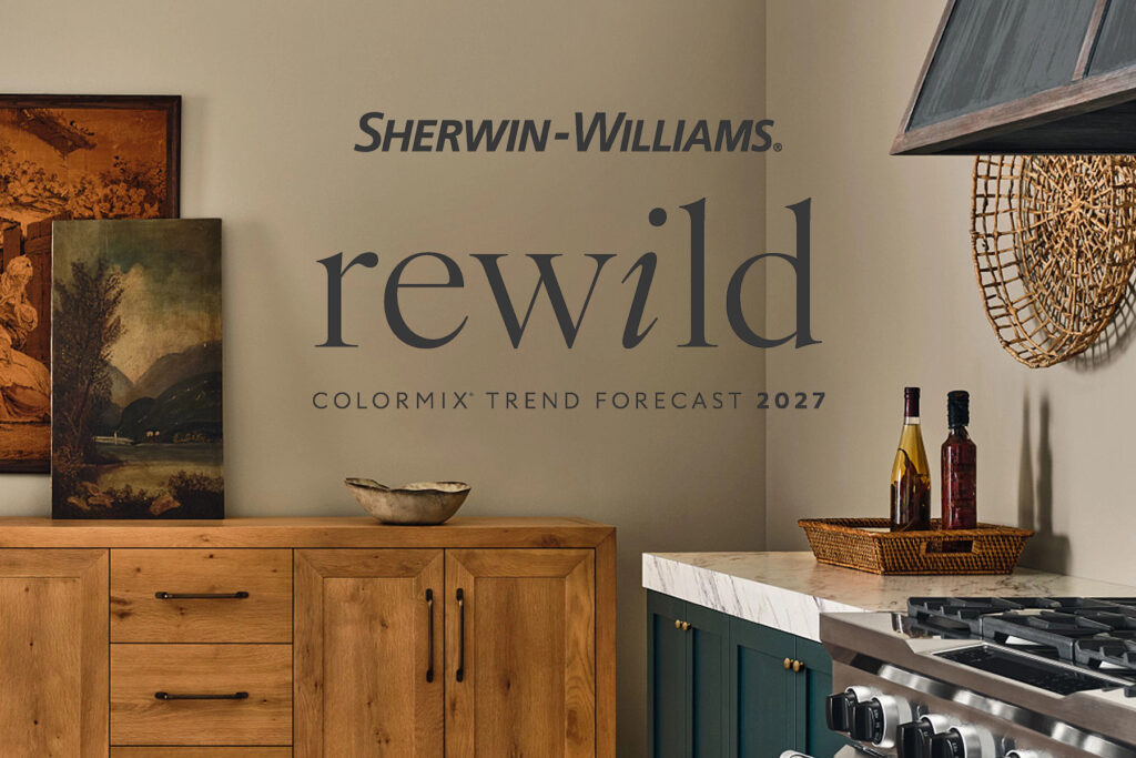
Celebrating a return to personal expression through color, this year’s trend forecast features 48 expertly curated hues sought after by designers and forecasted by our Trendsight Team to shape color trends of the future. Moving beyond one-size-fits-all design trends, this Collection encourages homeowners to embrace individuality, drawing inspiration from the pieces, memories and experiences that make their spaces uniquely their own. We sat down with Emily Kantz, Interior Designer & Color Strategist for the Sherwin-Williams Trendsight Team to explore color trends and talk about what sets this year’s forecast apart.
What is Rewild and how should I think about using it in my home?
A: Rewild is all about a return to creativity and personality in your space. Over the past several years, home design trends leaned heavily into minimalism — clean, neutral palettes that looked beautiful but often felt similar from one home to the next.
Now we’re seeing a shift. Homeowners are craving individuality again. They want spaces that feel collected, lived-in and uniquely theirs.
That’s where Rewild comes in. It encourages you to start with what you love, whether that’s a vintage find, a piece you picked up while traveling, or something passed down through family, and build your color story from there. These personal items become your “springboard,” helping you reintroduce color, texture and meaning into your home.
It’s about embracing imperfection, celebrating personality and letting your space tell your story.
How can I confidently mix and match colors without worrying about getting it wrong?
A: Rewild is designed to give you freedom, not rules. It gives you 48 hues chosen by experts, so you have the confidence to explore and combine in your own way without having to worry about whether they go together or not. You don’t have to fit into a predefined look. You simply choose colors that resonate with you and work with what you already have in your space.
If you have a bold rug, a favorite throw pillow or a standout piece of furniture, pull colors from that. Let those existing elements guide your choices. When your palette is rooted in things you already love, it naturally feels cohesive.
The result is a space that feels intentional, approachable and personal because you were part of creating it.

What are Continuity Colors and how should I use them?
A: Within the 48-color Rewild Collection, there’s a curated group of 10 Continuity Colors. Think of these as your anchors.
These shades have been tracked across multiple forecasts because of their versatility and staying power. They’re reliable, adaptable and designed to work across a wide range of spaces and styles.
If you’re unsure where to begin, start by ordering free color chip samples to test color in your space. Continuity Colors are:
- Great for whole-room applications
- Ideal as foundational wall colors
- Designed to have a longer lifespan than trend-driven hues
From warm neutrals like High Sierra to deeper, moodier tones like Roycroft Bronze Green or Clove, these colors offer a grounded starting point. From there, you can layer in bolder or more playful colors from the rest of the Collection.
What’s a simple way to start using Rewild in my home?
A: Start with what already exists in your space. Most homes have a primary wall color that flows from room to room. Instead of starting from scratch, look for Rewild colors that complement it:
- If your current palette leans warm, explore warmer tones like Cordovan or Red Barn
- If your home has cooler grays or whites, look to colors like Forged Steel or cooler greens
From there, introduce color in smaller ways — accent walls, powder rooms, cabinetry or décor. This allows you to experiment without committing to a full room transformation.

What if I feel overwhelmed by all 48 colors?
A: That’s completely normal, and exactly why Rewild includes multiple ways to approach the Collection.
If you’re feeling unsure, think in terms of mood instead of individual shades. For example:
- Want something cozy and dramatic? Lean into deeper, moody tones.
- Looking for something light and playful? Try softer, whimsical hues.
- Prefer something grounded and natural? Focus on earthy, organic shades.
You can also start with a continuity color as your base and build a small palette around it — think 3 to 5 complementary colors from the larger Collection of 48 hues to create a look that feels tied together and cohesive.
What’s the biggest shift in how we should think about color today?
A: The biggest change is moving away from perfection and toward personalization. Instead of asking, “What’s trending?” the question becomes, “What feels like me?” Rewild invites you to explore, experiment and trust your instincts. It’s less about following a formula and more about building something meaningful. Because at the end of the day, the best color palette isn’t the one that looks perfect online, it’s the one that feels like home.
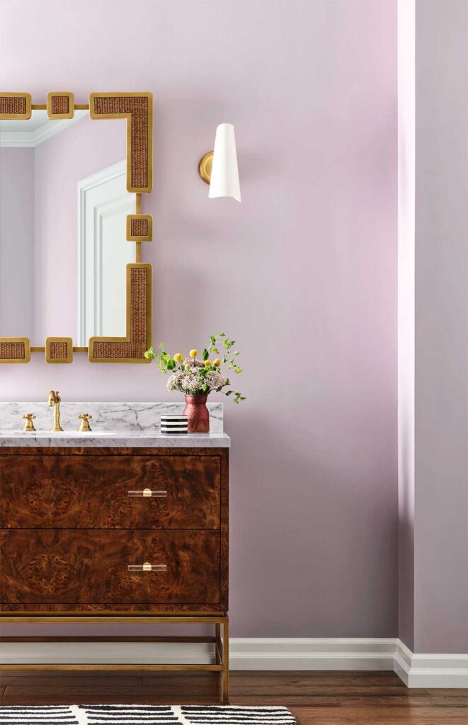
Ready to bring the Rewild palette into your own space? Get a closer look at the 2027 Colormix® Forecast to explore all 48 colors, uncover design inspiration and discover new ways to express your personal style. Need somewhere simple to start? Order FREE color chips of the 10 Continuity Colors to see these versatile shades in your space before kicking off your color journey.