Put on your rose-colored glasses and rethink the way you see pink. Millennial pink may have gained its wild popularity in 2017, but this warm shade hasn’t lost any momentum since.

New Neutral
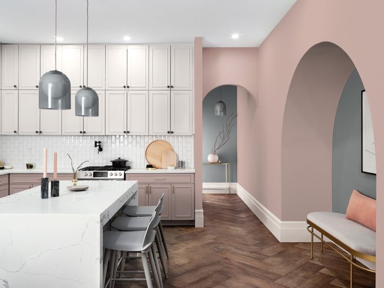
Unlike its color history, the beauty of millennial pink becoming a new neutral is that its appeal speaks to everyone. While pink traditionally triggers thoughts of Barbie and bubble gum, this trending shade is the complete opposite with undertones that are more beige than bright. “Millennial pink is so useful in so many applications. It’s taking the concept of what beige was 10 years ago,” adds Sue Wadden, director of color marketing at Sherwin-Williams. Instead of a look that’s feminine or masculine, this pinky neutral doesn’t pick a side.

Life in Pink
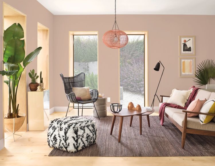
Creating a space that’s “la vie en rose” starts with finding your favorite color inspired by millennial pink. These dusty shades are great for evoking cozy feelings, so you can explore using them in places where you’d normally unwind like a bedroom or living room. Paler shades of pink also tend to pair well with classic neutrals like blues, creams and grays, so if you’re painting an entire room pink, look at using accessories in these colors to keep your space feeling grounded. If you’re opting for a pink accent wall instead of an entire room, don’t be afraid to incorporate more pink accessories to give your space a rosy look that goes beyond your accent wall.
Have a pink-inspired space you want to show off? Share your finished room with us by tagging your photos on social media with #SWColorLove for a chance to be featured in our gallery. You can also click on our favorite shades of pink to see how other people brought these colors to life in their home. Want to learn more about the perfect pink for your home? Book a FREE Virtual Color Consultation with one of our color experts to bring your color to life.


Which pink will work with a teal carpet?
Hi Lori! Teal & Pink are a quintessential Art Deco look and look stunning together – great choice. Take a look at:
Jazz Age Coral SW 0058
Priscilla SW 6575
Oleander SW 6603
Alyssum SW 6589
I love the pink and grey combo in the kitchen. What are those SW colors? I would like to try them in my master closet/bathroom space.
Thanks for the inspiration!
Hi Laura! The colors are Breathless SW 6022 and Spatial White SW 6259 from our Colormix 2020 Mantra Palette.
Hi! What colors are used in the living room photo? Thanks!
Hi Morgan, the walls are Likeable Sand SW 6058.
looking for a new pink to paint my stucco northern California home. i have a gray roof, want a gray front door. nothing bright
Hi Gerri! Is there a specific product you will be using on your home? Some stucco products have a dedicated or exclusive palette. We can help suggest both product and color. Please let us know. Thank you.
Will the Likeable Sand look good with Jade Dragon and Azure Jazz?
Hi Kathy, Likeable Sand is a soft pink and would look great with Jade Dragon SW 9129 – a quintessential Art Deco look. Azure Jazz is a Valspar color.
Hi,
I’m painting my living room with Sherwin WIlliams Breathless paint color.
What accent wall color should I choose to go with Breathless?
Hi Raj! What other colors are in your living room? For instance, flooring, furniture and window treatments. Also, Breathless SW 6022 is a soft taupe with a definite pink tone to it. Do you want to accentuate the pink/warm tone in Breathless?
Hi! What light pink would go well with medium-dark walnut wood window/door/carpet trim in a bedroom?
Hello there, take a look at Ibis White SW 7000, Pink Viburnum SW 7108, and Anemone SW 6567.
What is the wall color shown in the living room? (MCM couch, coffee table with black rattan chair)
Hi Loire, the walls are Likeable Sand SW 6058.
I’ve done design for 30 yrs and I have to admit I truly can’t stand pink paint for any application
As an accent it could be tolerable.
I love Sherwin Williams
But pink! Please be a bit more sophisticated than that
Hi,
I am looking for white with a pink undertone. What can you suggest?
Thank you.
Hello Kathy, we have the perfect color for you – Ibis White SW 7000. Order a chip of this from our website so you can see this soft white with a pink undertone in your lighting. swsamples.com
Dear Susan W. Get inspired look at the style that is coming from the UK , http://www.swoonworthy.co.uk Look at those tones of Peachy Pink! Just beautiful!
Luz
Can you tell me what shade is used in the living space with the Black and White ottoman, and tree in the left corner of the picture? Thanks!
Hi Tamara! It is Likeable Sand SW 6058.
I have olive green kitchen cabinets. Which would be a good shade of pink for my kitchen walls?
Hello Raquel, check out these subtle pinks and blushes for your kitchen walls. Look at:
Intimate White SW 6322 Charming Pink SW 6309
Breathless SW 6022 Demure SW 6295
Can you tell me what the gray in the pictures above with Breathless is
Hi Matt, the gray color is called Software SW 7074.
Hi, what color pink is used in the kitchen in the top picture? Thanks!
Hi Sara, the color is Breathless SW 6022.