


Looking for a little bit of blue to brighten your space? Whether it’s a bold shade of navy or an airy pastel, these tried-and-true favorites prove that blue’s versatility has something for everyone.
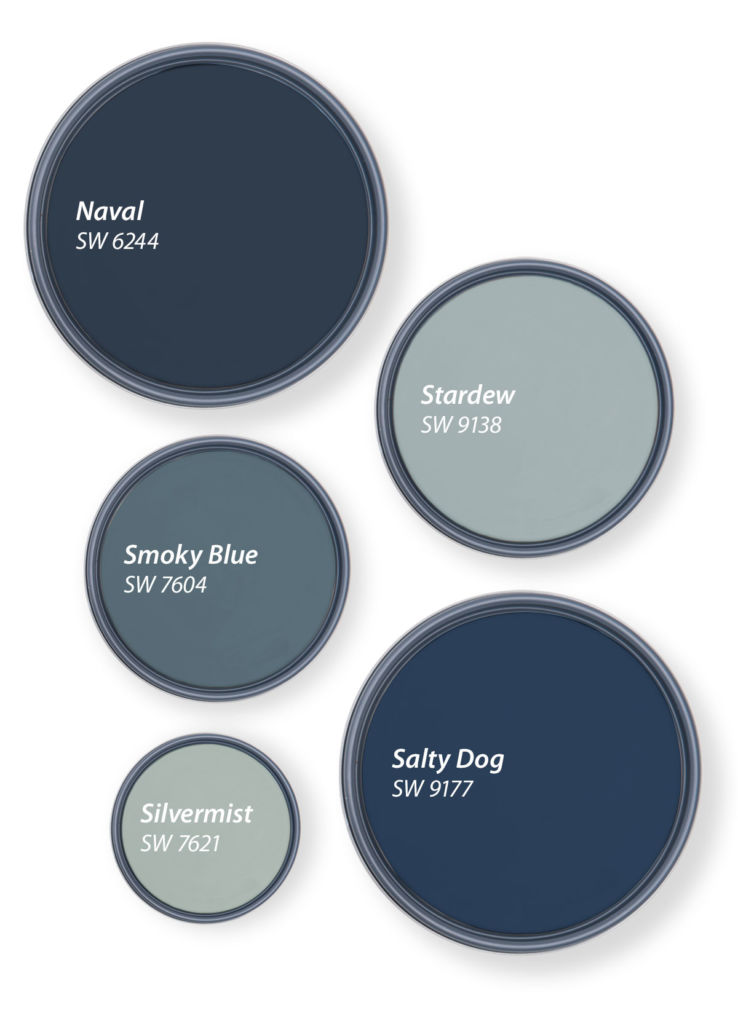
Naval
Like the night sky, Naval’s depth creates a rich background for the colors of your home to unfold. Whether they’re minimalist or maximalist, this easy-to-use hue has a knack for tying everything together.
Salty Dog
Salty Dog’s aquatic shade is easy to get lost in thanks to a saturation that feels deep and bright at the same time. This attention-grabbing neutral pairs especially well with a crisp shade of white to create a classic color duo.
Smoky Blue
Just like the name implies, Smoky Blue features subtle gray undertones that lend this medium hue a hazy look. To keep this color feeling brighter, make sure to use it in a space with lots of natural light.
Stardew
If you’re looking for a hue that’s calm and serene, an airy shade of blue might be the answer. Stardew’s breezy energy fills the room with bluish-gray color that reminds you to slow down and enjoy the time you’re spending in a space.
Silvermist
Silvermist mixes blue with a little bit of gray and green for a trifecta that’s a true chameleon. Whether it’s other paint colors or a collection of accessories, this transitional shade makes it easier than ever to mix warm and cool tones together.
Need more help finding the perfect blue? Book a FREE Virtual Color Consultation with one of our color experts to bring your color to life.


Two years ago I bought a 1970’s ranch that had not seen a paint brush or anything else for that matter. I painted the dark (very well made) kitchen cabinets an off-white to try to brighten the kitchen. I still have the original tile backsplash (white with the tiny gold flecks – I hear they are coming back in style lol). Thank goodness they are stacked instead of staggered. Also have the original countertops – white with a little graining in a pale green. Surprisingly they too are in good shape. Back to the cabinets – I’m thinking about re-painting for just a bit of color and Silvermist caught my eye. I have brushed stainless appliances, white farmhouse sink with brushed chrome fixtures. Flooring is medium oak – seems to go with everything. Walls are a shade darker than cabinets. Not opposed to painting them too. Have lots of other questions for the rest of the house but they will wait. Thank you!
Hello Jan, Silvermist SW 7621 is a beautiful color and will look great next to your oak flooring. Have you ever considered painting your kitchen cabinets in a two tone design? Think about painting just the bottom cabinets with Silvermist and then doing a soft white on the upper cabinets AND the walls. If you use a white color, like any of the options below, on the upper cabinets and walls, your kitchen will look bigger with a more cohesive palette. Take a look at these soft white options:
White Duck SW 7010
Whitetail SW 7103
Futon SW 7101
My master bedroom is painted in Silvermist. I absolutely love it and have never got tired of it. Now, we are doing the master bath. Trying to figure out what color to put on the walls. Is there a lighter complementary color to silvermist or should I just do the same color? I don’t really want to go darker.
TIA
Hi Gwen, Silvermist SW 7621 is a beautiful color so we can see why you would love it. If you want some lighter options check out Moorstone SW 9630 and Sea Salt SW 6204; either of these would be a beautiful complement to Silvermist.
We are thinking of Silvermist for an exterior house color, paired with a warm white for trim, and possibly another accent color as well. Thinking of White Duck, Shoji, or Alabaster for trim…are these (or any other colors) ones that may pair well? Thank you.
Hi Kari, stick with either Alabaster SW 7008 or Pure White SW 7005 for your trim. Those two whites do not have any muddy undertones and either of which would complement Silvermist beautifully.
I love these blues and others from Sherwin Williams! I’m currently painting my entire house in muted shades of blues, greens, greige and white. I’m considering the beautiful Silvermiste for my home office, which will have built-in bookcases along one wall that I was thinking about painting in the SW color, Sea Serpent. It’s a deep navy like Naval, but I think with a green undertone? Would this combo compliment each other? Or is Naval a safer bet. For consistency, I want to use the same deep navy color as accents in other parts of the house, including the interior side of front door near the office. So excited for the colors to come together!
Hi Heather, Naval SW 6244 would be a much better choice as both a complement to Silvermist and an all over choice for accent colors. Naval is a true navy without undertones and will work in any lighting or with any other color family.
Hi! I have City Loft for my entire home and love it, but I want an accent wall in my dining room. Would a blue color with City Loft and High Reflective White trim be okay? Please feel free to recommend some various colors other than blue as well. Thank you!
Hi Scott! A blue would work but can you tell us what other colors/finishes are in your dining room? For instance flooring/upholstery/rugs, etc.
I just tried to repaint the outside of my house national anthem blue… but i hate it.. its wayyy to bright and bold for the exterior…
what is a good blue/gray color to cover and look nice for exterio.
Hi Robyn, Do you have a color number?
Hi
Working on kitchen update. Current layout is black granite counters, oak floors, and oak cabinets. Having floor re-finished. Thinking about painting lower cabinets with smoky blue and doing the upper cabinets a creamier color (Crisp Linen) with the walls in Echelon Ecru. Want to stay out from “white” upper cabinets but want to lighten up kitchen. Will these colors work together? Thanks
Hi Bob, the two-tone look will be stunning but we do have one suggestion. Paint your upper cabinets AND the walls the same lighter shade – either the Crisp Linen SW 6378 or the Echelon Ecru SW 7574. Painting the uppers and the walls the same color will make your kitchen feel brighter, taller and more pulled together.
I need help with choosing colors.Colors for my kitchen cabinets. I would like maybe white cabinets with some blue on the island I would also like at beige wall with white tram.Could you please give me some suggestions.
Hi there! We’d like to get a better sense of your space before making a recommendation. Sign up for a free Virtual Color Consultation here: https://www.sherwin-williams.com/en-us/virtual-color-consultation