


Sherwin-Williams Director of Color Marketing, Sue Wadden, puts the focus on neutral paint colors. “There’s a very new direction in society’s ever-growing thirst for beautiful neutrals that bring warm and cool tones together,” Wadden explains.
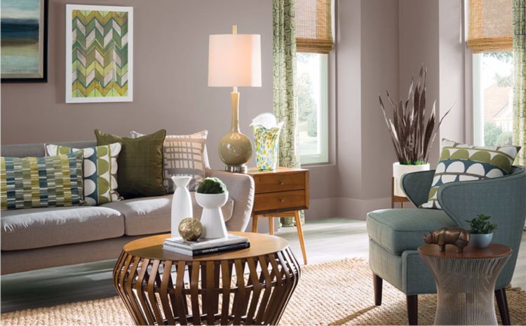
Poised Taupe
Poised Taupe, the 2017 Sherwin-Williams Color of the Year, is a perfect example of a classic, warm neutral color with a modern twist. Sherwin-Williams color expert, Sue Wadden, praises its versatility: “Poised Taupe celebrates everything people love about cool gray as a neutral, and also brings in the warmth of brown, taking the color to an entirely new level,” she says. “Not cool or warm, nor gray or brown, Poised Taupe is a weathered, woodsy neutral that brings the sense of coziness and harmony people are seeking.”
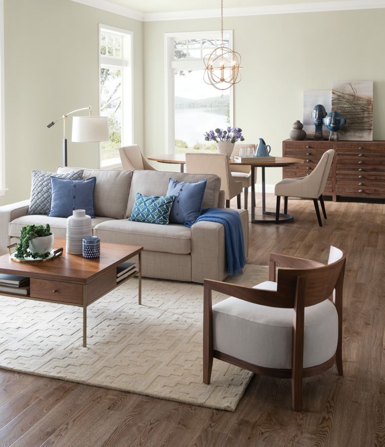
Requisite Gray
This neutral shade is clean and versatile. Use Requisite Gray to complement rich furnishings and accessories, either as a primary or accent color.
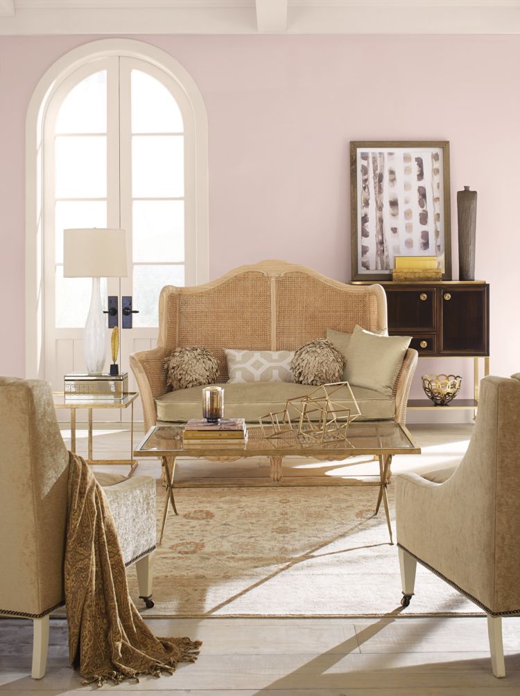
Romance
Want to add some soft, subtle color to your room? Try incorporating blush tones like Romance. This new neutral adds an understated hint of color that perfectly balances the warm and cool tones of any room.

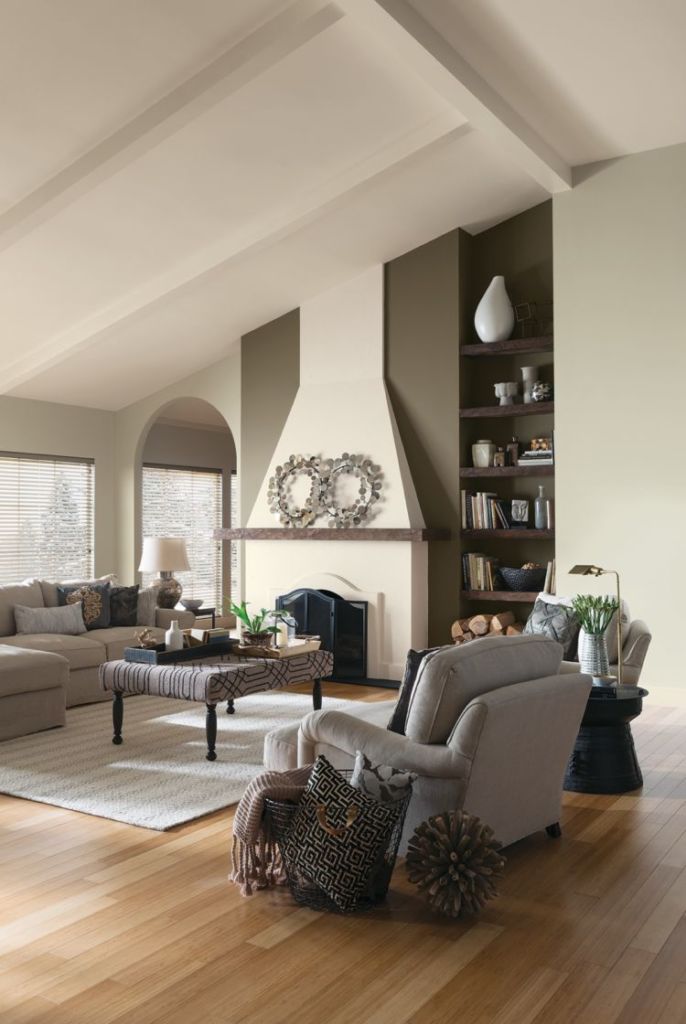
Practical Beige
DIYers are turning to warm neutral paint colors like Practical Beige to balance out a growing abundance of grays. It’s a great complement to sunset tones and the deep, rich shades in wood furnishings. Versatility allows this neutral to work in traditional and contemporary spaces alike.
Navajo White
White is a clean and stunning neutral that allows other room features and accents to pop. Use Navajo White as the foundation for a warm palette and watch your accent colors come to life.
ColorSnap® Confidence
ColorSnap® Visualizer is designed to fuel your color inspiration and spark big ideas for your next paint project. With so many ways to explore neutral paint colors, you’re just a click away from finding the one you love. Use this tool on desktop or mobile.


Hi. I bought a gallon of Romance in Emerald flat with the intention of painting a girl’s small bedroom. All of the furniture: her bed, dresser, desk and chair are a daffodil yellow color. I’m now second-guessing myself as to using Romance on the walls and ceiling. I also bought “intimate white” to paint the single north-facing window which has white Priscilla-type curtains. Would Romance clash with the yellow furniture? There also is a floor to ceiling bookcase and a non-functioning fireplace. Could I somehow use Romance on those two items? Thanks very much for any suggestions
Hi Martha! You can still rescue your Romance SW 6323 paint but it needs to be “tweaked”. Take your gallon back to your SW store and ask them to darken it one shade to Mellow Coral SW 6324. Romance & Intimate are too close in hue and tone to have any impact. A slightly warmer color like Mellow Coral will pull the bright yellow and crisp curtains all together.