


Painting with dark colors can seem daunting. Will it make the room look small? How do I keep my room from feeling like a cave? Can I go that bold? We’re here to help you embrace these bold hues and show you how they can work.
Start Small
If you’re looking to infuse some bold color into your space, but the idea of saturating an entire room has you on the fence, just start small. A feature wall is a great way to introduce dark colors into your home’s palette without going all in.
Think About the Space
When deciding to use a dark color on your walls, it’s important to keep in mind how different hues can influence the space. Crisp, jewel tones like Salty Dog can bring energy to a space, while hues like Urbane Bronze create a look that’s grounded and earthy. The color you ultimately choose should match how the room is being used.
Create Balance
Light and dark have always contrasted with each other. The breakdown is simple – dark walls are brightened when accented with a palette of bright colors, lightened when paired with soft neutrals, and dramatized when used in a monochromatic color scheme. Applying any one of these simple theories to your home will ensure you create a harmonious space when working with dark colors.
Need an experts opinion? Book a FREE Virtual Color Consultation with one of our color experts to bring your color to life.


OK that is great how to paint dark colours.
Question: how do I get rid of dark colours if I want to over paint with white !
Do I prime first or do I paint with an aluminum paint
Your thoughts would be helpful………Thanks !
Hi Ron! Priming is recommended. Please tell us more about your project and we can recommend a product.
I have used whites lots most recently updating my home. White takes many coats most often. Too heavy coats to cover a light gray. Three coats to cover a beige. Didn’t matter if it was Bher brand or Benjamin Moore. But it looks awesome
When painting using a dark cooler over a light color which color goes on top or bottom to make the room look bigger?
Hi Kimberley, one would want to put the darker color on the bottom with the lighter color on top. This scheme makes sense to the eye visually and works with your space, not against it.
In responding to a customer’s question asking if the dark color should go on the top or the bottom of the wall, you suggested the bottom for the dark and the lighter color on top. So why in https://www.sherwin-williams.com/homeowners/color/find-and-explore-colors/paint-colors-by-family/SW9179-anchors-aweigh, you use the dark color on the top with white at the bottom? Just curious.
Hi Janet! We weren’t able to tell what you referring to with the link provided. Is there a particular image you are referencing? Let us know! Thank you.
The anchors away link illustrates a different kind of scheme with dark on the entire full walls. The light color seen in the picture is trim, baseboards, mantel and builtin bookcases, not actual wall. So a different concept. The two tone concept described above alludes more to a setup where you have a wooden chair rail trim running around the lower middle of wall, creating a horizontal division of upper and lower wall spaces; that is the one where it’s recommended to paint the lower portion of the wall with the darker color and the upper portion with the lighter. The anchors away ‘full walls with dark’ works ok bc there is so much wide white accents eg trim all around and other wooden items painted white such as the builtin bookcases and mantel.
Kimberly the darker color goes on the bottom and if you are installing trim to delineate between the two, I’d install it at the 2/3 mark of the wall height.
I have used your paint before.
Awesome
I have been using Amalfi Coast (very similar to the Adriatic Sea color shown here) for years. I’ve used it in dining rooms, hallways and a library in more than one home. I Love it!
Looking for interior wall colors to compliment navy roman shades
Hi Cindy, please let us know what other colors are in your room such as furniture, flooring and upholstery.
trying to find a balance with a navy couch and shades and taupe rugs. want to paint the walls in a taupe shade (not gray) and do accent walls in a navy blue that is not too dark. suggestions?
Hi Harriet, for your navy accent wall take a look at Naval SW 6244 or Salty Dog SW 9177. Consider painting that accent color with either Taupe of the Morning SW 9590 or Loggia SW 9590.
How ’bout a tip for painting semi-gloss paints with sponge rollers *without* leaving roller marks everywhere..? My wife and I had a really tough time with this on our new interior doors, which featured a relatively dark shade of grey.
Hi Robert, Sponge rollers can be tricky especially when trying to achieve a smooth finish. We recommend synthetic covers (nylon, dacron or polyester) depending on the product used this could vary. Nap is something else to consider. Here is additional information about Choosing the Right Roller Cover.
Also very helpful w brush marks is using a paint ‘conditioner’ : Floetrol for latex/ Penetrol for oil based paint. These products change the drying speed of paint and allow the paint to flow & settle …a best kept ‘secret’ of professional painters.
Can confirm! Floetrol worked great when I painted my kitchen cabinets. There were no roller marks or brush strokes, and even the orange peel texture was at a minimum. The most prominent texture left at the end was the wood grain underneath (which was exactly what I wanted).
Use a mohair roller. I’m painting my kitchen cabinets and experimented with different rollers and brushes…and the mohair roller the best.
I just finished a bedroom feature wall with Smokehouse and the other 3 walls in Alabaster. Simply stunning.
Love this color combo, Brenda!
I have used Sherwin Williams for years! No smell, easy cleanup and in my opinion – worth every penny!
I just today used your olive in my kitchen. Getting adjusted to a small space first before going all out
I stopped in to get a sample of the Urban Bronze. I have a Sherwin Williams very similar color Intellectual ( a little more on the Grey side) Can’t wait. Painting the backboard of the bookcase dark while the frame and shelves are already painted with Emerald Pure White High Gloss. Match made in Heaven!
Definitely sounds like a match made in heaven, Robin!
I used Urban Bronze in my large bedroom – white trim and doors. I have three windows brining in natural light and French doors!! It looks amazing.
Sheri, this sounds stunning!
When using dark colors, paint the ceiling, as well as the walls, with the same color. This will keep your eyes focused on your furniture, drapes or art work along with making the room seem larger.
So we just painted my daughters room on sensuous gray. Love the color. Should we paint the ceiling too?
Hello Josi, yes, by all means paint the ceiling. Your ceiling is the 5th wall in your room and is a great place to have some fun and whimsy. One option for a ceiling color would be Ponder SW 7079 which is a few shades lighter than Sensuous Gray. A second option would be to pull a color from your daughter’s bedding, hopefully the bedding has a yellow or green in it you can use. Sensuous Gray would look fantastic with a green or yellow. Let us know if you have any other questions. Thank you!
I love Sherwin Williams paint. I have been stock piling SW paints to begin painting in February.
Good luck with your project, Gail! We are here to help if you have any questions.
I will be using the Adriatic sea in my bedroom.
Great choice, Ryan!
Sherwin Williams has a line of Roycroft colors which made my selection easier. Used’ ‘bottle green ‘ for feature wall in living room, accent in bedroom and above wainscoting in bath. Very pleased with results! Grounding and comforting.
Also used ‘naval.’ Above wainscoting in dining room. Added intimacy without smothering. Deen rich color.
Love your color choices, Carol! Sounds beautiful.
We used Anchors Aweigh as an accent wall in our master bedroom when we purchased this home last year. All the walls and ceiling had been painted grey, and winter weather in the PNW is gray enough for me. Anyway, the accent wall (the long wall behind the King bed) looks great, was easy to apply, and warms up the room.
Love your accent wall color choice, Nancy!
Painted a feature wall with Urbane Bronze and it turned out great. Its an unique color – sometimes looks black, sometimes dark brown. Our wall hangings are bright and they really pop now.
I would like to take a bold step but I’m afraid of feeling boxed in, or the color is not quite right. What can I do to determine if a room is right for a bold accent wall. And, if so, what color?
Hello Jae, don’t be afraid – it is just paint, easily removed in a year or two if you tire of the look. Accent walls look great in rooms that need a focal point; for instance, a room without a fireplace or compelling view would benefit with an accent wall for some interest. One would want to select a color already in the room, in the form of upholstery or window treatments. Simply pick out your favorite shade in those elements and go two to three shades darker for your accent wall.
I’ve used your paint in my foyer. The name of the paint is sea salt and the trim was dove white it is so beautiful I get complement all the time. Love Sherwin williams paint. And the staff are always helpful.
Thank you, Sandra! Sounds beautiful!
Would like more tips on using dark colors
Great paint!
Used Salty Dog (a dark Navy) on an end wall in my kitchen nook, side walls and trim around a window in a soft white. Love the look – put seascape artwork on sidewalls as well as a narrow display shelf with a sailboat … now I call that space my ‘Yacht Club” 🙂
Loving your color palette, Nancy!
Love the ideas…. I am using Urbane Bronze for external trim and it makes the house paint POP against the House Color
Great choice, Jeff! Love that pop of color!
I have used dark colors . Usually it is just a wall but adds depth to a room. Love your paint
Thanks, Yvonne! An accent wall can be a perfect way to break up a large room, or emphasize a great architectural feature.
Always Trying New Stuff. Did Some Nice Accent Walls In The Bedrooms & They Turned Out Gorgeous 😍
I used Urban Bronze on the outside of my house it’s beautiful. I love the color.
Sounds beautiful, Dawn! Excellent choice using our 2021 Color of the Year!
Recently purchased paint from Sherwin-Williams Paint because of an ad for a sale. Love the paint and got great, friendly service. I will definitely be purchasing again.
We love to hear that, Michele! Please let us know if you have any questions during your painting project.
I am using “in The Navy”on one wall and using Agreeable Gray on all of the rest! The trim is all white! I was a little afraid but because of Sherwin-Williams beautiful colors it is wonderful.
Sandy
Used In the Navy on my front doors and shutters. Beautiful color
Sounds beautiful, Sue!
It took three coats to get the blue just right
When painting a dark color, it’s best to use a gray tinted primer first. Then two coats of the dark color paint.
Great advice, Lori!
True…the darker the color, the more coats it takes for me, too! However, I found that I get away with fewer coats using Sherwin Williams than I do with other brands from the box stores.
I found using a tinted base coat/primer reduced the number of coats necessary especially when going from a pale original colour.
I loved the outcome, but I have to say, I didn’t love painting with a dark blue (Naval). I didn’t expect to cover with one coat, but it’s the same color wet or dry! For the 2nd coat, I needed a headlamp to see where I had been! SW, you can do better than that!
We painted one wall Dark blue, the height of the wall was a little over 12 feet, and the rest of the walls Alabaster. This was the wife’s idea. I wasn’t so sure. However the room looks unbelievable. Every one who sees the wall just loves the color. I let her pick the colors for my office, she wants one black wall and the other three a silver looking color. Again I never would have picked black, however I’m going along with her, she never led me wrong for 31 years. Bring on the black !!! LOL !
Love the dark blue with Alabaster! Your wife knows what she is doing, roll with it Joseph!
I painted all of our bedroom walls Tricorn Black with crisp white trim. Simply gorgeous!!!
Love your bold choice of color, Mona! Sounds beautiful!
We just completed painting the Master Bedroom with your Oceanside color and we love it. The contrast with the white trim is perfect. It also took 3 coats to get the color and coverage that I wanted but that was my fault for not using primer as suggested on the can.
Hi Mark! Oceanside is such a beautiful color and will make the trim really standout!
Just painted bathroom in my son’s house with Anchors Aweigh. Also paired with white wainscoting. IT LOOKS GREAT!!!
Great color choice, Mary! Anchors Aweigh will make that white wainscoting really pop!
I only use Sherwin-Williams paint. I have always done all the painting in my home and I fine Sherwin-Williams goes on the best and last.. I enjoy painting and the colors and easy cleanup is perfect.
We appreciate that, Carol!
I have dark Brazilian Cherry floors (red tint). Is there a dark hue anyone can recommend for my lower kitchen cabinets, or would any darker color be out of the question?
Hi Kristin, a darker green or gray-green would look fantastic next to cherry floors. Take a look at either Greenfield SW 6439 or Dried Thyme SW 6186.
We painted one wall with SW Loyal Blue. The other walls were a light gray, wood work was white and headboard material tan. The room has an abundant of light from the large glass sliders overlooking the Atlantic Ocean. The overall appearance is beautiful. The nightstand lights cast a beautiful contrast. The painting of one wall makes the room the showstopper for the whole condominium!
Sounds like a definite showstopper, Don!
Wanting to choose a bold color for an accent wall in a large, high ceiling master bedroom. Textiles are grey, white and cream. I want to create a cozy space. Any suggestions?
Hi Jackie, if you are looking for a bold color with your existing colors, consider using a grey family – specifically a blue-grey which would look great with your whites and creams. Take a look at either Storm Cloud SW 6249 or Downing Slate SW 2819.
I would love to see pictures with the comments. Is there a way for people to upload a picture of their painted rooms/areas?
Hi Cheri, We encourage you to look at our #SWCOLORLOVE GALLERY for room and color inspiration.
I am considering a dark accent wall on either side of a beige/gray rock fireplace with kilen beige surround walls and dark walnut colored wood floor. Should I us black or more brown or bronze tones?
Hello Mark, we think a color with a brown or bronze undertone would look fantastic. Check out:
Porpoise SW 7047
Quiver Tab SW 6151
High Tea SW 6159
I use Sherwin Williams paints exclusively. My kitchen/dining room/great room is Grandiose in the dining area and 2 sides of the u-shaped kitchen. It goes great with the Labrador laminate countertops. Above the cabinets and the rest of the kitchen/dining area is Oak Creek, as well as 2 walls in the great room. The other walls are Tiger Eye.
Master bedroom is Mountain Stream and Golden Gate. I’ve been trying to figure out what to paint the little vanity area off the master, which is separated by an arch,
Hi Julie! We’d like to get a better sense of this space before making a recommendation. Please fill out the form linked here for a free Virtual Color Consultation.
I used the Majolica Green in my large bedroom space. It looks great but I not sure I used the right brush as I experience some skipping with the roller . It is a new wall.
Hi Shelly! What size roller and nap are you using?
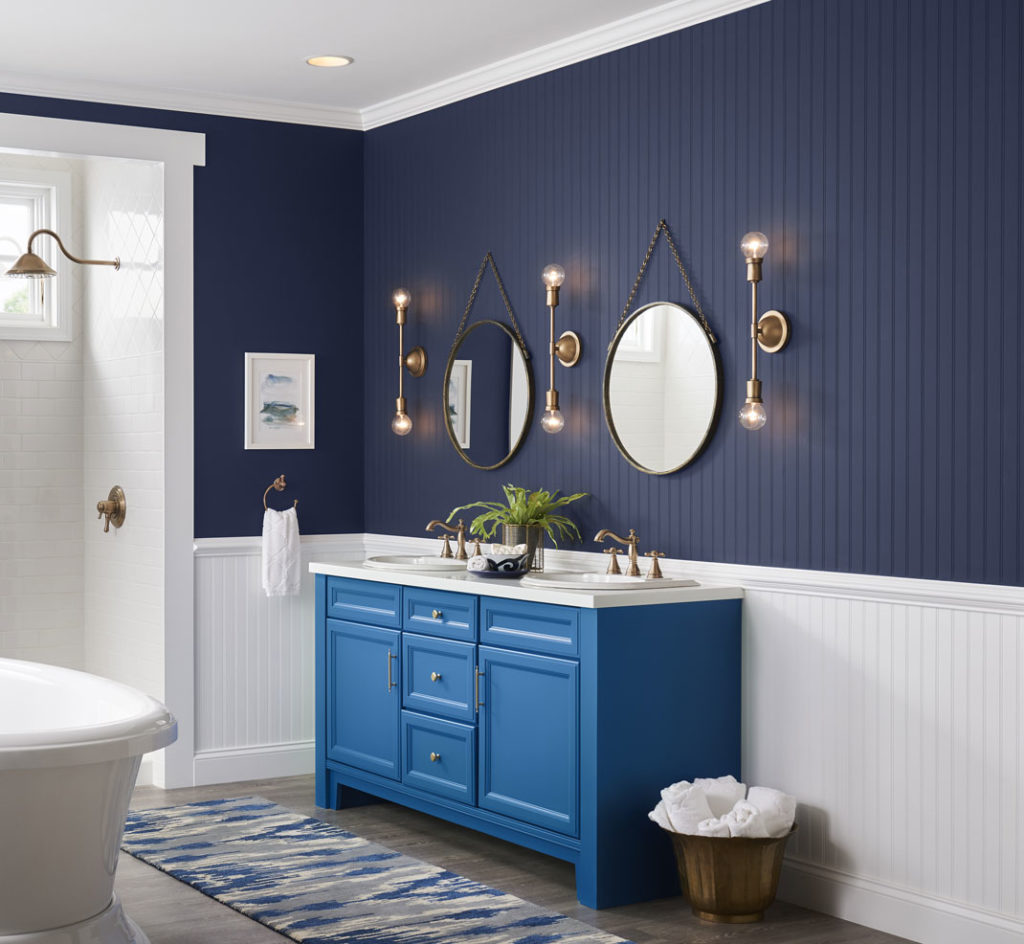
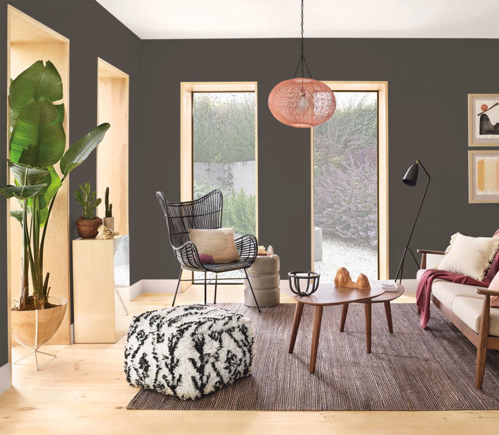
What color is used in the door and window frames in the picture above with the Urban Bronze? It appears a peachy/rose gold color on my monitor.
Hi Janet! There is no paint used on window frames of the 2nd image.
I would like to use Anchors Aweigh in my bathroom. Previously, I was told not to use dark colors in high moisture areas. Is this no longer valid?
Hi Sherril! As long as you are using a premium paint such as our Emerald line you are okay to use Anchors Aweigh SW 9179 in your bathroom. Order the colorchip today here https://colorchips.sherwin-williams.com/?colors=SW9179
I’ve used a dark S-W color in several walls that abut other walls of S-W Pure White. I have trouble making the line/edge perfectly sharp. I’ve used good quality painters tape but always seems to be some flaws. Help! I’m a perfectionist!
Hi Kathy! Is the paint bleeding under the tape or is the paint coming off when you remove the tape? Let us know. Thank you.
I recently had my bedroom painted by professional painter (highly recommended/decades of experience). Used Salty Dog, which with the white woodwork/trim looks amazing. The problem I am having is that with any slight touch, light colored scuff marks are left. I have to actually NEVER touch the walls, which is just not realistic. What went wrong?
Hi Joanne, we are very sorry that you had this experience. For this type of situation, if you have not done so already, please contact the Sherwin-Williams store where you purchased the paint. Each store is required to address any customer dissatisfaction regarding product application. Please contact the store and speak with the manager. If you have already done so, please contact us at 1-800-4Sherwin (474-3794) or by email at http://bit.ly/2Dgu0Ti.
We just finished a dining room/hallway project with Urbane Bronze on top two thirds of wall with Alabaster board and batten wainscoting on bottom third – it looks freaking stunning!!! I will see if I can figure out how to add pictures to the gallery as mentioned above.
This sounds stunning! Can’t wait to see.
I am wondering if I should paint my very large red /orange brick fireplace in a large basement rec room that gets good light with a tall ceiling. the rest of the room are grays do I go white with the fireplace or a dark color? I’m fearful that if I go dark I will not be able to paint over it with white very easily if I change my color scheme? Any thoughts? Thank you!
Hello Bonnie, you are on the right track with painting the fireplace white. Once your fireplace is white, it will become a focal point and bring additional light into the room. Then, if you do tire of the white, you can always paint it darker. Let us know if you need anything else. Thank you!
I have been messing my head trying to find a warm grey-black for my living room accent wall(Urbane bronze/Tricorn black or something else?) and a warm creamy white for the rest of the walls to go with it. Can you give me paint color ideas for black-white combinations that look good together. TIA!
Hello Jen, we think Urbane Bronze SW 7048 paired with a warmer white like Aesthetic White SW 7035 or Windfresh White SW 7628 would create the modern vibe you want.
I have old fashioned brown wood grain kitchen cabinets. I want to paint them white but i am afraid of the wood grain showing through the white paint. How can i prevent this from happening?
Hi Laney! For cabinets we typically recommend Extreme Bond Primer and Emerald Urethane Trim Enamel. Two coats of Emerald Urethane Trim Enamel should do the trick, but if you still have concerns we recommend testing it in an inconspicuous area first. For more information about painting your cabinets check out our Cabinet Refinishing guide here.
Laundry room dilemma. Currently have espresso cabinets top and bottom, but considering doing them in extra white to match trim, with Commodore blue walls. You can’t see laundry from the kitchen area but you can see it when coming in from garage and its off to the right of front door so can be seen if laundry door is left open. also there is a lower cabinet in espresso in that entry from garage that can be seen from open laundry door. Now confused about painting laundry cabinets all white or tops only. Will Commodore look ok next to espresso AND white cabinets? Or do them all white and not worry about the brown base cabinet in the hall? There are two pocket doors in laundry (so no large wall spaces) one of which leads to a den with blue furnishings…..hence the use of Commodore to tie it into that rooms color. Walls in that room and entry are in August Moon. Could use some advice asap.
Hello Barbara, Commodore SW 6524 will look beautiful next to espresso and white – a classic, timeless look. We suggest you paint all the cabinets white to create a flowing, concise palette.
Thank you so much for the reply. All white cabinets it is. Painting will start soon.
I have an open concept living space. My kitchen island is painted in Storm Cloud and I love it. I am trying to choose a paint for my brick fireplace in the same room and love either Urbane Bronze or Iron Ore, but I want to make sure I coordinate the two dark colors well. Any input? My walls are Benjamin Moore Classic Gray. Thanks!
Hi Chelsea, since this is an open concept, we suggest you use Storm Cloud SW 6249 on your fireplace. Repetition of color creates a cohesive, intentional palette and if you put Storm Cloud on your fireplace, you will balance out the strong color in your kitchen.
I have a large interior bathroom with white flooring/tub/counters and birch cabinetry. What colors do you suggest with this combination?
Hi Heather! Two color families that look great with birch cabinetry are greens and blues. Look at these options:
Greens Blues
Evergreen Fog SW 9130 Mineral Gray SW 2740
Oyster Bay SW 6206 Bracing Blue SW 6242
Dark colors do not just go on the bottom! It really depends on room size, color scheme, room function, personality!
I’m painting my kitchen cabinets in Peppercorn. The walls in the rest of the house are different shades of gray. What color do you recommend for the walls in the kitchen with the Peppercorn cabinets?
Hi TC, what other colors are in your space? Flooring and countertops?
I’m getting ready to paint my living room in off white. I have crown modeling what color would I paint that.
Hi Diane! If you want to highlight your crown modeling, use either Extra White SW 7006 or Snowbound SW 7004. Those are two clean, crisp whites without any undertones and will really “pop” next to an off-white wall. It is always best to look at color in your lighting. Order some free sample chips from our website to determine which color will work best for you.
I would like to paint an office with high ceilings a dark olive on the bottom 2/3 and then white on the top 1/3 and ceiling. How should I delineate between the two sections? Just a straight painted line or add a strip of trim to “separate” the colors bette
Hi Pat! Usually a piece of trim, referred to as a chair rail is used to delineate two colors on a wall. You can paint that trim the white of the top 1/3 or the dark olive of the bottom 2/3. A piece of trim will make the project look more finished than a painted strip.
HI how do I pair a nice saturated dark, warm color with my red oak floors, trim and crown molding. There are 2 walls of window so it gets lots of sun. I am looking for a rich cozy feeling. Fireplace is surrounded by brick with reddish grout also. I was thinking of something like Iron Ore (blue, grey, green vibe)
thanks Susan
Hi Susan! Iron Ore may be too black to be a complement to your red oak floors. Instead, take a look at
SW 6202 Cast Iron
SW 6208 Pewter Green
SW 2846 Roycroft Bronze Green