


Finding and maintaining a cohesive sense of design harmony throughout the home is a real challenge. We recently caught up with Matt & Beau from Probably This to talk about home harmony in interior design – what they think about it, how they achieve it, and how we can create it in our own homes.
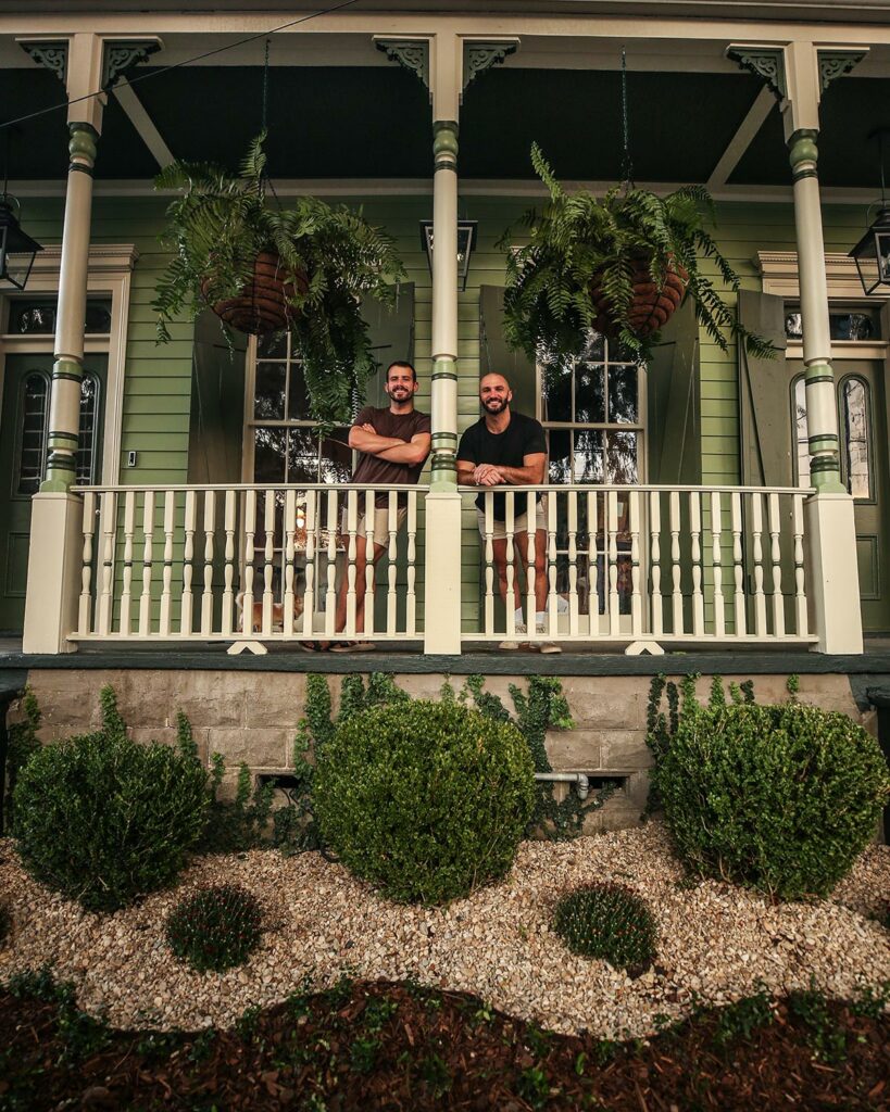
Photo Courtesy of Probably This
Featured Colors: Rookwood Jade SW 2812,(Exterior) Rookwood Dark Green SW 2816,(Shutters) Grecian Ivory SW 7541 (Porch Balusters)
Q: What does home harmony mean to you, and do you have any advice for our readers about how to achieve it in their homes?
A: We don’t believe home harmony has an exact formula, instead, we like to think of it being when each individual space of a home feels “right” as you pass from space to space and room to room. We are big believers in striving for cohesive, not uniform, spaces, where each room feels like it belongs in the home without necessarily being exact replicas of one another. The result is a home design that feels intentional, lively, and like a reflection of the occupant.
Q: How much of a role does color play?
A: Color is one of the biggest tools for creating home harmony, and it can be one of the most intimidating! Color is one of our most utilized ways of tying spaces together and creating contrast. Choosing colors that work well together while not being exactly the same takes practice, but if you get too overwhelmed, check out Sherwin-Williams color palettes. Their palettes of complementary colors go a long way towards narrowing down colors that work together. We actually used their Historic Collection palette to pick the exterior colors for our New Orleans home–using Rookwood Jade, Rookwood Dark Green, and Grecian Ivory together made for a timeless, historic look that reflected the age of the property while looking fresh and up to date.
Q: As you tackle new projects in your home, how much do you consider adjacent spaces in the design choices you make?
A: Adjacent spaces are the biggest consideration when it comes to harmony, and we often use connecting rooms to help transition between color and style selections throughout a whole home. For instance, if you have two bedrooms connected by a hallway, each room could get its own color, while the hallway color complements both and ties it all together. Additionally, incorporating decorative elements, such as wall moldings, to the rooms can help keep the flow of the spaces stylistically similar while allowing you to have two rooms that feel very different.
Q: Do you feel that it’s important to have a common aesthetic thread winding throughout your entire home that ties everything together?
A: We do feel it’s important to have common or at least complementary aesthetics throughout a home–sometimes creating each individual room as different from the next can cause that “skittles” effect that is somewhat overwhelming. That being said, there are times when it may be appropriate to indulge in a different design style, typically when the space is naturally set apart from the rest of the home, whether that be a mother-in-law suite or apartment, a converted attic space, or other set off room in a house. We chose to make our garden apartment lean into a French countryside aesthetic because that felt so relaxing for a guest suite, but it doesn’t really align with the rest of our home. We’re fine with that because it’s set apart and has its own exterior entry and feels like a distinctly different space.
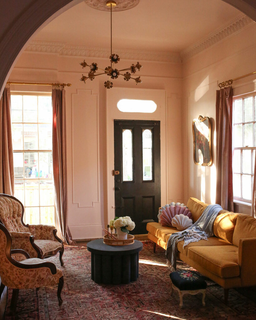
Featured Color: Intimate White SW 6322
Q: How do you allow the unique personalities of each separate space to shine while also maintaining harmony throughout?
A: Contrast is one of the most important elements of home design and decorating because it allows each individual space to shine in its own right. We will often use contrasting colors to achieve this. That being said, we like to have similarities between spaces, often relying on styling and decorative elements to create a harmonized look. You may remember our “design duel” wherein each of us decorated one of two adjoining rooms–Beau tackled the front entry sitting room and Matt took on the study. We each wanted very different color, Beau chose a blush-leaning white called Intimate White SW 6322 and Matt chose a dark blue called Rainstorm SW 6230, but tied the spaces together with the exact same wall molding, window treatments, style of art, art frames, and furniture. These two rooms couldn’t be more different color-wise, one being very moody and the other light and bright, but they feel so “right” next to each other. We love them individually as well as together.
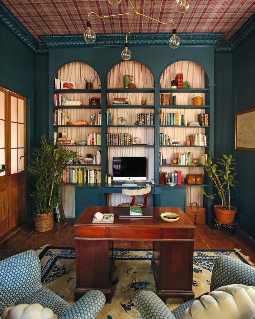
Featured Color: Rainstorm SW 6230
Q: As a pair, I imagine you occasionally have differing design opinions – how do you maintain a harmonious creative vision for your projects when you’re not quite seeing eye to eye?
A: We are actually currently in quite the battle over whether or not to paint the exposed beams in the bunk bedroom we’re building, so, loaded question!!! Having to hear someone else’s opinion on a project when you’re so sure you know what you want isn’t always fun, but it has allowed us to create our best spaces. What we typically end up doing is both making our case for why we feel a space should look a certain way, and then together judging whose idea is more correct for the room and for the house as a whole. Part of creating a harmonious home is being open to the fact that what might look really amazing in an individual room may not make sense–or be too jarring–for a home as a whole.
Q: In the initial stages of a project, what do you gravitate toward for inspiration?
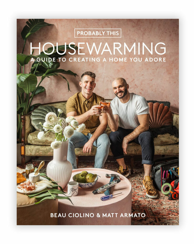
A: We talk a lot about this in our book Housewarming. The initial stages and grasping for inspiration can at times feel so daunting. We actually give ourselves the liberty to not even consider color or furnishings etc., and instead take time to reflect on how we want the space to be used and how we want to feel while we use it. It took us a long while to learn that was our happy place for starting–just a no stress conversation about what we want a space to feel like. Once we have that we can take into account the rest of the home and the design and decor needed to achieve that feeling. When we were making plans for our kitchen renovation, we agreed we wanted the space to feel exciting, energetic, and over the top, as we’d love to entertain guests in the kitchen and wanted an environment that would inspire lively and lighthearted conversation and fun. When we began considering the kitchen as one piece of the home, we knew that it would only be right to introduce one final shade of pink–a color that shows up in most of the rooms of our home. From there we made further design selections that would help elevate and ground the color selection.
Q: When planning for a project, how much do spaces speak to you, and when they do, what are they saying?
A: We tend to practice people-first design– meaning a space is meant to meet the needs of the individual, not the other way around. So we first look toward the individual living in the home, whether it be us or a client or friend, and figure out what that person wants from a space. From there we consider factors such as existing architectural features and the amount of natural light present and, yes, the adjacent rooms and design of the overall home if applicable, to make a plan.
Interested in seeing more about how Matt & Beau incorporate design and color harmony in their spaces? Check out more projects by Probably This on our influencer page and bring more balance to your space.


I’m wondering if, in Southern light, Grecian Ivory has noticeable yellow undertones? Thanks! Katherine
Hi Katherine! SW 7541 Grecian Ivory is considered a beige/neutral color but you are correct in your assumption that the color may look different in your lighting. The only way to tell if there is a yellow undertone would be for you to look at a swatch of it in your space. Grab a few sample chips of this color from your local SW store then take them home and look at them night and day to see if Grecian Ivory will work for you.