


If your walls seem to change color throughout the day, don’t worry, your eyes aren’t playing tricks on you. The type of lighting in the room, the direction it’s coming from, and even the finish of the paint itself can cause a paint color to change its appearance. The fact is that color never stands alone. So, when you’re trying to choose the perfect hue, you’ll want to consider a few things first. Read on for expert tips to help you choose colors with confidence.
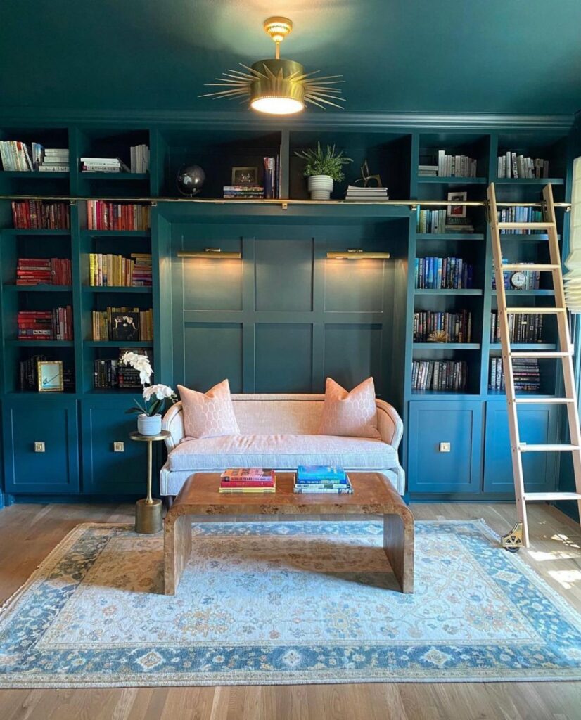
Featured Color: Cascades SW 7623
Let There be (Natural) Light
Any kind of light can dramatically change the way a certain paint color appears. Sunlight is no exception. In the morning, the lighting is warmer because the sun is lower on the horizon. This brings a warm, yellowish glow to a space. At midday, especially in rooms that receive direct sunlight, paint colors can appear cooler and more washed out. As the afternoon wears on, light from the setting sun brings a warm, reddish cast to walls. This explains why the same can of paint applied to two spaces can look and act like different colors. For instance:
- A north-facing room painted in a warm orange-red color will appear brighter and warmer whereas a west-facing room painted in that same color will become intensely vivid in the late afternoon.
- A west-facing room can look dull and shadowy in the morning but be bathed in a warm glow in the evening thanks to the setting sun.
- An east-facing bedroom that gets strong light with the early morning sunrise will look very different when seen late at night in artificial lighting.
Bottom line: Be sure to consider the presence and direction of natural light in your space before you choose a final paint color.
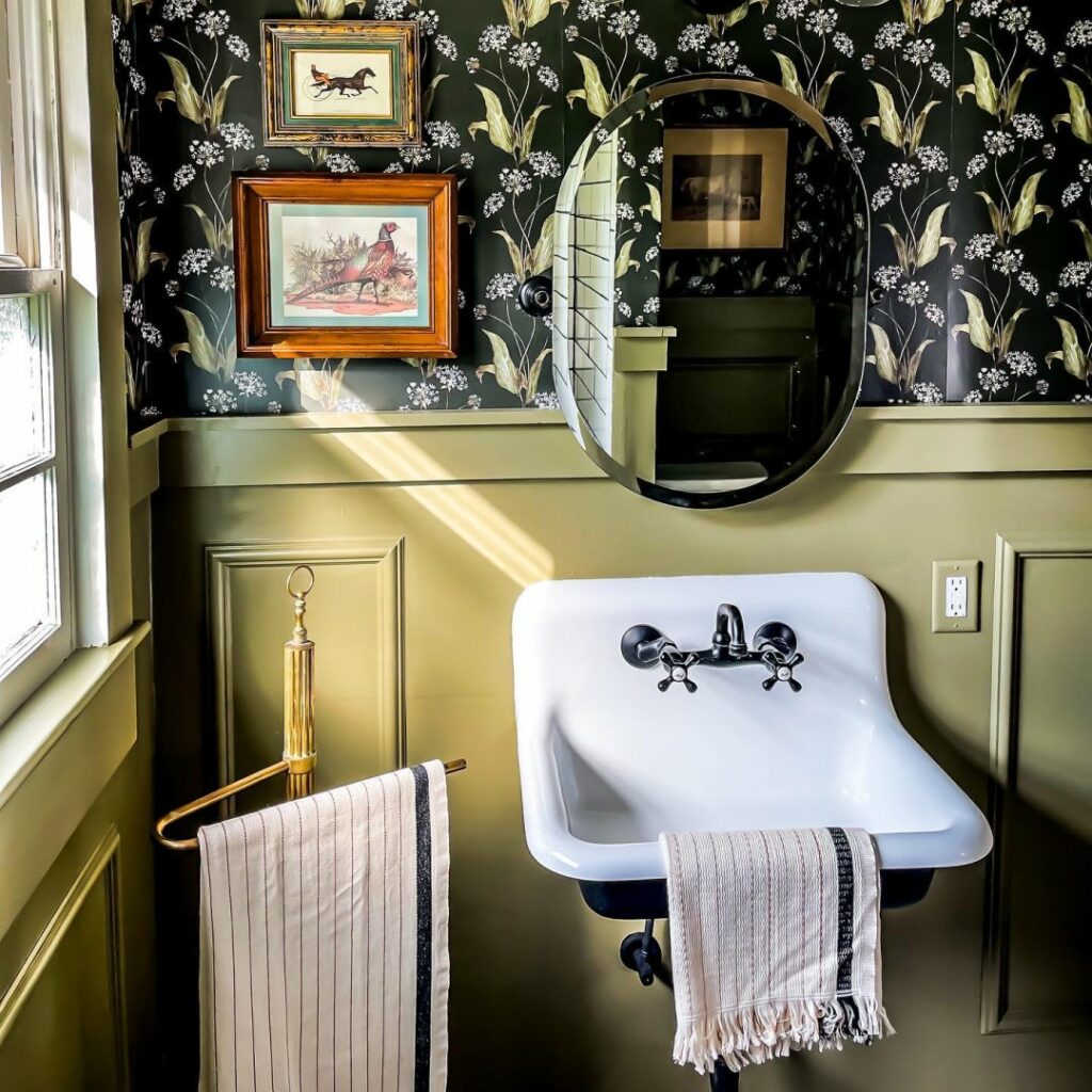
Featured Color: Messenger Bag SW 7740
All About Artificial Lighting
Sorry Mother Nature, but nobody lives by sunlight alone. Every homeowner relies on artificial lighting to either supplement natural light or replace it entirely. And the type of lighting you already have, or choose to incorporate, plays a huge role in how paint colors look. Bulbs and beyond, let’s break it down.
BULBS:
If you’ve already painted a room and feel like you chose the wrong color, it may just be your lightbulbs. Learn the differences then pick your bulbs with confidence.
- LED: Warmer LEDs produce a relaxing light while cooler LEDs emit a more refreshing light. “Smart” LED bulbs can be adjusted according to the feeling you want the room to have.
- Halogen: These incandescent bulbs produce brighter, white light that is more like sunlight.
- Incandescent: These generate yellow light that intensifies warm colors but tends to dull cooler colors.
- Fluorescent: These generate cool, blue light that amplifies blues and greens, but mutes warmer colors.
- Soft White Fluorescent: These mimic the warmth of incandescent bulbs, but all colors can appear faded in their light.
- Full-spectrum Fluorescent: Although expensive, these bulbs produce light that most closely resembles natural sunlight.
Styling Tip: To create a crisp, airy atmosphere that shows off bright colors, consider using fluorescent or halogen bulbs. For a warmer, cozier look that works well with darker colors and rich textures, go with incandescent or full-spectrum fluorescent bulbs.
FIXTURES:
When it comes to light fixture options, the choices are endless. Learn how some of the most popular types can affect paint colors.
- Sconces: These give off indirect lighting by aiming the light toward ceilings or walls. Paint colors with direct exposure will appear more intense, while those without it may feel more shadowy.
- Lampshades: These can impact paint color more than you realize. White or ivory shades will give off the brightest light. Shades with a warm hue will cast this glow onto the other colors in the room. Strongly colored shades will mute any surrounding colors.
- In-ceiling Lights: These types of fixtures direct light straight down from the ceiling which can cause the paint colors on the top edges of walls and on the ceilings themselves to appear dark in comparison.
What About Wattage? Choose a bulb’s wattage based on the size of your room and how much light you want or need in it. The higher the wattage, the brighter the light. So, the higher the ceiling, the higher the wattage should be.
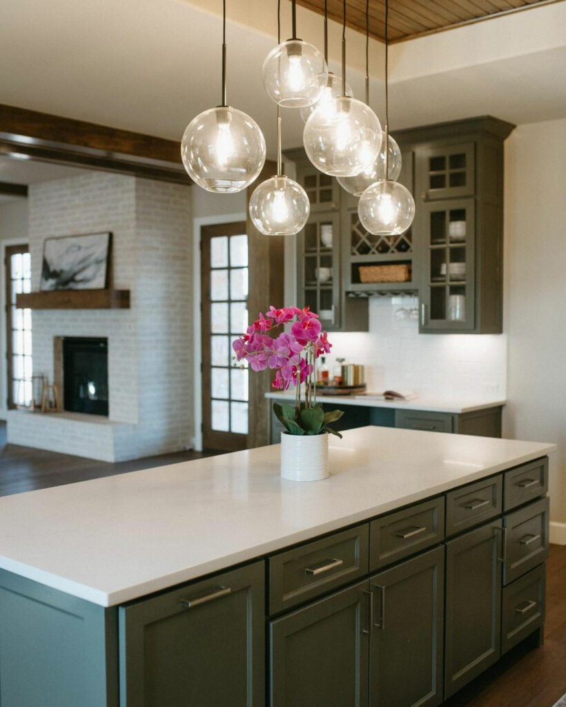
Featured Colors: Night Owl SW 7061 (cabinets) + Accessible Beige SW 7036 (wall)
Surprise. Sheen (and Gloss!) Impact Color, Too.
A paint’s finish—which includes its gloss and/or sheen value—can also drastically affect the appearance of color, especially in spaces that don’t receive a lot of natural sunlight. Technically speaking, gloss and sheen are two aspects of the same thing: the amount of light reflected off a painted surface, independent of its color. But to even the untrained eye, the two are very different:
- Gloss is shiny, crisp, and highly reflective which can significantly impact how a color looks from different angles.
- Sheen looks softer and has more depth and luster. It creates more subtle differences in color appearance and is most notable in low-gloss paints.
Every Sherwin-Williams product has a gloss or sheen number. Some have both. The resulting finish falls into four basic categories:
- Flat: No to very low reflection when dry.
- Satin: Low to medium reflection when dry.
- Semi-gloss: Medium to moderate reflection when dry.
- Gloss: High reflection when dry.
Choosing paints with slightly different gloss/sheen values can bring subtle shifts in color perception to a space. Because higher gloss paints tend to enrich and brighten color, contrasting glossy window and door trim with flat or satin walls can add depth, definition, and texture.
Ready to pick the perfect finish for your project? You’ll want to select the right product first. For detailed guidance on our interior and exterior products, including their gloss/sheen values and which rooms they work best in, check out our Gloss & Sheen Guide.
Styling Tip: Lighter-tinted paints have higher light reflectance values than darker ones. So, for a recessed nook off a main room, painting the walls in a lighter tint of the color used in the main room would lighten up the area while still maintaining a sense of flow and coordination.
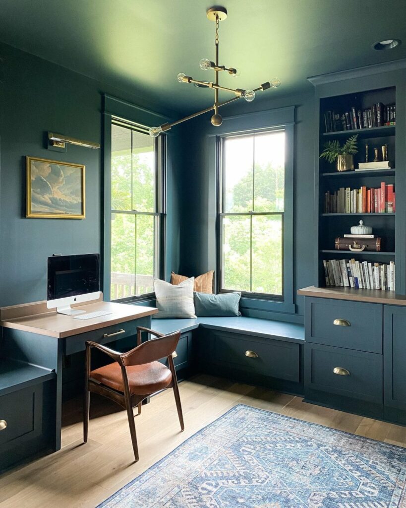
Featured Color: Mount Etna SW 7625
When selecting wall colors, it’s all about balancing the room’s lighting and decor with your paint’s finish (gloss/sheen level). Remember, these factors should work together harmoniously.
Need more help choosing colors with confidence? These tools and services can help:
- Place an order for removable peel & stick samples or FREE color chips, and we’ll mail them to your door.
- Let’s make your inspiration a reality. Book a FREE Virtual Color Consultation with one of our color experts to bring your color to life


Holy paintbrush, Batman!! This blog was only slightly less informative than a House Painting 101 course at the local H.S. This information is highly appreciated. I copied and pasted 75% of it so far, and especially exciting is the fact that the painter recommended this exact color. So now I am going after free paint chips. Thank you
Hi Sherrill! We are so glad to hear that you found this blog so helpful. Best of luck on your project!