


Sherwin-Williams Director of Color Marketing, Sue Wadden, offers up tips on how to use bold colors in your space, so your place will stand out.
Start Big
“Think of your color selection process as a funnel,” Sue says. “It’s a great way to narrow down your personal color preferences. Are you a warm or a cool color person, for example? Once you have a general idea, you can move on to things like neutral vs. bold.”
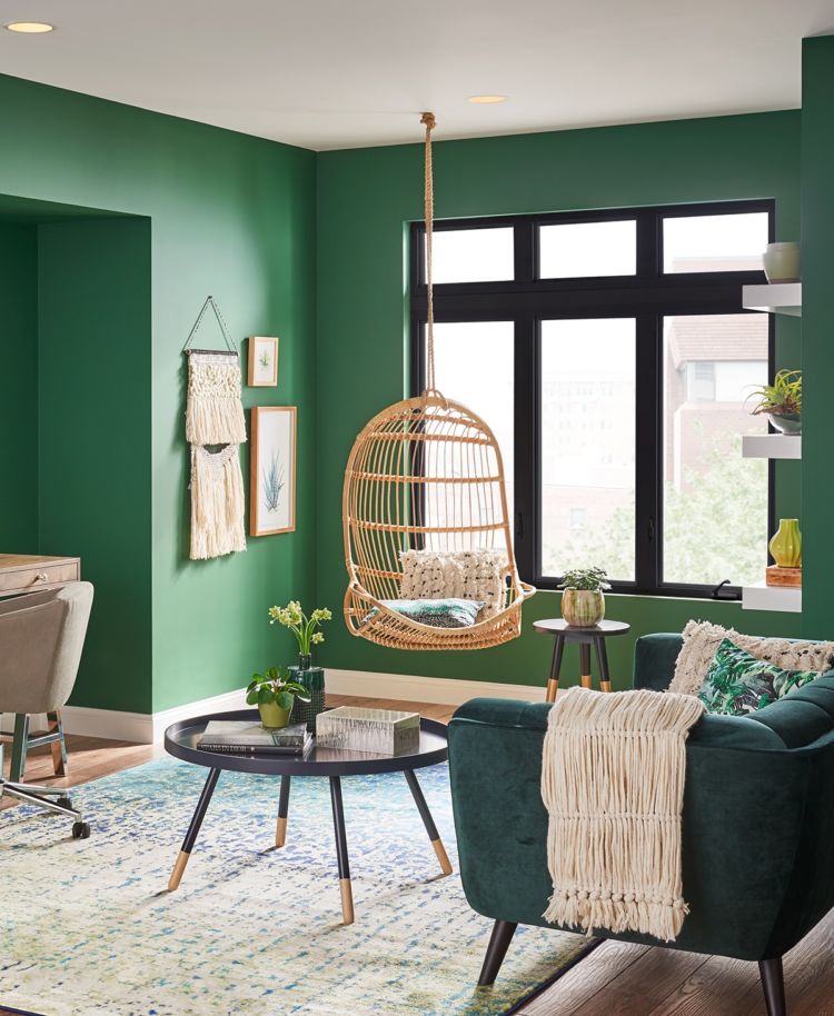
Bold Accent
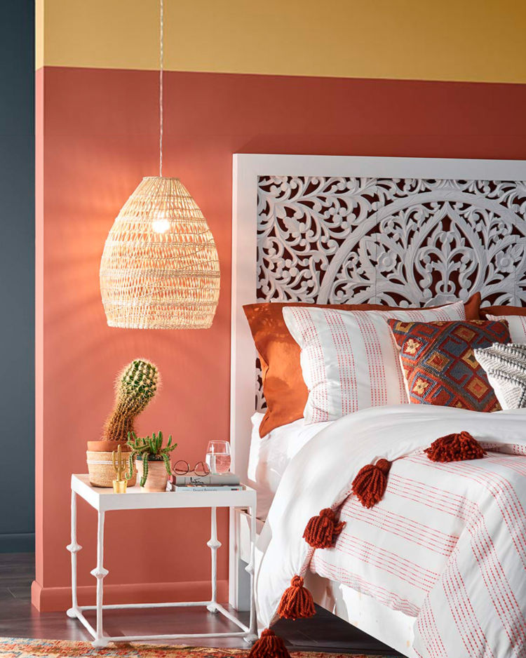
“An accent wall is all about balance. If your walls are painted a neutral color, for example, then perhaps a bold paint color with depth and richness would be appropriate for your accent wall. On the other hand, a deep, rich wall color might be equally dramatic with a light, bright accent wall color. Look at the color wheel – colors that ‘sit’ next to each other usually pair up well.”
Rule of Three
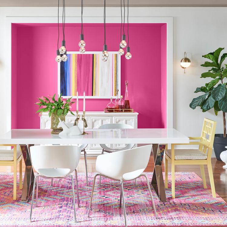
“When incorporating a bold accent wall in a room, it is helpful to coordinate with the style of your home. A great color scheme is put together with an odd number of colors – three colors in a scheme are recommended by most designers. Think: primary color, first accent color, and second accent color.”
Need someone in your corner before you commit to going bold? Book a FREE Virtual Color Consultation with one of our color experts to bring your color to life.


This message was very helpful. I also love these colors! Thanks
Very nice color
I love to use bold cool colors! Sue’s rule of three will help me achieve the balance needed to make my color choices work. Thanks!
I just picked up a gallon of green the same color as in your picture. Can’t wait to make a couple of accent walls.
Great choice, Debbie!
I want to paint my boys room using the Spiderman theme what are the wall color and trim
Hello Terrence, take a look at Heartthrob SW6866 for the red and Blue Chip SW 6959 for the blue. Also, are you open to doing one wall the blue and the other three walls the vibrant red? You could then do a darker blue like Honorable Blue SW 6811 on the trim. Let us know if these colors will work for your project. Thank you.
I used a very similar shade of green to define my entry from the rest of the living room. The walls begged to be decorated with that much color definition and the art etc. was easy to put together, including some pieces already owned and moved in from elsewhere in the house. Love the pink wall too!
What bold colors would in consideration with Aesthetic White as the primary color?
Hello there, consider incorporating a vibrant green like Greenfield SW 6439 or Leapfrog SW 6431 paired with an earthy terra cotta like Pennywise SW 6349 or True Penny SW 6355.
Thank you !
I like the suggestions.
We did decide on SW 9173 Shiitake for living room/ kitchen /family room so SW 6439 Green field is a great choice for the adjacent formal dining room.
Thank for sharing your knowledge.
We just picked Arugula for our front door last week! Can’t wait to see it painted. It’s such a pretty color.
Great choice, Kelly!
I painted the exterior of the house. Now I want do the interior. Ceiling has popcorn texture. The 3 bed room 2 bath house has all white finish except the doors that have an ivory finish, all flat sheen.
I want to paint bed rooms a softer color like beige and the living areas a whitish color ceilings also whitish. Your suggestions will be considered. I use Emerald series.
Hi Ed, we’d like to get a better sense of your space before making a recommendation. Sign up for a free Virtual Color Consultation here.
I have been selling bold colors for years. am finishing a cedar exterior was a light blueish done a few years ago by a hack and peeling terribly. we power washed using the proper solution. Painted the body a goldish with a maroon soffit and trim, with the white windows and doors, we painted the mailbox bronze and bought new house numbers in bronze. Just beautiful.
Love it! Sounds beautiful, Terry!
I Like the Gibraltar color swatch but I do not see it in the room anywhere ? Thanks !
Hi Patty, take a look at customer submitted projects under the Paint Projects tab for inspiration.
Going to get the green arugula for my bedroom i love bold colors. My family room is midnight blue with off white trim. My kitchen and dinette are smoke blue with off white trim. Ceilings are all off white as well. all three rooms are open to each other. So the color scheme has to blend well
Hi Betty! Arugula will be a beautiful bold choice!
can you get a real paint color in high gloss sample? like the colors
Hi Charles, is this for an interior project? We offer two products in a high sheen finish. ProClassic Waterborne Interior Acrylic Enamel which comes in quarts to sample and All Surface Enamel Latex. Both products are typically used on trim, doors and cabinets.
I am looking for a teal color to paint an accent wall. Any suggestions?
Hi Martha! What color is the other wall(s)?
I’m looking for a bold color
to go with Aesthetic White as the primary and shiitake as a secondary. The bold I would like to ascent a wall.
Hello there, consider incorporating a vibrant green like Greenfield SW 6439 or Leapfrog SW 6431 paired with an earthy terra cotta like Pennywise SW 6349 or True Penny SW 6355.
I wanted to chime in “about lighting” in a room. Every room has different levels of lighting “ie” brightness , and although you may love a certain color and your color scheme may match, I would diffantly sample it for a couple of days on the wall, or sample board before deciding.
So many times I’ve went for it, meaning I loved the color and just painted it then later regretting and having to redo.
For instance in my master bathroom I painted one wall “ a South Wall” on NE part of house with Passive Gray, it looks beautiful, it picked up more of the gray , but the “adjacent wall a “West Wall” looks completely different, a totally different vibe. Note: I have great lighting from a skylight in my bathroom, so perhaps that plays a bigger part in my situation. It certainly was an eye opener to see the difference in the same color because of lighting.
I was glad to see that you’re addressing bold color, but my dilemma has to do with the exterior of my house. For the past ten years I’ve had a soft, beachy, light gray with white trim and a light aqua on two shake peaks and bottom posts. I’ve really enjoyed the look but am ready to go more bold on the peaks and posts on the front porch covered in shakes . I selected MINDFUL GREY despite the fact that half the homes in my neighborhood are some shade of grey! The second trim color will be White Chill and I was going to go for more contrast with Teal but I think it’s too bright and several of my neighbors and family members do too. I really need some guidance please!
Hello Christie, if you are ready to go bold, take a look at Butter Up SW 6681 or Cucuzza Verde SW 9038– both of these complement Mindful Gray beautifully.
I’ve always said that I’m not afraid of color. For MY she-shed nearing completion, I chose colors that make me happy. Every time I see a daffodil I smile, and I have quite a collection of daffodil items (& family members to fight over it someday). SO, bottoms of walls are Vegan; tops of walls are Daffodil; the chair rail is Starboard; the interior ceiling is Mountain Air (have it many uses in our home); the porch ceiling is Porch Ceiling, lol! All interior trim is High Reflective White. Flooring is Restoration Oak in many shades of brown. Think: earth, bright spring flower, & sky!
Sounds beautiful, Dorothy!