


Probably This showed us what they can do with our Color of the Year, and we wanted more! Whether they’re bringing new life to an old space or picking out the perfect color, this traveled duo is always up for an adventure, and it shows in every DIY they tackle together.
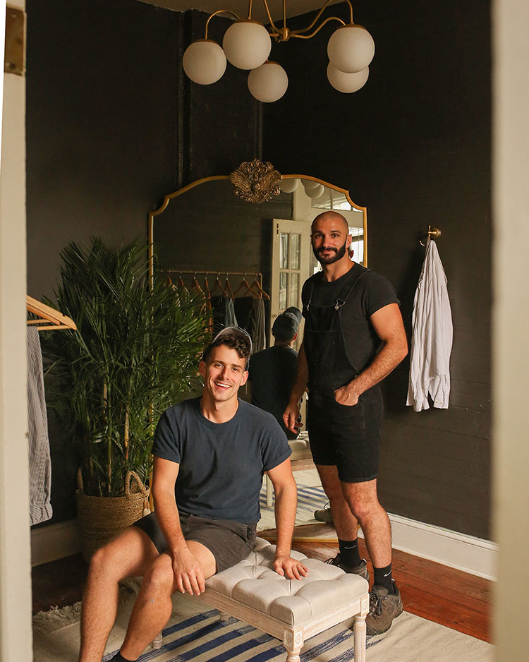
Featured Color: Urbane Bronze SW 7048
Q: Welcome to the Tinted community! Tell our readers a little bit about yourselves.
A: We’re Beau and Matt, a New Orleans-based couple that runs the blog Probably This, where we share our fav designs, DIY projects and entertaining tips! We’ve lived in eight (!!!) different homes together, if you count our vintage camper, and each one has taken on a life of its own. Our favorite pastimes are cooking together and arguing over paint swatches (we’re both always right and that’s that).
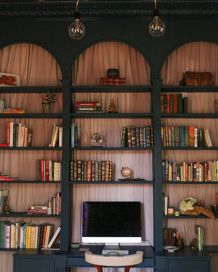
Featured Color: Rainstorm SW 6230
Q: You recently bought a Victorian-era home – what has been your favorite space to makeover?
A: Ahhhh why would you ask a question that’s going to be impossible to answer? Maybe it was the navy Victorian study? Or the open concept bedroom suite with the pink shower? Or the Garden Apartment filled with Sherwin-Williams green hues? Can’t decide. Next!
Q: Where do you find inspiration for your DIYs?
A: Usually, it starts with “we need this nice thing but can’t afford to have someone else do it,” so then we figure out how to do it ourselves. Too honest? DIYs are great for folks on a budget, and we first got into DIY because we’re always on a budget. Once you get your hands dirty with a project, the joy of getting something done right yourself is unbeatable. At this point, we find excitement in diving into a project that we aren’t 100% sure how to tackle.
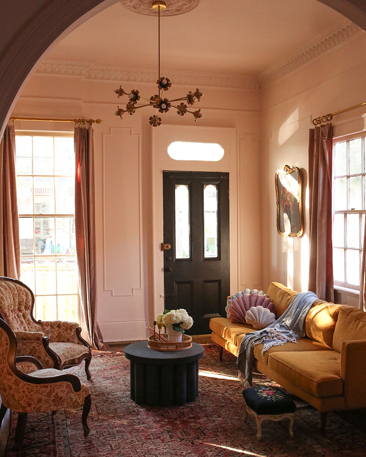
Featured Colors: Intimate White SW 6322 (Walls), Tricorn Black SW 6258 (Door)
Q: How would you describe your styles?
A: We’re both born and raised in New Orleans, so the city definitely influenced us. It’s such a unique place with French, Spanish, African and Afro-Caribbean influences that all blend together. There are plenty of Victorian-style homes painted in rich hues of the Caribbean and surrounded by tropical foliage. Really, there’s no other place quite like it.
Living somewhere so bold and unique has given us the liberty to have that same approach to home design, but of course, the “bones” of a house also have a major influence on how we choose to style it. In short, though, the best way to put our aesthetic is “earthy & eccentric” with both traditionally masculine and feminine colors and shapes to balance it all out. We lean into warm tones with nature-driven elements but always throw in something quirky and unexpected.
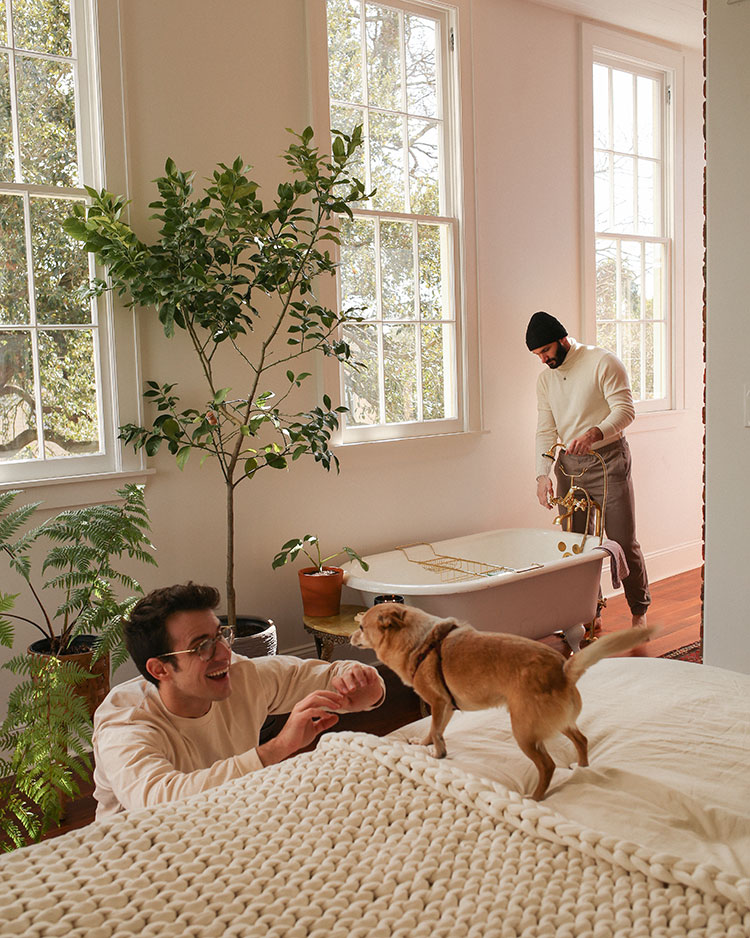
Featured Color: Pure White SW 7005
Q: All of the greenery in your home makes us smile – what do you love the most about bringing nature inside?
A: Plants are so rewarding because they act as living decor. They’re constantly changing and bringing new excitement with every offshoot. As we mentioned above, we’re in a tropical city filled with gorgeous foliage, so we want to make sure that’s reflected in our home.
Q: How do you find the perfect paint color when you’re starting a project?
A: Establishing a direction is the hard part, but it all comes down to picking out what the mood or “vibe” of the space will be. Once we have a direction, we usually go to our local Sherwin-Williams and grab a few samples to just stare at for far too long.
Once we’ve narrowed it down to three or four, we test each color next to one another in the space it’ll be used in. We test in the darkest part of the room and the lightest part of the room to see how it’ll look in each area. Then we try and convince each other of our favorite and whoever has the better argument wins!
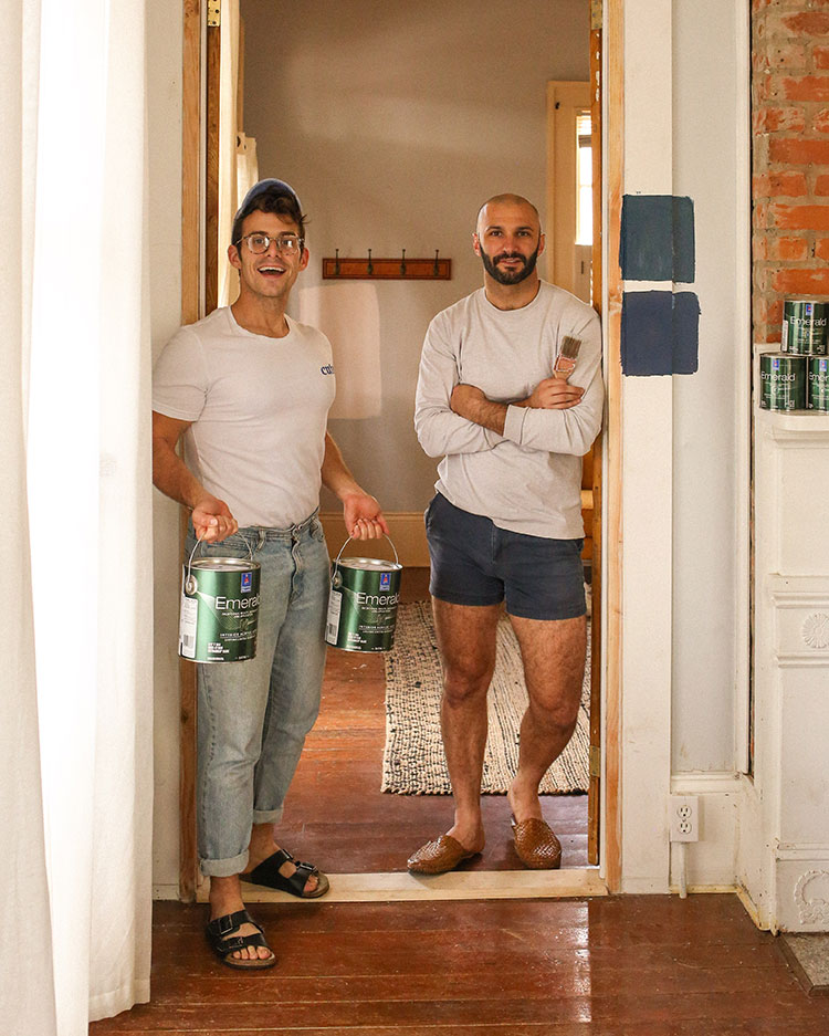
Featured Colors: Rainstorm SW 6230 (Top Swatch) Naval SW 6244 (Bottom Swatch)
Q: What’s your favorite Sherwin-Williams color and where are you using it?
A: This is hard. Current obsession? Softened Green, and that’s in our Garden Apartment’s kitchen. Biggest surprise obsession in the past year? Tricorn Black. We’ve never worked with a black that is so gorgeously…well… black. That made its way onto our entryway door and fireplace mantel. Old standby? Pure White. Because when in doubt, a classic white will do the trick! We used this color in our bedroom and workshop.
Want to check out more projects by Probably This? Visit our influencer page to see their latest DIYs and find inspiration.


Looks great, I’m planning on doing some cupboards in my 1920’s home in Garden Spot, but am having a tough time picking between black or gold pulls and knobs. I’m leaning toward black but with an unlacquered gold faucet and gold light fixture. (The floor will be black and white ceramic)…thoughts on pulls and knobs?
Hi Robyn! We think gold pulls would look fantastic.
I used Urbane Bronze on my brick wall behind my TV and it’s perfect- the color is sensational and the darkness aids in watching programs & movies. P.S. I’ve never posted on this sight before !
Love your approach!
What a great story. We also live on a budget and what a great feeling to see what we have accomplished. Of course, I use only Sherwin Williams Paint. My husband does not paint!!! I love painting. You two are awesome!!!
Love the fabric on the bookcase!
Matt and Beau,
Thank you for sharing your ideas. I love colors intimate white is gorgeous as well as softened green. My husband thinks everything should be beige or almond color due to being military and moving often.
I just finished painting my pool deck with Sherwin Williams Cool
Feel and it is so pretty. I have to do my painting when my husband is away. I really enjoy painting. Have a Blessed evening and Thanks for sharing.
Hi Sheila! Nothing wrong with a little color! 🙂
Just remodeled kitchen- wish I coukd send a photo// island & door- muted ebony; cabinets- white
Quartz count tops— painters a light gray in kitchen
I am not ready to put $ into backsplash/ I want to wallpaper
Husband says no, he likes the paint
Hi Lois, you would benefit best from a one-on-one virtual consult with one of our designers. You can schedule a “real time” appointment with a designer when you sign up. This virtual consult will allow the designer to see your space and lighting which would be the best option for your project. Click here to get started.
Hi,
Would love to see pictures of your projects where you used the softened green.
Thanks
Hi Bill, you can see customer submitted projects under the Paint Projects tab here. We also recommend trying out our ColorSnap Visualizer to try this color and others on our sample scenes or you have the ability to upload an image of your own.
I used Tricorn Black in my bedroom with crisp, white trim and linens. Stunning!!!
I really like dark colors as accent walls. Made our small kitchen a dark blue cupbards, and walls and an accent wall in L.R. some people don’t like it so much. Is your kitchen bright and cheery?
I just saw your softened green color and I just love it. I can’t wait to find somewhere to put it I was thinking my bedroom.
I need a perfect dramatic beige, not light but not too dark, for my living room with all neutral upholstery bd wood floors with a grey and beige area rug. I have tried sand dollar, kilim beige and perfect beige. Ll too light
Hello Kathy, take a look at these two beiges: Cream & Sugar SW 9507 and Beachcomber SW 9617. Either of these beiges sound like the color and vibe you want.
Towards the end of this year I plan on remodeling my guest bedroom using colors inspired by a photo I found in one of the Sherwin Williams paint brochures. About 3/4 of the way up the walls I’ll be using “WATERY”, and the remainder of the way up the wall I’ll be using “HEARTS OF PALM”, with the colors separated by molding. I’m really excited about how the bedroom will look once it’s done!
Love this combination of colors. Make sure to hashtag any photos with our paint using #SWColorLove for a chance to be featured on our website and social channels!
I have been struggling with a color for my bedroom – I have some light grey with a little cream and light beige in carpet and chair. I also have a tray ceiling that I was thinking of painting a little shade darker than the walls so the crown molding would pop. Thinking of a light grey with maybe a little blue cast for the walls (Tinsmith?) – the room has the curtains shut a lot because we are in Florida and the windows are on the west side. Any suggestions or comments?
Hello Pat, either Tinsmith SW 7657 or Front Porch SW 7651 would work for a wall color in your bedroom. You can pair either wall color with Mineral Deposit SW 7652 on your tray ceiling.