


The best part about maximalism? Anything goes – it’s as simple as that. We’re sharing some of our favorite spaces from maximalists like you that prove dialed-up style should always be brighter, bolder, and busier.
Featured Color: Moody Blue SW 6221
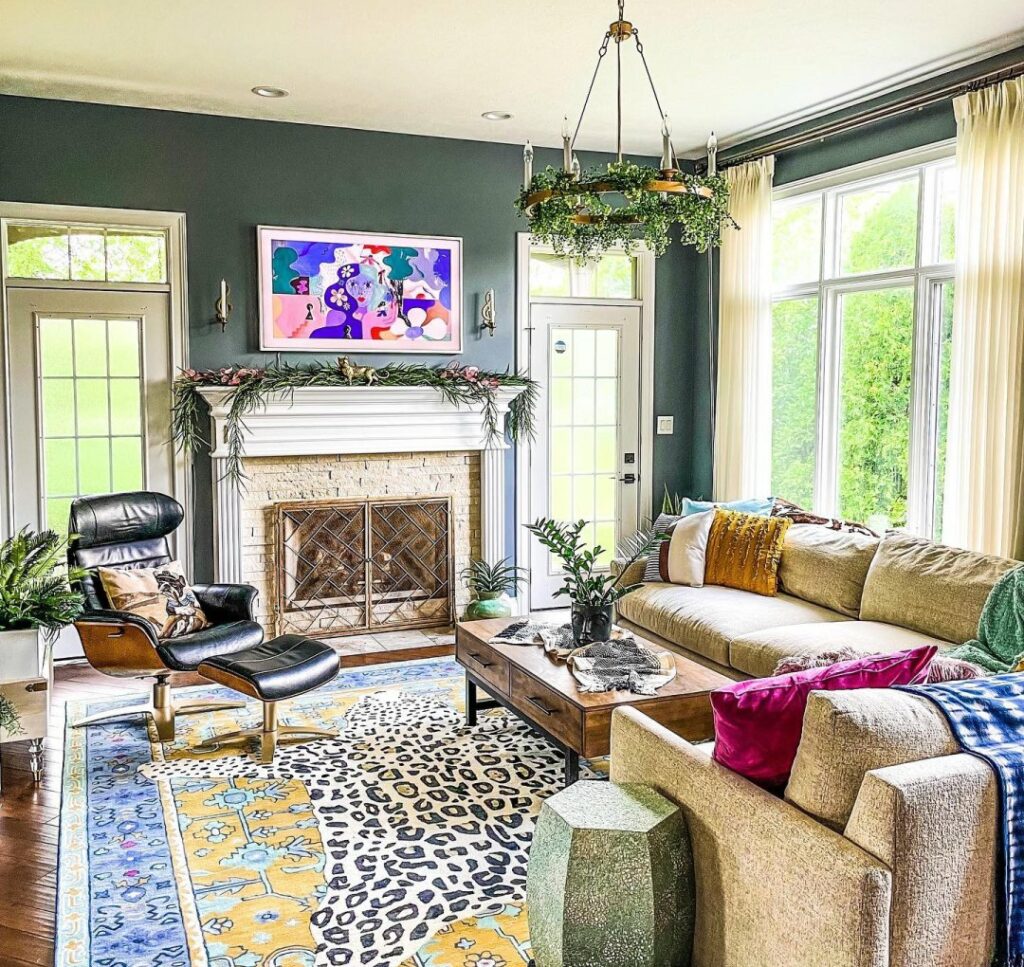
Mix it All
Throw the rule book out the window! Embracing an over-the-top look that mixes textures, genres and prints doesn’t have to be tricky. A statement hue like Moody Blue grounds the space by washing walls in a solid color that leaves you with more room to play with pattern.
Featured Color: Mount Etna SW 7625
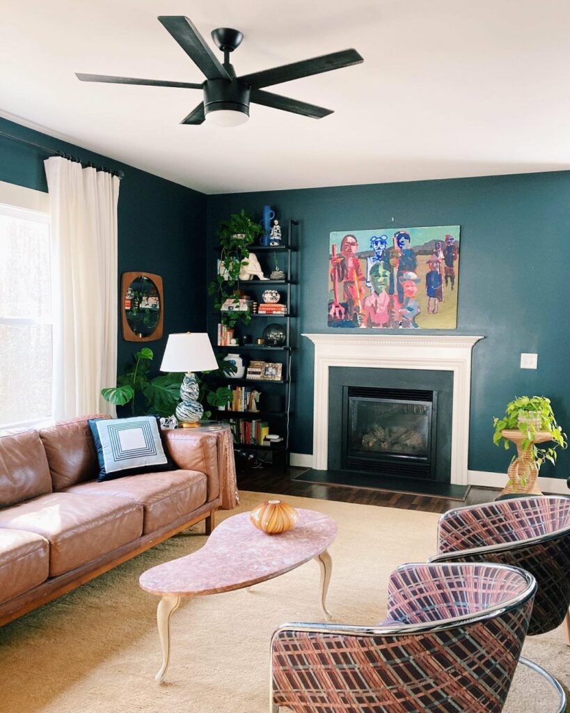
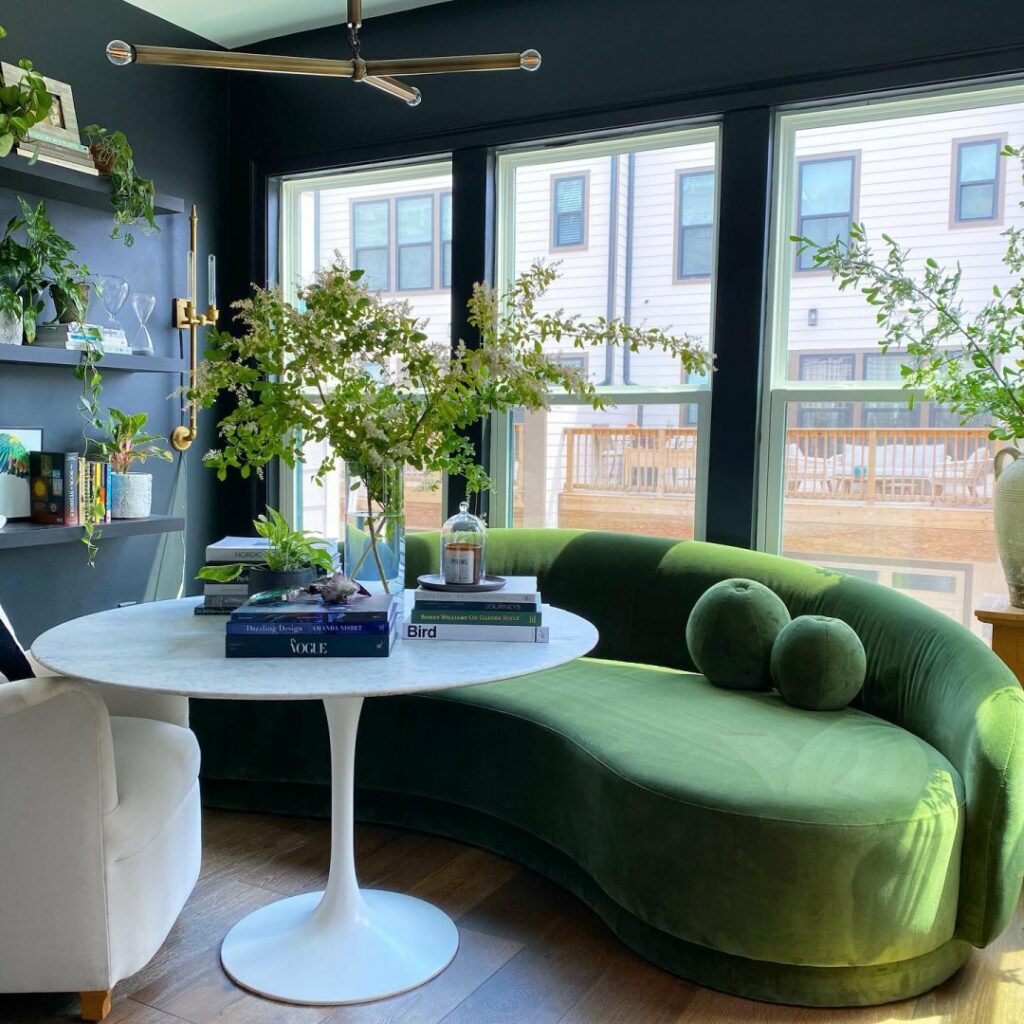
Keep it Colorful
Feeling inspired by a bold painting or patterned chair? Statement pieces are the perfect starting point to build your maximalist escape. Taking color cues from artwork or accessories lets you create a cohesive palette that always ties back to your focal point. We love the way Mount Etna was used on the walls to make the pink and teal accents in this room stand out.
Featured Color: Granite Peak SW 6250
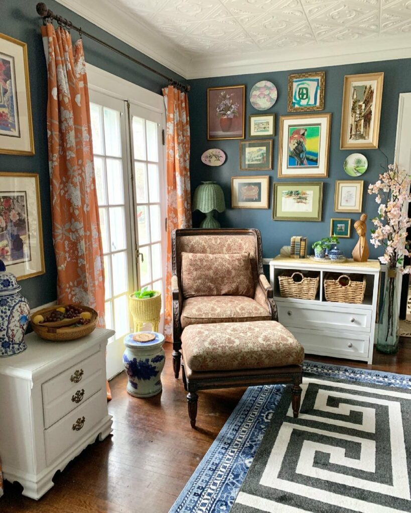
Tell Your Story
Give decor with a story a place to shine. A colorful gallery wall is the perfect space where old meets new, so you can easily work in modern and vintage additions alike. Granite Peak offers a neutral backdrop for other unexpected elements like printed floral curtains and geometric rugs to be woven in.
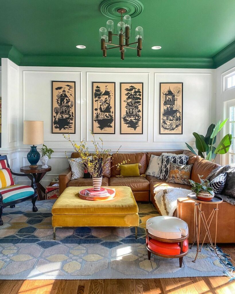
Featured Colors: Espalier SW 6734 (Ceiling) Extra White SW 7006 (Walls)
Brighter is Better
Set the stage for a burst of color and texture with white walls. Hues of equal intensity create balance in a space that puts color first. For a floor-to-ceiling maximalist look, think beyond the wall! Make the most of your ceiling space by contrasting Extra White walls with a burst of energy from a hue like Espalier.
Featured Color: Tricorn Black SW 6258
The Modern Maximalist
Black may be the absence of color, but it sets the perfect foundation for a maxed-out modern space. Offset the drama of Tricorn Black with bright, luxurious furnishings for a look that is balanced and bold. Keep accessories and other furnishings light and bright to keep the energy in the space lifted.
Feeling inspired by these larger-than-life looks? Check out these maximalist-inspired hues with our color samples and drop a comment below to share what you love the most about this carefree style that’s all about being colorful and having fun.
Featured Colors


I have built 4 homes and remodeled 4 others and have always used Sherwin Williams paint. I recently started a sunroom and went to Sherwin Williams Kingsport, TN–1532 Bridgewater Lane to get some stain for my concrete. They didn’t have what I wanted but said they would order it and call me when it came in. They never called. When I called them, they couldn’t find the order. They finally found it and assured me they would find my stain. I talked to all three technicians at the store about the stain and all three assured me it would be in and they would call me. They still have not called or gave any explanation of where the stain is. I asked them if they could find it at another location and he did find it in Ashville, NC. He said he could not have them ship it to his store. I called Asheville and she told me she could have it shipped and would help me any way possible. The customer service in Kingsport is sure not what it used to be. All three technicians, after making two trips to the store, assured me and said they would call me back. Haven’t heard from them. Very disappointing with the paint I have bought from that store in the past.
Hi Charles, your feedback is very concerning to us. We’d like to discuss the situation with you. Please contact us at 1-800-4Sherwin (474-3794) or by email at http://bit.ly/2Dgu0Ti.
I love it…FINALLY, COLOR again !!! I am so tired of gray & white.
How do I receive or print coupons for reduction on paint?
Hi Shirley! Visit our website here http://bit.ly/1OifKti for more information on sales & coupons. You can also sign up for PaintPerks to receive advanced notices of sales and exclusive benefits:http://bit.ly/1PZ4AXt. Thanks!
I have my home on SUNDEW color from Sherwin Williams. This was done when Tuscanny style was on vogue, 10-12 years ago.
I have to change the color now to a lighter color in the same tones; which color do you suggest ? My pictures and kitchen maple cabinets will not go with grays, greens, blues.
For trims and fireplace surrounding : do you recommend a satin or shinny paint ? white or a very light color of the wall ?
Thank you for giving me an answer.
Hello Lucy, Lighter tones of Sundew would be warm, golden neutrals, we have listed some options below. Consider using Extra White SW 7006 in a semi-gloss sheen for your trim with any of these warm whites:
Morning Sun SW 6672
Crème SW 7556
Fresh Zest SW 9662
Love the ceiling painted bold color. I have never done this but got the wheels turning.
It’s something different but exciting.. You should definitely consider!
I love color, especially jewel tones. I based my home decor around navy, tan w hints of orange & turquoise. I keep my living room walls a neutral tan and have a navy leather couch & caramel leather chairs. The orange is picked up by some Egyptian applique pillow covers & needlepoint pillows, a 1950s orange foot stool & terra cotta pottery lamps from the 70s. Navaho accent rugs we have collected, complement & add texture. I have some bold art on the wall. I had an accent wall for a long time & recently painted it to match the walls. i have used this palette for decades but change it up w wall color changes. My kitchen/ dining room (L-shaped w living room) is a soft mustard yellow with navy on navy leaf wallpaper below the chair rail. I have the trimwork painted in a coordinating navy semi gloss. BTW, Our Jefferson City Sherwin Williams has the best customer service!
Thanks for sharing Diane, your house sounds beautiful! We are so happy to hear that you receive great service from our Jefferson City location!