


A room is more than four walls with windows. The way the sun shines into the space can change the feeling of any color you have in your space. The same paint swatch can drastically change how it looks in a room, whether cool, warm, muted or vibrant, based on where the room faces. This guide will help you decide what colors to use in your north- , south- , east- or west-facing rooms.
North-Facing Room
North-Facing Room Light: Soft, diffused, consistent, and naturally cool.
Key Feature: Minimal direct sunlight.
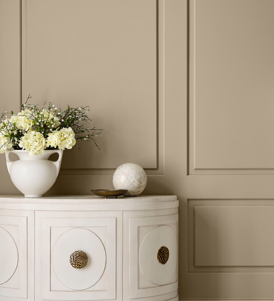
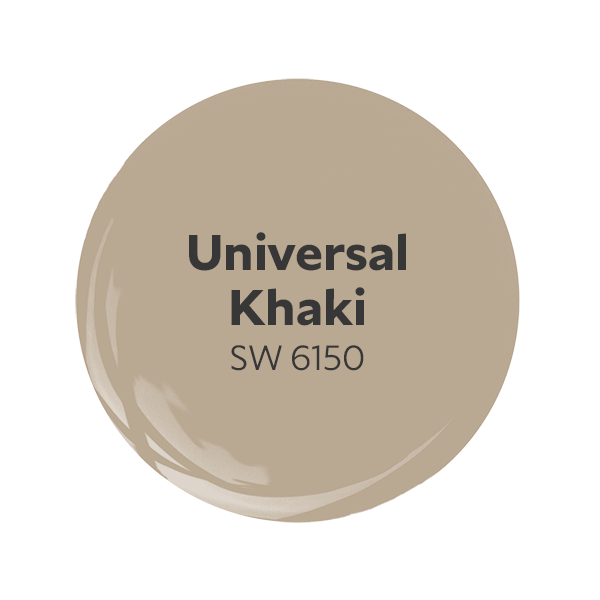
North-facing rooms have fleeting natural light that leans cool and soft. These rooms are great places for any space one may look for a soft, quiet atmosphere. With this light’s frosty qualities, peachy neutrals or sunny yellows like Lemon Chiffon or Malted Milk add a cozy warmth to the walls. Want a more true neutral? Try Alabaster or our 2026 Color of the Year, Universal Khaki, which can add depth to any space feeling bare and help you find strength in simplicity.
Take the next step and get FREE color chips from the North-Facing Room palette.
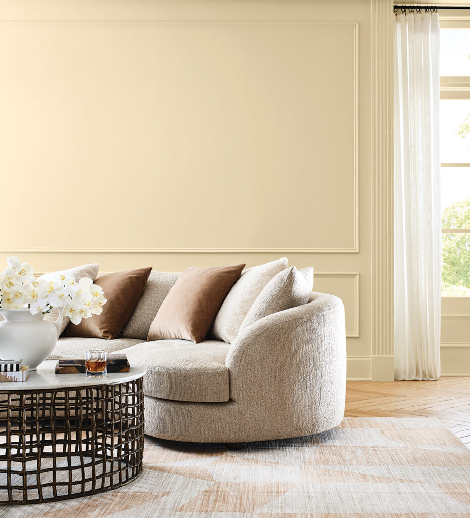
South-Facing Room
South-Facing Room Light: Bright, warm, consistent and golden throughout the day.
Key Feature: Vibrant and warmest sunlight.
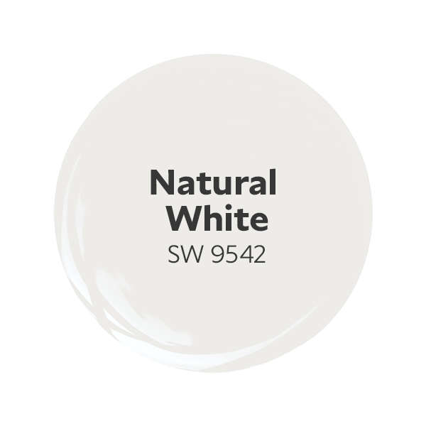
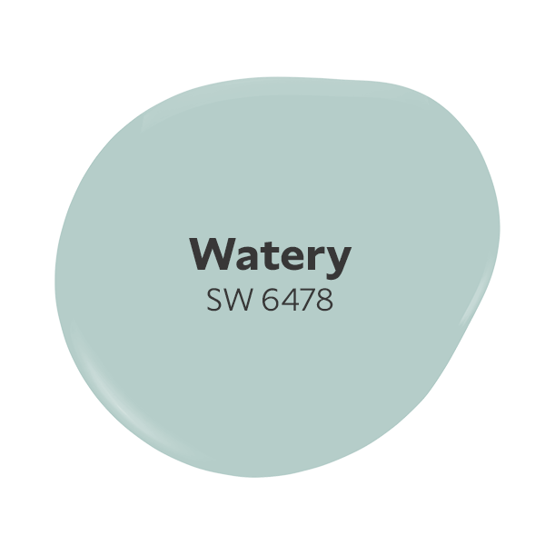
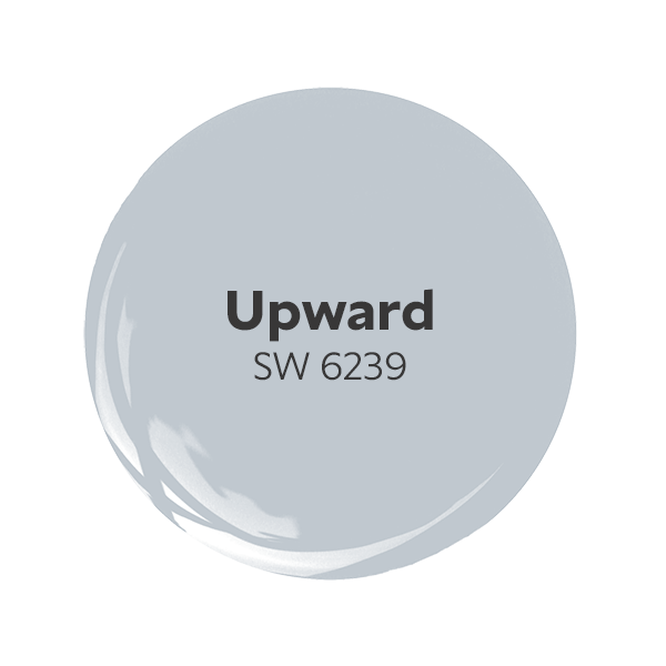
Looking for some balance in your south-facing room? Try some cooler colors to balance the warm rays coming through your windowsill. Dreamy blues like Watery or Upward act as a harmonious wave of calm in the lively southern light. You could also use this light to invigorate more muted tones such as Drift of Mist and Natural White. These south-facing light and color duos will work in any room you want brightness and warmth all day.
Ready to embrace these calming hues? See the complete South-Facing Room palette in our FREE color chips and get them shipped to you.

East-Facing Room
East-Facing Room Light: Bright, warm in the morning. Softer, cooler in the evening.
Key Feature: Fresh and energizing early; muted and calm later.
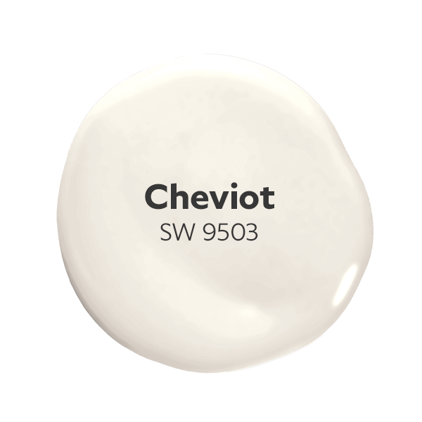
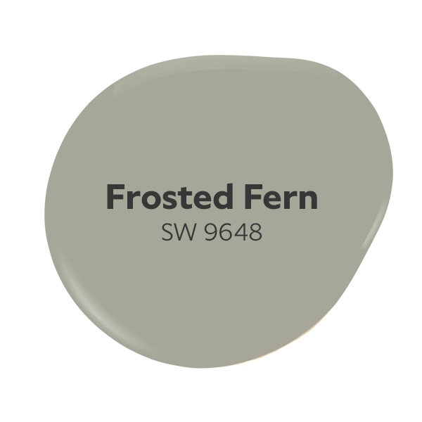
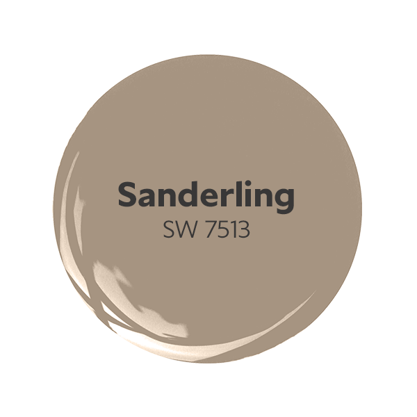
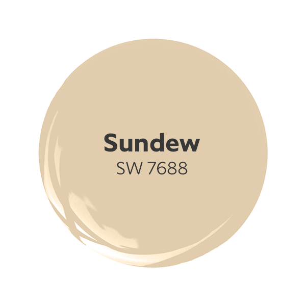
From living rooms to kitchens, an east-facing room paint color needs to be able to match the tone of light it is given throughout the day. Take advantage of the early morning sun with warm undertones, and enjoy that they can also be toned down in the setting rays of the evening. With gorgeous neutrals like Frosted Fern, Sanderling or Cheviot, you can design a space that is versatile. If you are looking for a bold choice, think of Sundew — it will embrace the vibrant morning light with open arms.
Embrace the synergy of the day with FREE color chips from our East-Facing Room palette.
West-Facing Room
West-Facing Room Light: Gentle, cool in the morning. Golden, vibrant in the evening.
Key Feature: Calm early; fiery and dramatic later.
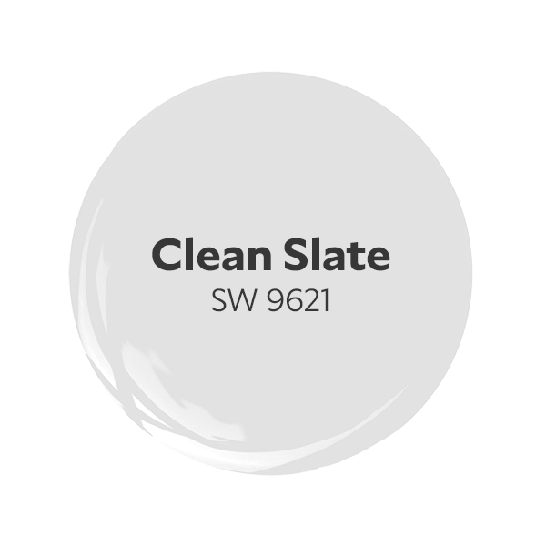
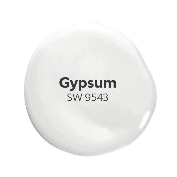
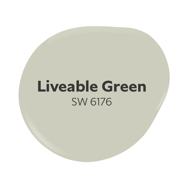
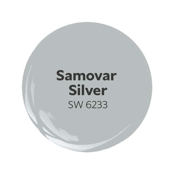
As the sun moves throughout the day, the windows let in beautiful golden-hour lighting during the late afternoon to evening. Take advantage of this special time frame with stunning whites like Gypsum or Clean Slate. These hues allow the sun to be the showstopper in these west-facing spaces. Samovar Silver or Liveable Green are great colors to balance out the warm light with their gray undertones, while embracing any guest in your home in serenity.
Get FREE color chips from our West-Facing Room palette and see how your space can take on a whole new view.
Are you seeing your space in a new light? Grab the right palette for your direction with FREE color chips for your North-Facing Room, South-Facing Room, East-Facing Room and West-Facing Room. Don’t forget to comment below and let us know which color you love or which color you feel inspired to use in your next project.
Want more project inspiration? Check out our other articles like: Feel-Good Colors to Boost the Mood or explore our feature on the Sherwin-Williams Color of the Year Universal Khaki.


I had a client who had me paint walls different sheens based on how natural light entered the rooms.
This information was extremely helpful. Thank you Sherwin-Williams. You’ll always be my trusted paint source.