


Good style never gets old, it just gets better with time. Find out how the Ephemera palette from our 2022 Colormix® Forecast takes a piece of the past and looks to the future for a modern-day take filled with the old, the new and the reimagined.
Meet the Palette
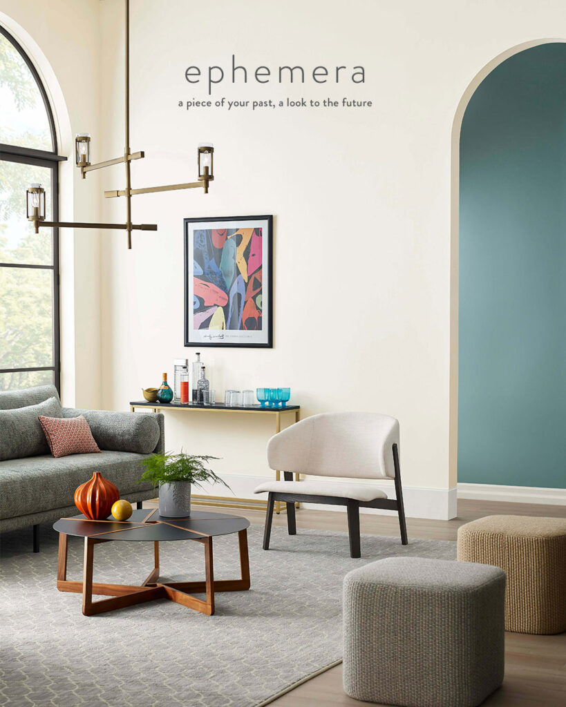
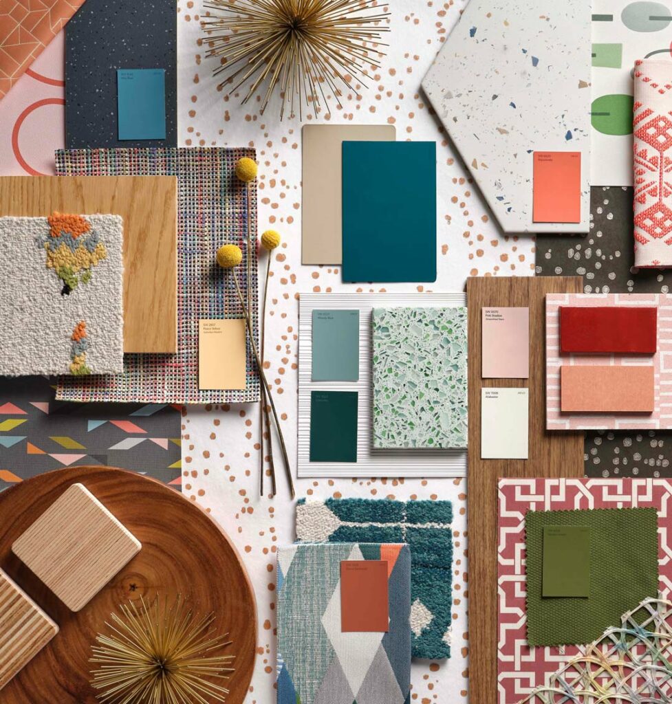
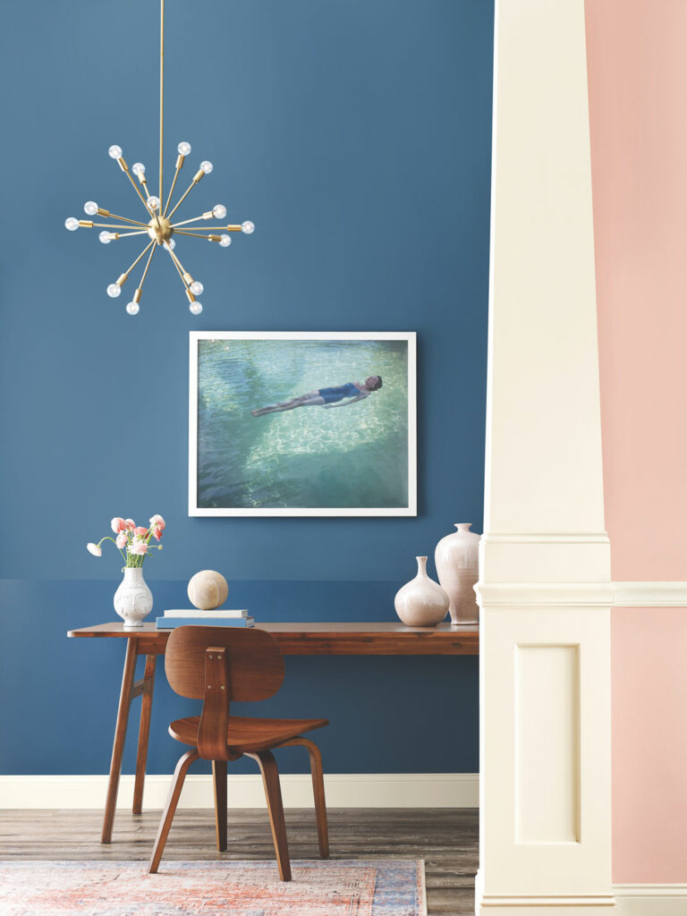
You don’t need a time machine to bring back your favorite era – all it takes is a little bit of color. Our nostalgic palette of cheerful shades instantly brings you back with pops of color softened over time. From striking reds like Sierra Redwood to bold blues and greens like Cascades, these retro musings are getting a muted update that helps them seamlessly blend yesterday’s style with today.
Influences: Nostalgia, Retro Futurism, Meaning & Memory, Optimism
Get the Look
When it comes to styling, always remember the past is for inspiration, not repeating. Nostalgic spaces might build off familiarity, but the key to making them feel personal is adding your own spin to an oldie but goodie. Mixing new finds with vintage ones helps you reimagine a pastime favorite into a modern-day take.
Thinking about adding some vintage charm to your walls? We’ve added these playful hues to your cart for FREE color chip ordering so you can find the perfect shade for your next project. Make sure you also check out our full 2022 Colormix® Forecast to see the rest of this year’s color trends.


Love these pops of color! Happy to see a new trend with array of shades other than white and grey and neutral. I’m digging the cool warmth.
Im looking for an old color called silver polished. Can you help me find the SW# for it?
Its almost a white with blue and grey undertones…beautiful
Hi Lisa! We cannot locate that color name in our archives. Could it be another name or possibly from another paint brand?
Lisa, it’s a Valspar paint. Very pretty color, but SW has better quality. Go get a sample and have SW match it!
the 2022 color forecast hurt my eyes. the last time I saw colors this ugly were in the early 80’s who were then trying to re-create the 1950’s. Sherwin Williams needs to hire a color designer with some genuine talent.