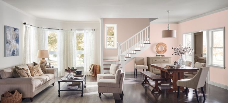
What can color do for an open floor plan? While these airy layouts have been popular for several years now, people are starting to crave spaces that are more defined and personalized.

Transitioning with Color
Open floor plans are traditionally characterized by a large room that turns a variety of individual spaces into a continuous one. The kitchen can run into the dining room, which turns into the family room and everything functions together as one unit.
While this type of flow is great for making everything feel connected, the lines can start to feel blurred when you want each room to function individually. Color can help visually divide one room from the next without having to physically close off a space. Think about a studio apartment. These single-room spaces might be void of extra walls, but when they’re painted thoughtfully and arranged carefully, every section of the room feels like its own.
Open Floor Palette
Creating an open floor plan palette is about harmonizing color to make the room-to-room transition easier. Instead of feeling overwhelmed by the number of colors you can choose, start by finding your main color. This will be the hue you build off, so it will set the tone for other coordinating shades.
Pro tip: Warmer colors visually draw you in which makes them a great option for making larger rooms feel smaller. Stick with warm hues if you want to give open spaces an intimate feeling that’s more confined.
Once you know what your main color is, think about the different ways you can build from it. It’s important to make sure that colors are coordinating, not clashing. See how we used Quaint Peche to build three palettes in a monochromatic, tone on tone and complementary color scheme. As a rule, you’ll want to keep your palette between three to five colors.
Monochromatic Color Palette
Tone on Tone Color Palette
Complementary Color Palette
Pro tip: When you’re painting with different colors in an open space, keep trim the same color. This will help create a unified look even though the wall color changes from one room to the next.
Defining your Spaces
Not sure where to draw the line? Eliminate the guesswork by looking at some of the architectural features in your space. Open floor plans might look continuous at first glance, but things like doorways, archways and beams naturally divide spaces. These features draw a line across the room to create a visual stopping point where a change in color feels expected.
Even if your open floor plan doesn’t feature natural dividers, you can get still get creative by making your own lines. Pick a corner of your room that you want to use as a dedicated space. Whether you’re turning the wall into a backdrop for your desk or creating an area to house all of your books, painting an accent wall is a strategic way to create a focal point that features a natural starting and stopping point.


Your photo above caught my eye as I am looking for a pale “peachy” color with undertones that lean more towards an orange tone than a pink tone. I am looking at Malted Milk (SW 6057), but is there a color that you would suggest that is this same tone but maybe lighter and maybe a shade more orange?
Hi Susan! Malted Milk has a very pronounced brown undertone. Consider something much softer and more feminine. Take a look at:
Alluring White SW 6343
Choice Cream SW 6357
Peach Fuzz SW 6344
Creamery SW 6358
I was inspired to try this look (different colors) in my open concept style house in IN. I saw this idea in a model house while staying in Ft Myers, FL two years ago. I did it! My entry, dining, living area, hallways are Useful Gray, kitchen/breakfast area Comfort Gray and island is painted Underseas. I am so pleased with how much brighter the house looks. The three colors compliment each other perfectly. Thanks Sherwin Williams.
That sounds beautiful, Cathy!