Clear the way for the breezy and blissful blue of our 2024 Color of the Year. Relaxed and carefree, Upward brings a gentle and uplifting spirit, ever ascending toward boundless possibility. Let your freshest ideas take flight in this dreamy hue’s timeless lightness.
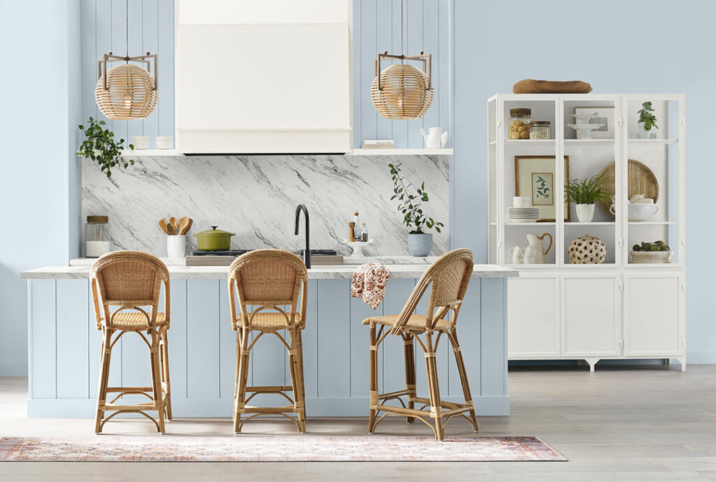
Find Your Bliss
In 2023, we brought home the warm soulfulness of Redend Point. Now, we ascend to a place of ease with a calming shade of blue that inspires the imagination. “This cool, crisp blue offers a fresh perspective and a new look,” says Director of Color Marketing, Sue Wadden. “Promoting steady optimism and tranquility, the ease of Upward encourages a gentle forward momentum to uplift us all while opening our minds to the future.” As constant and endless as the sky above, this shade invites quiet moments of contentment.
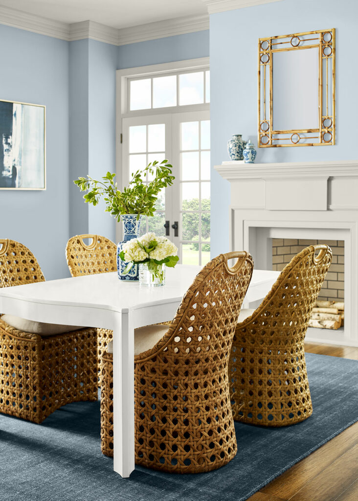
Positively Peaceful
Meant for spaces brimming with positive energy, this cheerful hue’s sunny-day vibe breathes a calming breath of fresh air into any space. Paired with crisp white accents and marble or natural stone, it infuses a kitchen space with a tranquil elegance. Or, its soothing wash of pale blue is refreshing in a bathroom, adding a relaxed calm that’s perfect for creating an elevated yet serene escape. Whether on walls or cabinets, as an accent or the star of the show, wherever and however you use it, Upward’s buoyant energy is capable of elevating any space inside or out.
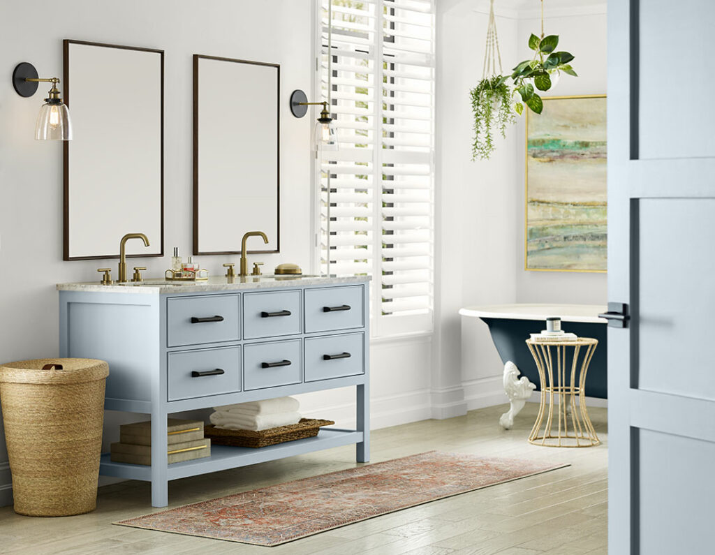
Timeless Harmony
The subtle, transitional nature of this hue easily blends with other colors. “Upward is amplified by the dynamic collection of on-trend hues,” says Wadden. This year’s mix of colors has a classic but fresh feel perfect for crafting calming environments that exude harmony and a sense of enchantment. “From crisp and clean to bold and earthy, the palette provides range for creating bright areas with a fresh sense of fun, but also depth for more reflective, sanctuary spaces,” noted Wadden.
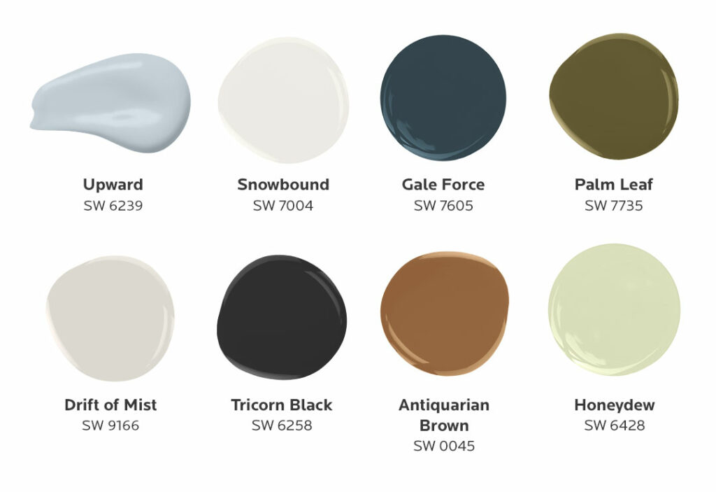
Ready to let your imagination soar into the blue? See this uplifting hue with its coordinating colors in person with FREE color chips! For personalized guidance, book a FREE Virtual Color Consultation to bring this color to life in your own space.


Your “color” of the year is hardly a color! IT’S GREY! Grey is black and white mixed together, black and white are technically not colors. All your colors of the month are some shade of grey or beige or even greige. This is one reason people are in such foul moods these days, and yeah myself included!
Hi Shannon, this color is actually a breezy and blissful blue that reflects calmness and tranquility. Everyone needs the gentle and uplift in their everyday life and that’s what we’re pushing with Upward!
For those who think gray is made with just black and white you are incorrect. You use black and white as a base . You add blue ,red or yellow to get the correct shade of gray .
Wow! Every room in my house is grey with a versatile tone. Grey is the most easy color to work with if you know what you’re planned outcome is. Grey has an undertone of every color that can be enhanced with a contrasting color.
This is my favorite color. I wanted to paint my whole house this color because it is so calming and makes my heart so happy as soon as I see it. I do agree the word blissful describes it. Thank you for creating colors that are not only beautiful but also can bring a person inner joy and peace.
Hi Leigh! We’re beyond happy to hear comments like this. So happy you are loving our 2024 Color of the Year and that it brings you pure bliss and relaxation all 2024!
Relax Shannon, it’s only paint.
Love this color in the kitchen setting. I think it would also be great for the ceiling of my porch. Will have to check it out.
It would be beautiful as a ceiling color as well! Best way to find out is by testing out a sample first and making a decision based on that. Good luck, Diane! 🙂
I’m glad I’m not the only one that thought this was perfect shade of haint blue! 💕
I love it. It is relaxing and for a punch of color you can add with furniture and accessories without having to redo the whole room. I do not want to be trapped in a room that I have to redo the whole thing every few years.
Agreed, Jamie! You can use Upward SW 6239 in so many different ways. This color is nothing but blissful and comforting. 🙂
So Pretty! It has a nice subtle blue tone in it which is very 2024!
Shannon, I agree with you, plus the sample looks way darker than the posted picture with the supposed color.
The look of this color on the screen/paint swatch does not do it justice! The beautiful and calming light blue hue is perfect for my baby boy’s nursery!