


March 2024
Color of The Month
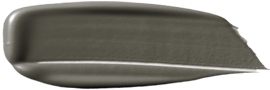
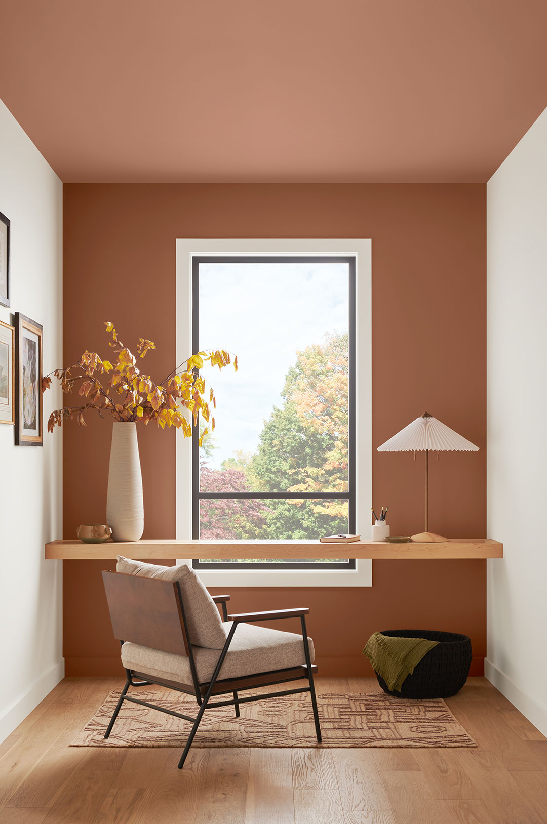
Roycroft Bronze
Green
SW 2846
Find renewal with a rejuvenating dark green. A rich hue like Roycroft Bronze Green evokes the tranquil atmosphere of a deep, shaded forest.
Why We Love It
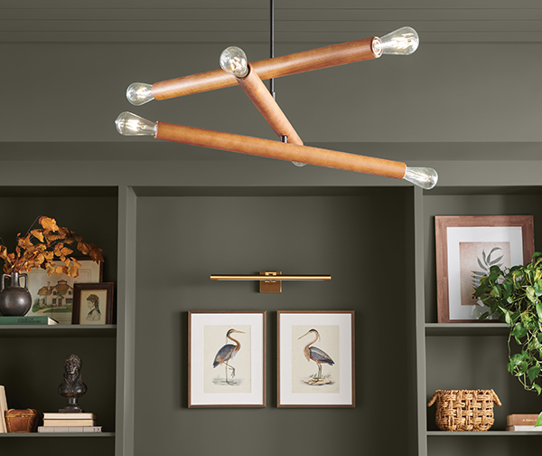

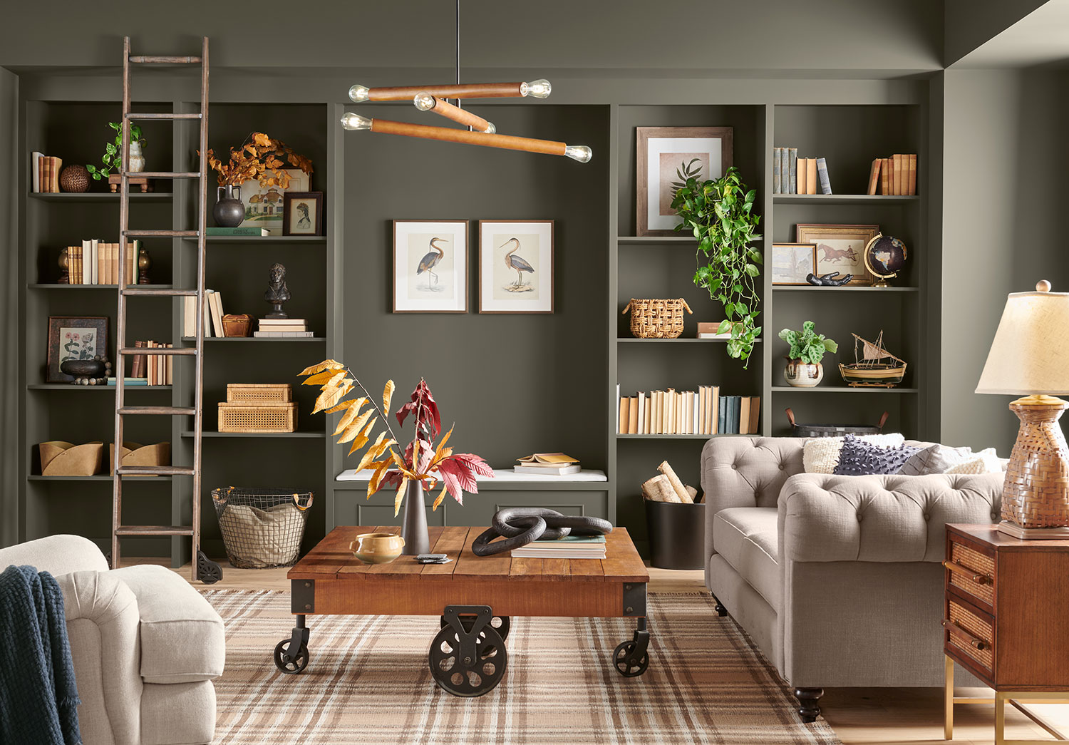
Nestle Into Nature
March is that time of year when the earth wakes up to find itself green yet again. Our Woodland Retreat palette is a timely nod to fresh, nature-inspired color. At the center of the collection sits Roycroft Bronze Green, a versatile forest green that effortlessly captures the calm serenity of the outdoors. This moody shade’s earthy character envelops interiors with an easy, inviting feel perfectly fit for a modern rustic look.
Get the look: Mixed Textures, Handcrafted Items, Organic Shapes, Greenery
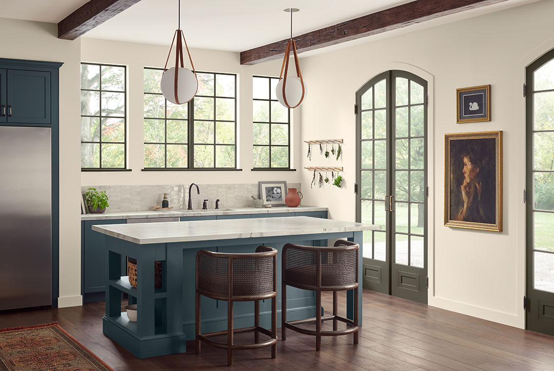
A Little or A lot
Roycroft Bronze Green makes a statement whether in large or small doses. Just a hint of this shade on doors or trim ties the space together with the library, creating a harmonious room-to-room color story. White Sesame walls create a clean, uncomplicated backdrop for Tarragon‘s compelling blue-green shade to stand out on cabinets. The slight warmth from White Sesame emphasizes the impression of a relaxed yet elevated style.
Get the look: Natural Light, Simplified Palette, Wood Tones, Clean Lines
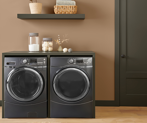
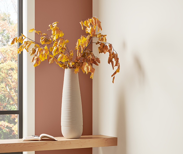
Snug Spaces
Wheat Penny‘s sunbaked, terracotta tone radiates cozy and comforting warmth that easily fills any space. Its humble, earthy energy is grounding, creating a sense of laid-back sophistication. Organic accents and natural materials connect to the outdoors and add to the nature-inspired vibe of the look.
Get the look: Earth Tones, Natural Light, Raw Wood, Natural Elements
Ready to get close to nature with Roycroft Bronze Green? Get FREE color chips delivered to see the whole Color of the Month palette in person! Need personalized, expert guidance? Book a FREE Virtual Color Consultation with one of our color experts to bring these shades to life in your home.
The Woodland Retreat Palette
Colorsnap Tools®
When inspiration strikes, our tools make it easier than ever to explore different colors and virtually try them on.
Color Samples

Found a hue you love?
Bring it home today with ColorSnap® color chips or a Color to Go® sample.
Store locator
Head to your neighborhood Sherwin-Williams to bring your project to life.

I like it.
I like it. Works well together. Good ideas for decorating. Thanks for posting and giving us new ideas ‘
DOES 2468 HAVE A LIGHTER COLOR IN THAT SHADE?????? IT IS NO WHERE ON YOUR COLOR CHART AND HAVE TYPED THIS 4 TIMES, AND TRIED TO GET TO YOU CHART 8 TIMES. yOUR WEBSITE IS TERRIBLE.
Hi Karen, this color is part of the Lowes HGTV Home palette. The color is Balanced Beige HGSW 2486: https://www.lowes.com/pd/HGTV-HOME-by-Sherwin-Williams-Balanced-Beige-Interior-Paint-Sample-Actual-Net-Contents-8-fl-oz/1000879660
We do have Balanced Beige SW 7037 and the next lightest shade is Accessible Beige SW 7036: https://www.sherwin-williams.com/en-us/color/color-family/neutral-paint-colors/SW7036-accessible-beige