


With a belief of building on the past and crafting for the future, Rejuvenation’s collection of lighting and hardware is paving the way for the next generation. We sat down with our Portland-based partner to talk about their 2020 Spring/Summer palette and how those hues work with their furnishings to design a space that feels timeless.
Meet the forces behind our latest collaboration with Rejuvenation – introduce us to you!
CR: Hi, I’m Carolyn Richardson, and I work on the art direction for Rejuvenation’s photography and marketing.
ED: Hello, I’m Evan Dublin, and I’m the Creative Director at Rejuvenation. I work on all things creative including product design, art direction and creative marketing campaigns.
This is your first seasonal palette with us! What role did each of you play in curating the 2020 Spring/Summer Rejuvenation palette?
CR: I pulled lots of images from Instagram, Pinterest and news feeds for home interior trends that I’m seeing. Then I created mood boards and layered everything together with our product palettes to see what color choices would be the most complementary and seasonally relevant.
ED: We also wanted to make sure the palette we pulled together would work cohesively with our product line and layer with the brand. Working through the palette, we found ourselves bringing in colors, swatches and materials from across our product categories, like the metal finishes we use in our lighting and hardware, and our range of upholstery fabrics, and textiles.
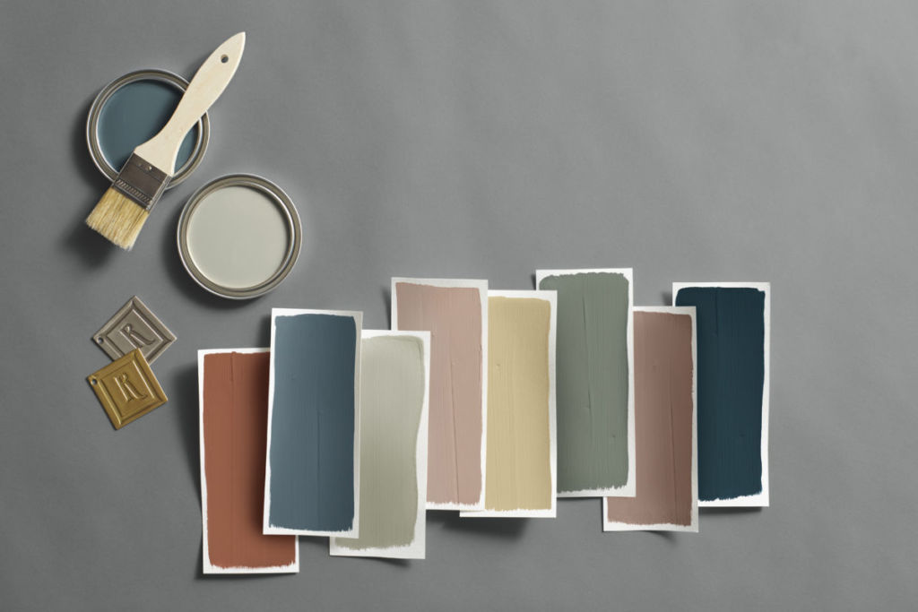
You were inspired by early archivists who gathered inspiration from nature to document colors. How did that inspiration lead to the 18 hues you wound up choosing?
ED: A lot of the creative decisions we make at Rejuvenation are rooted in a balance of historical research and trends. When looking to the past for this project, we collected a number of books that taught us about early pigment trade routes and the use of colors in interiors, as well as the evolution of color combinations through time.
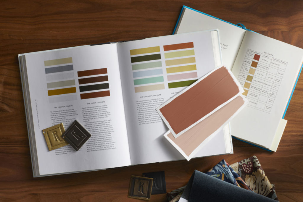
One of the most interesting books we referenced was an archive, Werner’s Nomenclature of Colours, where he studied like colors and hues across nature, looking to animals, vegetation and minerals for research. The book helped us create the earthy, natural palette we’re presenting for 2020.
Bold colors are getting a lot of love in the new decade. Can you share a little more inspiration behind some of the seasonal statement colors you chose?
ED: The statement colors we’ve chosen are meant to be backdrops for someone’s space. They’re earthy, natural and almost subdue to blend into an environment where they’ll enhance focal points like someone’s statement lighting or solid natural wood furniture.
Kitchen remodels are flooding our Pinterest feed right now – what kind of lighting and hardware trends are you noticing in the kitchen and how is color impacting these trends?
CR: We’re seeing people use the kitchen to make a bold statement. Instead of the all-white kitchens from a few years ago, we’re starting to see more adventurous choices. Someone might choose a neutral cabinet color that allows hardware in a bold finish, like dark oil-rubbed bronze, to stand out, or they could take a maximalist approach by pairing rich hues of green and blue with equally bold brass fixtures. Either way, people are taking more design risks in the kitchen to create a space that stands out, and we couldn’t be more on board with this personalized approach.
Which hue from the 2020 Spring/Summer Rejuvenation palette is your favorite and where would you use it in your home?
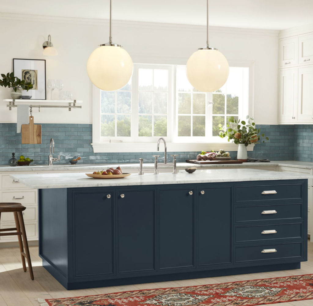
CR: I’m excited about Dark Night. This bold shade of blue has a rich warmth that’s great for making kitchen cabinets and exterior doors feel inviting. I’m also really loving Fawn Brindle for a neutral choice that still has lots of character. Its versatile shade pairs well with all of our hardware finishes so I’d love to use it on kitchen cabinets or in other functional spaces like entryways and mudrooms.
ED: I’m personally drawn to Greek Villa – it’s the perfect warm white. I would use it in our main living space because we have a large, open-concept room that houses our dining, kitchen and living areas. This shade of white would also pair perfectly with our walnut furniture and our brass and nickel accents.


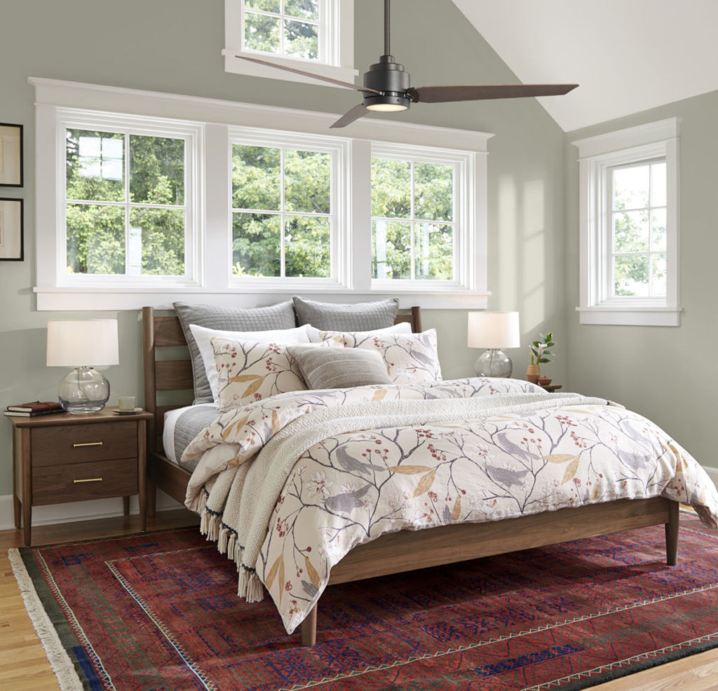
What is the color on the bedroom wall I’m the picture? I am wanting to paint my dining room wall which is red and I have a lot of red accessories and rigs with red as well as a red couch. The other rooms are painted with SW Blonde paint so the dining room walls need to go with the Blonde paint as well as be appealing with furniture and rugs . The rooms space is very open. What color would you suggest?
Hi Judy! The color in the bedroom is Chatroom SW 6171. For your 2nd question, could you confirm what room you are painting and what color families you prefer? Thank you.
The kitchen island cabinet is Dark Night. What color paint is on the wall and trim?
Hi Donna! The wall and trim color is Greek Villa SW 7551.
Do you have an inspiration photo using the Fawn Brindle?
Take a look at the Paint Projects tab. These are projects submitted by customers participating in our #SWColorLove campaign:
Fawn Brindle SW 7640
Please, consider posting pictures displaying these beautiful colors in rooms with limited natural light. This is not the first time I ask. What would Fawn Brindle look like on my walls? I’d like to see a more realistic idea, since our small home has low-ceilings and gets limited natural light. The visualizer doesn’t work very well in that sense. I love SW but I’ve exhausted my budget on color samples alone.
Hi Flo! We appreciate your feedback about the ColorSnap Visualizer. We currently offer night/day lighting for our sample scenes, but will pass along your request for rooms with limited natural light. The best way to determine how the color will look is to test it in your lighting. This includes using both color chips and our Color to Go samples. Please let us know if we can help you select color(s) for your home. We now offer free 30-minute virtual consultations with one of our color experts to get one-on-one guidance for your project via text, email, phone call or video chat. Complete the form to request a Virtual Color Consultation
Walls are currently sage. Since then my furniture has changed, please help me choose new colors! Also what color would you suggest for trim? Furniture is chalk paint black, sofa is dark blue, curtains are deep coral. Black and white buffalo check valances and decor. Thank you! Judy
Hi Judy, Consider these grounding neutrals for your space. Any of these colors will complement your existing furnishings. Take a look at:
Nantucket Dune SW 7527
Urban Putty SW 7532
Sand Beach SW 7529
My chairs are a deep chocolate and my wood future and frame are oak. Looking for a color that will bring brightness and warm welcome country feel to my home. Also need an accent color for a wall to go with it and another color for the remaining rooms. I would like forvthem to be in the same family if possible.
Hi Vicki, take a look at either Paper Lantern SW 7676 or Buff SW 7683 for a warm, understated all over color for your space. Consider using Blonde SW 6128 or Whole Wheat SW 6121 for an accent color.
We bought a spec home where we were allowed very little input on changes we’d like made. The home has a very open concept. Unfortunately they painted the textured walls and textured ceilings the same color, Reposes Gray. I like that color in other rooms, but in our family room it tends to show up as white on our walls due to having two walls of windows (south and west facing). The wood trim and is Extra White / SW7006 which makes for very little definition between the walls and the trim. I’d like to paint the walls in our living / dining area a darker color, but do not want to go to the work or expense of repainting the textured 12’ ceilings. Plus, if I repainted the ceilings in the Great Room I’d need to repaint the ceilings in all our rooms. In trying to come up with a color for the walls that might work with leaving the ceilings Repose Gray I’ve been looking at Sticks & Stones / SW7503 and Palisade / SW7635. (Granite cabinets are heavily marbled with brown tones, kitchen cabinets are white with dark brown cabinets in the island). I’d appreciate your input.
Hi Cate, We’d like to get a better sense of your space before making a recommendation. Sign up for a free Virtual Color Consultation here.